Wednesday, 30 October 2013

It's all change in Croydon!

We started working with the team at The Croydon Business Improvement District (BID) back in April. They approached us to pitch for their marketing & communications, website redesign and loyalty scheme launch, having heard from Better Bankside such positive things about our work for them. Revising the brand was not included in the original brief, however we felt it was both achievable and important to incorporate a brand refresh alongside the other deliverables, and after putting our case forward the team at the Croydon BID agreed.
“This is a time of real change for Croydon, not only in terms of what the BID is doing but also with the proposed new Westfield & Hammerson shopping centre on the horizon and developments across the town as a whole. It was important to find an agency who were as excited as us about these changes and Simon’s connection with the town and his experience as a Better Bankside levy payer made it an ideal match.”

Matthew Sims, Chief Executive, Croydon Town Centre BID.  
Old Croydon BID logo
New and improved!

The team wanted to improve the positioning of Croydon BID and promote the benefits the BID has already brought to the town for business owners, residents and visitors alike.

We started off by looking at the BID’s five key pledges to the business community – to make the town safer, cleaner, better promoted, more attractive and more accessible. We kept the original pledge colours, but developed a rationale to ensure consistency and harmony across the brand.


The logo was already established, however it needed a stronger presence. We focused on making the typography bolder and more vibrant, changing the colours in favour of something more contemporary (and a little less Wimbledon-ey!).

With the logo spruced up (and looking very smart if we do say so ourselves!), the core messaging needed to be updated. “All Change! Croydon” lent itself perfectly to the cause. Its subtle play on words not only indicate Croydon’s position as a major transport interchange, but also reflect the positive changes the BID brings to the town. On a secondary level “Making a Difference” concisely highlights what the BID is doing and reinforces its role and the reality of change.


Alongside the logo and messaging, a new website was also needed as it provides a key channel for the team to communicate the positive changes happening in Croydon. The site 'soft-launched' last week and although only a few weeks in, site visits are already up by over 3300% - you can see the new site and find out all about that side of the project here.

This strategy is being rolled out across various collateral from Christmas Banners, their Annual Report and the all-new Check Out Croydon loyalty card.


The Check Out Card gives exclusive offers and discounts in many of Croydon’s shops. The name we conceived, Check Out Croydon, offers a conversational and friendly tone, whilst the play on words also act as a call to action for people to check out what’s happening for themselves.

The card is proving to be a popular addition to Croydon BID’s positive changes, exceeding expectations with the number of sign-ups.


“Our partnership with the team at tothepoint has been great, they’ve produced some really creative, forward-looking work and have demonstrated a vested interest in our cause. It’s been a pleasure to work with the team and we wouldn’t hesitate to recommend them!”

Matthew Sims, Chief Executive, Croydon Town Centre BID.
As they always say (particularly at Halloween) there’s no rest for the wicked – we’ll be continuing our work with the BID. So when you’re next in Croydon, keep your eyes peeled for their influence, as we’ll have new collateral springing up in the coming months.


October scare stories

Eeeek! An Exhibition!

Our client CIPR will be hosting the first dedicated PR show, aptly named PR Show 13 on the 26th of November, and not only did we brand the event and much of the collateral; our good selves will be exhibiting! It's free to register so there are no excuses and throughout the day there are also education streams, workshops, advice hubs and even more. So why not drop by and say hello!


Wicked Wordpress

WordPress, one of the world's most popular website Content Management Systems (CMS) celebrated it's 10th birthday earlier this year. It's rapidly maturing into one of the most flexible and easy to use platforms to build anything from a simple blog to a fully functioning, content heavy website. To date there are over 72 million Wordpress based websites (about 19% of the web) and this isn't slowing down at all.

It's just been updated to version 3.7, bringing with it a few nice new features. Of particular note is the new background update process. Wordpress can now handle automated maintenance and security updates - to keep sites automatically updated to the latest version of the software. Security has been further enhanced with various additional checks – including much improved password recommendations – and the system also supports better localisation for languages other than English. Version 3.6 (which brought with it enhanced media management and a built-in HTML video player) was only released a few months ago, so at this pace we expect the next version to be out by the end of the year.

If you'd like to see some of the rather cool sites we've created using the Wordpress platform, just head on over to our new digital site at: www.ttpdigital.com

» read more (TNW)


Grand Guignol Google

Fresh on the heels of Google Reader’s demise, iGoogle – Google’s browser dashboard is about to close down. If you’re still using the service, it will go the way of everyone’s favourite Monty Python parrot on November 1st.

First introduced back in 2005, iGoogle has been my de-facto homepage for well over 5 years, so I’ll really miss it when it’s gone. This is all part of Google’s so called ‘spring clean’ – and is just one of many smaller projects and services they’re shutting down (here’s a few more) – apparently in order to have greater focus on the things they want to concentrate on.

For those who’ve never used iGoogle and are wondering what the heck I’m talking about – it’s essentially a tool for creating an ‘at a glance’ homepage based around your own interests and needs. So, for instance, it may show you: the latest news or sports results, the weather in your area, your twitter/facebook feeds, your ‘to do’ lists, useful notes or reminders, your email inbox and your online calendar – all on one page and accessible anywhere on any computer once you’ve logged in. You can easily change the layout and add new content whenever you want.

So, if you’ve never tried a dashboard homepage and fancy giving one a go, or if you’re looking around for an iGoogle replacement, here are my top 3 suggestions:

» iGHome

» iGooglePortal

» NetVibes


Whispering wallets

This nifty little creation brings your wallet to life, yes you heard right! The living wallet is paired with an app which monitors your spending habits and hopes to help the user save money. The wallet starts off by running away from you, moving on to crying for help when it's captured and as a last resort it'll send a text to your parents! It's a little spooky, but of course we're so in control of our money, it's wasted on us....(it's pay day soon right?)


Little Print Shop Of Horrors

Now, I know we shouldn't promote the work of a "rival" design agency, but this is all for a good cause! Manchester based Creative Spark have opened their Little Print Shop Of Horrors again this halloween. They are selling limited edition prints inspired by famous horror films, and to top it off, all proceeds go to charity.

Terrifying Tesco

Another month, another Apple product release - this time they've graced us with updates to their iPad range, a new iPad Air (the bigger one) and iPad mini (the smaller one) - both sharing the new iOS7 look and rather spiffy 64bit A7 processor. The iPad mini has had probably the bigger of the two upgrades, not only significantly faster than its predecessor but now sporting a full 'retina' screen too. But with Google, Amazon, and even Argos getting in on the small tablet act - is this the best one to go for?

In short, yes it is, but with a proviso. It's probably the best tablet around right now on everything apart from the price. And at £319 for the base model it's certainly not cheap. For those wanting a email/facebook/iPlayer tablet that will handle most casual demands but won't burn a hole in the bank balance, it's worth checking out the new 7" 'Hudl' tablet from Tesco.

A brand hardly known for its cutting edge hardware, Tesco have just launched a rather nice new entry to the mini tablet market - and whilst it's not the thinnest, fastest or highest resolution tablet around, it probably offers the best value (every little helps right?). At just £119 it's a very decent bit of kit that compares favourably with anything else on the market. Perfect for those who find themselves wanting to try out a portable tablet but put off by the price of an iPad. If you're willing to go up a bit on cost to £189, then the Nexus 7 (2013) is almost on par with the iPad mini - but the iPad still holds the crown as king of the hill simply due to the tablet app support.

» Hudl review

...and while everyone else is trying to corner the 'mini' tablet market, Microsoft... well, they seem to have got their measurements a bit mixed up!


Scary skipping

Business In The Community (BITC) have recently launched a campaign highlighting the difficulties that ex-offenders face in the job market, with their goal being to have the previous convictions tick box removed from applications form. The ad features a clever use of the Skip Ad button to highlight how potential employers will skip over an applicant with a previous conviction, often without a second thought. It's a touching ad, and a very clever use of technology.

Read more (Creative Review) 


And finally...

It's Halloween again, and we had to end with some sort of spooky themed story. Although we tend to associate the carved, candle-lit pumpkins with a more 'American' version of Halloween, it's actually a tradition thought to have started in Ireland during the 19th Century (although using turnpis rather than pumpkins).

Of course, even if they didn't invent the tradition, American's always have to do things bigger and better and this years 'Great Jack O'Lantern Blaze' - a 25 night event held in New York is no exception. Still, they've really outdone themselves this year creating all manner of glowing pumpkin statues - from dinosaurs to sea monsters - see them here.

And if you're like us and feel your pumpkin carving skills could do with a bit of polishing you'll be happy to know that the Telegraph have put together a video to help you do just that!

In fact, if you've got a halloween creation you'd like to share with us – do send us photos of your pumpkins and we'll put them up here on our blog! We may even send you some treats for the effort! No tricks....

Tuesday, 29 October 2013

Advanced design

The EPSRC (Engineering and Physical Sciences Research Council) are the main UK government agency for funding research and training within engineering and the physical sciences, and we have had the pleasure of working with them for a number of years.


“We came back to the TTP to help us with this brochure as they had developed the original concept for the series and we had a tight deadline to meet - as ever, they delivered for us, on time and on budget.”
Joanne Enderby, Acting Head of Communications, EPSRC.
Most recently they came back to us for another brochure based on advanced materials and nanotechnology, which would sit in their High Level Position Statement (HLPS) range. This range offers an overview of the strategic areas within the EPSRC portfolio and highlights key investments, along with future priorities and past impact within the area. The HLPS range is aimed at stakeholders within business, government and academia, this one was also used at a recent event, Nanotechnology Partnership for Progress – One Year On.

Both the event and the Materials For A Smarter Future HLPS brochure celebrate the work being done with nanotechnology, therefore a microscopic view of a carbon nanotube was selected as the hero image for the cover and central spread.

The EPSRC are constantly pioneering new research and investing in the future of engineering and physical sciences, so keep a close look out for more of their work in our e-news.


Monday, 30 September 2013

Going digital

tothepoint launches a new digital arm 'ttpdigital' to focus on digital design and communications: www.ttpdigital.com


The world of marketing and communications is changing fast. It used to be the case that websites and videos were a low priority luxury that companies could afford to ignore (or merely pay lip service to). However that has changed and digital is more important than ever.

We’re not claiming that print is dead, or even that it’s on its way out. However, it is an undeniable fact that most people's first introduction to a brand is now through some kind of digital medium - usually a website, but sometimes a video, email or even an app.

And this isn't just affecting traditional print-based design, it's having a huge effect on the idea of branding too - when people's main experience of your brand is on your website, can we still treat the branding process in the same way? Your logo now has to work hard on a huge variety of sizes, screens and formats - and the brand experience must be in tune from your poster campaigns to your annual report and your website(s).

This change isn't slowing down either - whether you're a fan of them or not, the use of smartphones and tablets is increasing year on year and it's not limited to the 'early adopters' or young geeks. Your site is as likely to be seen on a nice big Windows laptop as it is on a tiny iPhone - and so we need to turn to new ways of doing things like building 'responsive' websites that reconfigure themselves to make best advantage of the screen size they're viewed on.

Recognising the importance of this, tothepoint has been a truly 'integrated' agency for quite a while. We don't believe in separating design for print, web, video or any of the other media we work across - we think it's essential that the brand comes first and that it works successfully and consistently across all required materials. However, we also acknowledge that for many companies, digital now comes first.

So, we've created a new digital arm of tothepoint dedicated completely to the pursuit of digital excellence: www.ttpdigital.com

Whether it's a new website for a startup company, an animated corporate video that has to explain the intricacies of a company USP in an engaging way, or e-newsletters and analytics, we thought it was time to highlight our expertise in this area and show the range and depth of our work.

Our new website is now live and you can browse over some of our work, or read (our admittedly 'techie' focused) blog.

Let us know if you have any comments about the new site - we'd love to hear what you think. And of course, if you have any digital projects for us - just get in touch!

September's newsround

Have a break, have an OS


In a slightly bizarre marketing mash-up, Google and Nestle have recently joined forces and named the next version of Google's Android operating system (version 4.4): 'KitKat'.

Google has been alphabetically naming each successive version of its OS after some kind of sweet since V2.3 'Cupcake' - followed by 'Donut', 'Eclair', 'Froyo' (Frozen Yoghurt), 'Gingerbread', 'Honeycomb', 'Ice-cream sandwich' and current version 'Jellybean' - so the fact that the latest iteration is named after a chocolate bar isn't such a surprise.

What is odd is that as far as all were concerned the next name would be 'Key Lime Pie' (an admittedly odd choice) - with the KitKat name seemingly coming from nowhere at the last minute. It's also the first time Google (or ANYONE as far as I'm aware!) has ever thought to promote their OS by getting friendly with an existing, unrelated brand.

Could this be the start of a strange marketing trend, or is it just Google being a little kooky? And if it follows the same convention for the next version - could Nestle's 'Lion Bar' be gearing up for an Android make-over?

I do wonder if they've both considered the potential implications of the deal. This could be perceived as Nestlé basically endorsing Android phones, which may then be seen as 'anti-Apple' due to the two tech companies ongoing rivalry - and Nestlé really doesn't want rabid Apple fans mounting an anti-Nestlé campaign!

more info (BBC)


The Gold standard


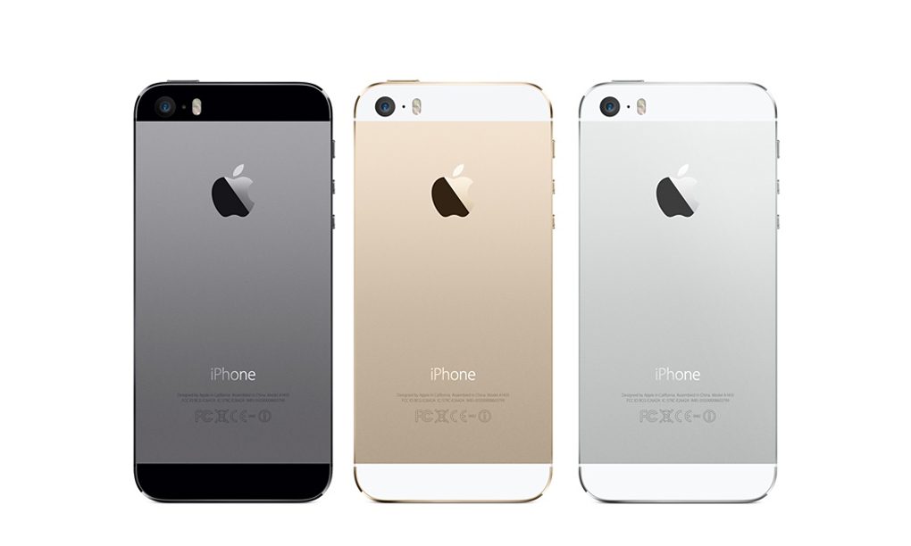
The usual media frenzy took the interweb by storm last week as Apple announced its newest update to the iPhone range. There have been rumours for a while now that Apple has run out of steam when it comes to innovation and sales are slipping against arch rival Samsung and Google's Android OS. So, did its new phone set the world alight once again?

Well, not so much, but to be fair, Apple seems to be on a path of refinement and minor improvements recently rather than throwing as many features as possible at their handset (certainly something of which the Galaxy S range is guilty). Many were expecting a high end iPhone and a mid-range 'economy' version this time round. However, we seem to have been given an expensive option and a REALLY expensive option. But, when Apple sees itself as more of a luxury brand - why do cheap? No doubt the varied colours of the 'C' model will sell well amongst the younger audience, whilst the 'bling' of the new Gold iPhone 5S may do well among the glitterati.

Feature-wise there's nothing too ground-breaking, but the new fingerprint scanner could end up being a game-changer. It's not certain quite how accurate it is in the wild, and how Apple might then use the new security feature to connect other apps/services, but if it works as advertised, it could open up a whole new world of in-phone-payment that its competitors can't even get close to yet.

And talking of competitors, Microsoft was very quick to parody Apple's new creations - which would have worked well if those ads weren't so poor - they've now been quickly pulled after Microsoft admitted they were 'painfully unfunny' - oops!

more info (the verge)


Ya-who?

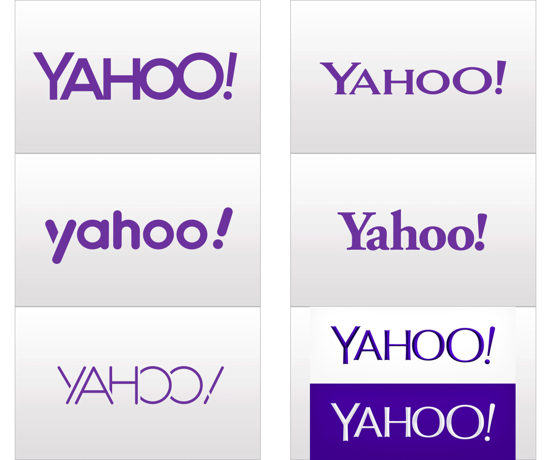
So after 30 days of teasing, Yahoo! finally launched its 'real' new logo to the world. Did it make sense of the plethora of design variations previously shown? Has it moved the company forward and refreshed the brand? For one of the Internet's earliest and longest surviving players (it's 18 years old - which is about 180 years in web years!) it will be interesting to see how it is received by users and non-users once the initial parodies and criticisms die down.

Marissa Meyer, Yahoo!'s new young and energetic CEO writes all about it in her personal Tumblr blog (well, it would be Tumblr as she oversaw the purchase of that company not too long ago) – and goes into detail about the design process ...
http://marissamayr.tumblr.com/post/60336044815/geeking-out-on-the-logo

In her words:
"I love brands, logos, color, design, and, most of all, Adobe Illustrator. I think it’s one of the most incredible software packages ever made. I’m not a pro, but I know enough to be dangerous :)"

One would think it's a rare CEO who gets their hands dirty with this sort of thing (or even knows what 'Adobe Illustrator' is). Although, having said that, Rupert Murdoch essentially designed his own News Corp logo not too long ago, skipping the need for an external design agency, or even Adobe Illustrator. Is do-it-yourself brand design the new trend? If so, are these 'dangerous' times for brand agencies?

The jury is still out but as one of our clients we see this as an opportunity to help evolve and support the new brand. Our work so far has ranged from standard signage and wayfinding to the more adventurous art installations we produced for their Rolle office last year. This work demonstrates the life that can be brought to a brand through creativity and that a brand is far more than just a logo.

Only time will tell if this new logo can last as long as the previous one - but if stock price is a good measure, perhaps the refresh really has worked a charm! http://mashable.com/2013/09/12/yahoo-stock-30/

more info (adage)

Meanwhile, back at the ranch...

So while Yahoo drops the 'flat' and brings on the 'chiseled' 3D look, the rest of the big search boys are changing their logos too - and 'flat' is definitely the trend du-jour.

Microsoft's big Google search challenger 'Bing' has just announced its logo has had a makeover - it's now bright yellow instead of the original blue and much more angular than the previous version - and flat as a pancake of course.


And if rumours are true (update: turns out they were), Google is also going through a logo refresh - dropping the long-standing drop shadow and 3D bevelled effect and going for a simpler, flatter (there's that word again) identity.

This new version first started popping up all over the company's services, but was then officially announced a few days after Bing's updated identity.

So, can it be a coincidence that all the big internet search brands are refreshing their logos at the same time?

more info: 

» bing logo change (the verge)

» google logo revamp (BBC)


A shriekingly good light show


Had a bad day? Feel stressed and need to let it all out? Why not pop along to the ‘House of Pain’ on Borough High Street, where you can unleash a cathartic scream or yell, with each scream generating an instant light show that illuminates the whole building.

We tried it out and it’s a lot of fun, but be warned, people on the street outside the building will hear you!

Part of this year’s MERGE festival, the ‘House of Pain’ is open between 5pm-10pm every night until 21 October.

And finally...

We're hiring! We're looking for a front-end web developer with an eye for design so if you're interested in joining the lovely ttp team or know of anyone who would fit right in and push new ideas, get in touch. For further info have a look at the opportunities page on our website or check out our Linkedin ad.

Community Spirit

We’ve helped out Bankside on a couple of projects this month, designing a set of posters for ‘We are Bankside’, which is led by Bankside neighbourhood forum, a group of local partners involved in Bankside's future planning issues. Also for Better Bankside, our local business improvement district, the design team here has been advising on and creating an engaging, concise brochure for Better Bankside’s response to the Major of London’s Road Task Force report.
‘We are Bankside’, a new neighbourhood forum aiming to give the local community and businesses a voice, asked us to create a set of posters to introduce its services and highlight its seven core principles.
This new venture needed a distinct look and feel that was friendly and welcoming, whilst also distinguishable from branding used by other Bankside partners. We used a warm green tone supported by obvious calls to action and plenty of engaging imagery of the Bankside area and its people to reinforce the group as a vehicle to give the local community and businesses the opportunity to be heard.


We’ve also designed a more corporate, business use brochure for Better Bankside, to highlight its response to the Mayor of London’s Road Task Force report, and how it will be actioning the findings. The brochure is to be given to key decision makers in local government and the Bankside areas and therefore needed to have a more formal look and feel, whilst promoting the Better Bankside brand.

Saturday, 28 September 2013

Exhibition expertise

Knowing where to start when looking for the best exhibition stand system and manufacturer for your needs can be pretty daunting as there are so many companies out there, all offering similar services. Of course, being cost aware is often the most important criteria, especially when demonstrating ROI on a stand, but as we all know, there can be a fine line between cost effectiveness and wasting resources on a ‘one size fits all’ stand.

So, when global leader in testing, inspection and certification, Bureau Veritas, needed a modular, flexible exhibition stand, they approached us for our expertise on the matter, knowing they would be in safe hands. The company needed a reusable stand for the RenewableUK Offshore Wind Conference and Exhibition held in Manchester.

RenewableUK Offshore Wind is a prestigious, European-wide event and Bureau Veritas needed their stand to reflect its high-profile presence and unique proposition. As such, the stand needed to be cost effective and easy to install, breakdown and resize for additional events as required, yet allow for a bespoke, professional design.

Working closely with Bureau Veritas’ Marketing and Communications Manager, Nadia Cadby, we established the exact requirements so we could recommend the most suitable stand systems and manufacturers, as well as being on hand to provide ongoing consultancy throughout.
initial hand sketches to help the client visualise the stand


modular system which can be tailored according to requirements
The stand and exhibition were both great successes for Bureau Veritas, and they were delighted with this first usage. Nadia Cadby said: ‘to the point is a great company to work with, following the brief to a T, but not afraid to challenge where necessary. The team kept me updated throughout the consultancy stage, offering timely and relevant advice, and helping me to achieve a final stand that exceeded my expectations."

Thursday, 29 August 2013

August's newsround

From brand new phobias to the perils of relying on the cloud, here're a few news bits and pieces that caught our eye during August...

No Mo


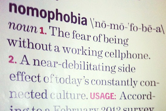
nomo
Not only have we made up a brand new phobia, but apparently half of us Brits suffer from it -'nomophobia' - the fear of not having access to your mobile ('no mo', get it?). As Facebook / Twitter / Candy Crush Saga or just plain email addiction increases, will we start to see nomophobia hospitals opening around the country for all those who've had their phones stolen? Maybe even walk-in clinics for those who just left it in the car that morning or helplines for those who've used up their monthly internet allowance?

A scary thought maybe - but then it's that scary we need a word for it in the first place. And whilst we may think it slightly ridiculous now - just try a 'digital detox' and see how long you can last without it - perhaps not quite as long as you thought?

more info (the drum)


How to do renovations right.


The National Trust owned stately home Cliveden in Buckinghamshire is currently in the middle of a £3.4 million renovation, with the vast series of works anticipated to last five years.

And, being a caring organisation, The National Trust was worried about the disruption the renovation would cause to visitors, especially as part of the restoration plans involve the property’s historic staircase. So, to counter act the disruption (and inject some fun into the process), the trust has installed a 16.5m slide that lets visitors slide from the roof of the terrace down to the gardens. Now, that's our type of historic sightseeing!

More info (design week)


Jerry's map


At 79 years young, Jerry Gretzinger and the map of his fictional world have been causing a stir in the design world. For 50 years now he’s been working on the map, which now spans over 2,500 pieces of A4.

Jerry adds to the landscape each day in his coffee break, drawing a card from a specially customized deck to decide what sheet he will work on. And don’t be fooled, this is no half hearted attempt, Jerry has created airports, high courts, cemeteries and train stations. The map is coloured to represent different altitudes, and to bring it to life further, he adds tickets, photographs, magazine cuttings, drawings and other bits and pieces to the existing pages to create textures and layers.

The images and a few brief blog posts really don’t do Jerry’s life-long project justice, so if you’re still curious then watch this brilliant short detailing the Jerry’s whole process.

More info (it's nice that)


Gathering Clouds


Amazon is slowly taking over the world. And I don't mean Amazon's impressive online shopping service either - I'm referring to Amazon Web Services (AWS) - possibly the largest 'Cloud' service around. Most people don't realise that many of the big web services - from Flipboard to Instagram all run on Amazons servers. In fact it's only when something goes wrong do we realise the implications.

Last week an AWS outage took down Instagram, Vine and several others (including Amazon.com too). Being taken offline is pretty serious for anyone, but for an internet only service it's disastrous. Are these web-based services relying too much on Amazon's Cloud? Perhaps, but it's doubtful that any competitor can ever offer 100% up-time. The answer then is that more companies will have to spread their reliance around as much as possible - otherwise the next outage could leave us all in the lurch! Maybe this Cloud thing is a little less fluffy than we'd imagined?

more info (techcrunch)


 Shut the Gates on your way out


Steve Ballmer, Microsoft's CEO announced his decision to step down - leaving a very different Microsoft from the one he inherited 13 years ago from good ol' Bill. Has his reign been a roaring success? Well if you judge his on-stage performance - he certainly thinks so! (yes, that's real). However, looking back we struggle to see the real vision he's brought to the company - for every success (Windows 7) there's been an equal failure (Windows Vista) - for every innovation (Metro interface design) there's been a cheap knock off copy (Zune).

In fact it's been remarked that Microsoft really doesn't know what to do when its out in-front - it's only when some young upstart (ie. Apple) comes along that the company realises that it has to up its game - but then that's where Microsoft can be dangerous. It does seem to be turning around and realising the up-hill climb its got to face to get back on top (finally, the Microsoft team is starting to think in 'joined-up' terms - desktop, living room, mobile all now sharing a similar approach). Let's hope his replacement just has a little more vision.

more info (the verge)

update: since writing the above it's emerged that not only has Microsoft bought Nokia (for cash no less) but the current Nokia CEO is rumoured as a replacement for the top job at Microsoft... hmmm almost like it was all planned...


At a loss


Poor Katie lost her iPhone this month, and being the foolish renagade she is, it wasn’t insured and didn’t feature any of the techie tracking or back up apps on the market now. 

We thought she couldn’t be the only ill prepared smartphone owner out there, and clearly Gizmodo feel the same, as this month the technology blog reviewed the best apps to have in your arsenal just in case you ever lose your phone.

Of course just being sensible with your phone is still the best defense, but Katie does like to live on the edge.


Timelapse Photography re-imagined


Fong Qi Wei's timelapse photographs are a beautiful, yet frankenstein-esque, look through time and capture the stunning effect that sunrise or sunset can have on a land or city scape. The only thing to do with these images is simply enjoy them.

Here today, hair tomorrow


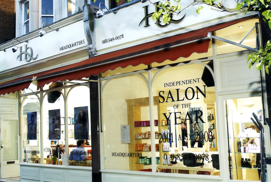
We’ve worked with premium, award winning hair salon Headquarters on many projects over the years, and this month the team asked us to create an invite for its 15th birthday celebrations.

The salon is celebrating in style with bubbly, canapés, fashion designers and, of course, plenty of top notch hair. Not only that but HQ is using the party as the perfect excuse to show off its brand spanking new salon, which has had a birthday make over.

The salon's new interior

So, the invite for the birthday party needed to have the same luxury, celebratory look and feel. We chose to keep the reverse clean and typographic, allowing the show-stopping image on the front the take centre stage.

We used Fedrigoni Splendorlux, a thin card with a gloss coating to the face and an uncoated finish on the reverse – an unusual mix of textures that gives it a high end, distinctive feel. It’s usually a paper for litho printing, but thankfully our clever printers were able to make it work on their digital press.

On another note, it’s not just Headquarters that is 15 years old; the logo is too! It’s not had any work done, and no, we don’t hold the key to the fountain of youth. We just understand branding, and what it takes to make a logo stand the test of time.


We don’t like to hark on about it (ahem) but it is true that by getting ‘to the point’ (sorry, we couldn’t resist) of your business, understanding your values and your audience, there’s no reason why you can’t have a logo that will last.

Wednesday, 28 August 2013

A bridge not too far

On the 11th August, on a chilly but bright morning, with the Thames two degrees colder than expected, Sam undertook yet another challenge on Team Hutton's fundraising journey in aid of the RNLI and in memory of their brother Charlie. Mum and Dad (our FD and MD) were there to see him off and despite second thoughts he entered the water with over 300 other swimmers. The event is only in its third year and has already tripled in size.


The 14km Bridge to Bridge swim starts at Henley and is billed as non competitive but the challenge is to beat the Thames, keeping out of the way of boats, kayaks, angry swans, ducklings and swimming dogs. With stops at locks, there's just time to grab a bite of a banana or chocolate snack before jumping back in with all the other seasoned swimmers, including a few cross channel fanatics.


The murky waters of the Thames are enough to freak out even the best swimmers but after a very shaky start, coming to terms with both the emotion of the event and his first experience of swimming in the Thames, Sam settled into his natural stroke and started to enjoy what is a magnificent stretch of theThames. The supporters were able to walk along the banks watching their friend or family member making steady progress towards the next stop. A great day and another great achievement. A small photo diary can be seen here of the day: http://bit.ly/Sam_henleyB2B


This stretch of the Thames Path is great for a weekend walk or cycle, but if you do decide to swim, do make sure you get the tide right and swim with it or it may be a bridge too far...

Footnote:
Tom and Sam's next event is the Charlie Hutton Hockey Festival to be held at Whitgift School South Croydon on Saturday 7th September 2013 from 10am. It should be another great day so if you fancy it, come along and support the teams and watch the passion, skill and fun that was so much part of Charlie's life. Team Hutton's giving page will remain open for further donations to the RNLI http://bit.ly/RNLIfundraising

--