Friday 19 December 2014

Year Ye, Year Ye


2014 has been a busy 12 months for us here at tothepoint, and as we're coming to the year end, we wanted to look at the exciting work created for clients old and new. Click the titles to read the full stories!


January
New Year, New Capital
New Capital was the newest product from our client EFG Asset Management and in the New Year they asked us to create an impactful identity and website for their investors. It was essential that the identity reflected the strong research, data analysis and insight that inform the selection of each investment, and which sets this fund apart.


February
New Depths of Design
In February we dove into design with Rockpool Investments, refreshing their identity, website and printed materials to give them a more contemporary look, whilst building on the brand's existing foundation. We also developed a strapline and a series of icons to help better define them in a crowded market place.


March
Turley, Madly, Deeply
In March we won a three way pitch to rename and rebrand Turley (formerly Turley Associates), who are one of the UK's biggest planners - working with equally sizeable developers such as Land Securities and British Land. With client interviews and brand workshops at board director level it was a challenging undertaking but we think the results speak for themselves and Turley has had a great response to the new look.


April
Building a Brand for a Building
Derwent London specialise in office regeneration and investment, and the innovative and creative approach they bring to their work is certainly close to our hearts. Earlier this year we developed the name, identity and marketing material (including a new and unusual website) for Charlotte St Studios. This has been such a success that all the spaces are now let and the site is now out of the public domain. Watch this space though as it'll be on our site soon!


May
IMagine That!
Our work for Transport Systems Catapult all began with our work for the Imagine Festival where we designed the brand and website for the event. This led to the creation of the IM campaign to promote intelligent mobility. We worked on a number of projects from office exteriors and interiors to animations and merchandise, plus everything in-between.


June
Exceeding Excellence
Each year in June the CIPR celebrate and award the cream of the crop in public relations at their Excellence Awards dinner. Each year we work on the branding and collateral for the event, and this year we embraced the disco ball!


July
Thinking Logically
July flew past us, as we started working with News UK's News Logistics on their brand and interior workplace, with a turnaround time of 8 weeks from brief to completion. We managed to agree the naming as well as design, artwork, and install the new brand with interior graphics for their ‘News Logistics’ division, on time and on budget. It's fair to say that it was a busy couple of months!


August
Tickled Pink
Following on from refreshing their website earlier in the year, in August we saw our local area through rose tinted specs, and that’s a good thing! We helped Better Bankside refresh their brand and launch their 2015 BID campaign, which included their ballot proposal book, an invite, leaflet, roll banner…the list goes on! They were successful so they can keep up the good work (and adding that dashing shade) in our local area.


September
Making Waves
We gained our sea legs in September with Thames Clippers and their new partner MBNA. We implemented their new logo across various brand touchpoints, as well as evolving their guidelines to cover all the changes, which just goes to show that we don’t need to have designed the logo to apply it.


October
All Change!
TFL and Transport Systems Catapult (TSC) called for students to innovate bus travel for visually and hearing impaired people through their recently launched All Aboard Competition – you may have seen it on the 6 O’clock news!


November
The In Crowd
November we were in with the in crowd as EFGAM launched their In8 publication series. From the thought leadership approach of Invest to engaging and informative infographics that brought to life complex investment themes, we were involved throughout.


December
Words of Wisdom
Festivities have begun and some wise men (and women) at Croydon BID are encouraging party-goers to stay safe during the Christmas season with a range of posters and promotional items to 'Wise Up'!


These, along with many other projects, including lots of new exciting work on interiors, have been keeping us busy this year, which is why we 'love where we work' too. Plus there's a few wins we'll be talking to you about in January that we can't wait to get started!

We want to send a big thank you to all the clients and suppliers we've worked with in 2014 and look forward to developing these and new relationships in 2015! 

Words of Wisdom

Christmas is here (in case you hadn’t noticed) in all its merry mulled wine glory, and as spirits rise in Croydon, the Croydon Business Improvement District (BID), in partnership with the Metropolitan Police and Croydon Business Crime Reduction Partnership, are keen to to remind merry Croydon-ites how to stay safe on a night out and avoid letting Christmas cost them more than they think.

In the last two years the area of Croydon has blossomed thanks to the successful initiatives from Croydon BID, and the Christmas party season is no different with the launch of the recent Wise Up! campaign aimed at keeping the city centre safe and enjoyable for all.
The campaign centres around five core themes to help keep the fun times flowing whilst staying safe and planning ahead. Together with Croydon BID we decided to use bold headlines that reflect the internal monologue we're all guilty of having (how many times have you uttered the phrase "what's the worst that can happen?!"), juxtaposed with images that show the negative side of each theme or phrase - A wandering hand in a bag, the wary journey home or the room looking a little fuzzy after leaving your drink out of sight.
 

The poster campaign (which will be in 75 poster sites across Croydon, as well as in pubs and clubs) acts as a quick, sharp wake up call to remember the basics whilst you're out to ensure the night stays festively fabulous and that you get home safely....whatever time that may be!

So if you're planning on heading out in Croydon, keep your eyes peeled for our posters and leaflets, but most importantly wise up and stay safe!

The posters ready to go out at Croydon BID HQ


The quote bank (aka our 2015 calendar!)

As you can imagine in a busy studio such as ours, many priceless gems come out during day to day discussions. They’re mostly the things we wish we hadn't said...or, more importantly, things we wish hadn't been heard, although until now they've never left the studio. As with any supportive environment we thought it was only best these little diamonds were recorded and immortalised in our 2015 calendar.


From mispronunciations to the downright non-sensical, these are all genuine comments from the team (although some members contribute more than others...). We hope you enjoy them and this little insight into our world.


Feel free to join in and share your moments of enlightenment on Twitter with #thequotebank or here, where you can also play the quote bank quiz! Your mission, should you choose to accept it' is to guess who uttered ten famous quotes, in three minutes. If you finish top of the quiz we'll send you one of the quote bank limited edition prints. Furthermore tell us your favourite famous phrase and our expert quote judges will be awarding the funniest with two vouchers for a one-day screen printing workshop, so you can print your own quotes. Click here to play the quote bank quiz!


The quote bank calendars are being shipped out now, a little early Christmas present from us, to see you through 2015. If you don’t receive one, fear not, just drop us an email and we will do our best to send one to you.

Here's a sneak peak of what's to come...

Monday 1 December 2014

The In Crowd

In8 are now a series of eight publications used by EFGAM as a framework for conversations with investors. Before becoming In8 each publication existed in some guise, but were disparate, so the team was keen to bring the publications together in some way.


Initially the thought of not only understanding the complexity of global and regional approaches in the investment discretionary sector, but also turning it into a functional, engaging brand with digestible infographics that stood out from the competition, made our heads spin.

But, after plenty of swatting up (and some invaluable help from the EFGAM team) we created a unique and distinctive brand, that kept the information clear and relevant, with a visual tool kit that enabled the team to use a system across all eight In8 publications, both locally and globally.


Through a visual language of graphic devices and infographics the In8 brand moves away from cliché abstract imagery used by competitors to create clear, concise communication pieces, that informs and engages the audience (after all that is at the heart of what we do).


Evolved from the existing EFGAM honeycomb device, we created icons to differentiate the pieces that are used as quick reference points. They sit within the banner to notify the reader which theme the publication represents.


Following on from the investment theme icons, we created new chart styles to represent strategic and tactical information to convey the core investment approach of EFGAM. Using changes in colour and shape we were also able to communicate a large amount of information simply (and stylishly might we add!), to quickly allow the inhouse team and clients to interpret the content and difference in information so that they could evaluate and choose their approach more easily.


The eight publications each required different deliverables ranging from banners for Word documents and InDesign master templates to full implementation of materials. Once the tools were in place it was a case of working with the team to provide everything they would need to easily role the style out in house as and when required. This involved not only the templates themselves, but also guidelines to explain the style and its flexibility. As our client said the system is disciplined by nature, flexible by design. 


Mo Mews


'Tache Tales

As you may have spotted from our ‘tache updates the ‘tothepoint ticklers’ have completed their month long challenge in aid of men’s health. The men here have put up with strange looks, comical comparisons - Ned Flanders, Hulk Hogan and the cast of Blackadder to name a few - and an itchy upper lip for 30 days.

Thanks for all your support and funding. After a month we have raised a grand total of £305 If you would still like to donate, click here!


Green Giants

Following on from our branding of the News Logistics’ interiors we have created seven giant 1.2m pyramid signs hanging 50ft in the air. These define specific teams or areas within their huge warehouse. By creating instantly recognisable icons and using bold, clear type no one will need a map to locate each team here! Watch out for our other work for News UK at their new offices at The Place London Bridge.


Wedding Bells

A massive congratulations to our senior designer Sar-…sorry Mrs Callaghan! Aside from the invite (the hardest job any designer will ever be tasked with) Sarah was the most relaxed bride-to-be we’ve ever seen! She headed back last weekend to the West Country to tie the knot with new husband Chris. With the confetti barely settled the new Mrs C. is back with us for a short time before heading off to New Zealand on her honeymoon!


From Channel to Tape Tunnels

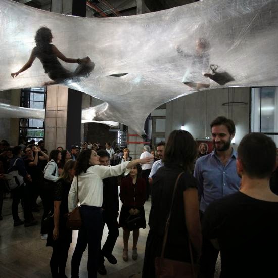
Our work with interiors often challenges us to create a space that represents the heart of the business. Unfortunately no brief has quite been suitable for an installation reflecting a mind/body organism… Luckily Tape Paris already has this covered! These translucent passageways are constructed purely of tape wrapped around concrete pillars through the gallery. So if you fancy hopping across the channel before January next year you can experience it in the flesh. Read further details here.


Flipping Fun

We've been sprucing up some old technology with some new technology with our new friends in the good old U S of A and while they've been enjoying thanksgiving we thought we'd give you a preview of some early experimentation... We're hoping this will turn into a major project for 2015 subject to planning but thought it might inspire others to chat to us about 'flipdots'... Watch this space... 


Digital Corner - Listen to yourself!

How much attention do you pay, to who's paying attention to you online? Read a few thoughts from us on how to get to grips with your online audience, and who's listening. 
Click here to find out more.

Digital Corner - Listen to yourself!


Are you using social media as part of your B2B marketing? Whether reaching a specific audience or generally spreading your USP, keeping your brand included in online conversations can be time-consuming. You also run the risk of either pestering your audience or not putting enough out there. When you get it right though, it can really help drive traffic your way and spread the word. On top of this, you can be fairly sure that other people are out there talking about you, or if they’re not wouldn’t it be useful to know?

There are many easy ways to keep your finger on the nubbin and monitor what’s going on in your online circles, as well as your competitors:

Google Alerts

Everyone knows about search engines of course. But did you know that you can easily use Google Alerts to notify you of new content online? Log in, build yourself a search list and get your results sent to your inbox:

Twitter trawlers

If Twitter’s your bag have a go with Tweetreach or Topsy for instant results and stats on keywords of your choosing. You don’t need to be baffled by complex data to see a snapshot of how far your Tweets have travelled.

Managing your networks

More complete services out there such as Hootsuite can help you to gather your social media content and be more strategic with it. Why log into everything separately when you can do it all from one place? This comes with detailed reports and feedback, of course.

Bringing it home

After all this, you’ve probably still got your own site content to manage as well, so why should that be any different? The trick is to stitch everything together. Publish to your site via a third party service (such as Hootsuite), or blast out your media feeds from your own website instead using a tried and tested plug-in. With today’s wealth of open-source Content Management Systems on offer (Wordpress anyone?), there’s no shortage of ‘bolt-on’ solutions to suit most needs.

Someone just has to write the content that’s all. The internet's not that clever… yet.


Find out more about our digital offerings at:
www.ttpdigital.com

Monday 3 November 2014

All change


A lot of the partnership work we do is based around creating and building sustainable brands that will see a business through thick and thin. However, every so often we get to work on something more short-term, and this time we were even able to set our inner-child free as we helped with the naming and then branded the All Aboard Competition for Transport Systems Catapult (TSC) and the Department for Transport.

The competition is aimed at 14-18 year olds and challenges them to think of innovative ways to make bus travel easier for people with visual and hearing impairments. The competition is introduced through schools, so the brand needed to be swaggy (that’s slang for cool these days) to attract the students, but it also needed to be professional and educational to attract the teachers who will drive the competition forward, plus hinting at the TSC brand.
“That’s a lot of boxes to tick!” we hear you cry. Of course we managed to tick them all. The blue hints to the TSC corporate colour, coupled with the grey on the website creates a fresh and professional colour palette. The doodles reflect the exploration of ideas but are also inspired by the icons we used throughout the TSC IM campaign, and together with the “thinking head” they create a playful foundation for the competition.

Despite battling the countdown clock coding and entry form logistics, the website was up and running in time for the launch on the 24th October. You might have even spotted it on the ITV news, #totesamaze.

Our experience from one of our other school projects, “Lab in a Lorry” for the institute of Physics, really helped us to strike the balance between fun and education, “funducation” if you will.

Projects with tight deadlines have never scared us, and unless yours involves spiders or heights we’re unlikely to be phased! Quick projects are no different to any others; communicate, plan and then communicate some more.

Bless Up (that’s slang for goodbye…)*

*Other “hip” slang words you might like to try can be found here.

A trained eye


A brand should evolve as the requirements of existing customers change, or new customers are sought. But it’s a common misconception that this will mean a time consuming and drastic change to a brand.

This month the CIPR (Chartered Institute of Public Relations) looked to us to help them refresh their Training division brand look. As a widely recognised style (who could miss that pink!), and part of a suite of divisions all with a similar look, the design needed more of an evolution than a revolution.
Using the icons more subtly, and with a stronger emphasis on people, gives the division a fresher look without straying too far from the pack. The first piece to flaunt its new style is the Training Brochure, with a series of ads to follow.Whilst working on the new Training style we also took the opportunity to tweak and refresh the CIPR logo.

Your market is constantly evolving, so like CIPR, it’s important to evaluate how your marketing materials are performing. Is your brand effective in today’s virtual world, and more importantly is your acronym a mystery to new (and existing!) customers?

In the words of Darwin (we can use Darwinism in branding, right?) it’s not always the biggest who survive, but the most adaptable to change. The brands that are innovative, flexible and embrace change not only survive but also thrive.

Autumnal announcements


Make:Shift:Do

Our technology and digital based clients are asking more and more for tactile and hand crafted solutions to their internal and external communications. Looking at screens all day as part of our job, and with staff and clients who do the same, we know how they feel.

Going back to traditional and craft techniques we are constantly looking at new ways to use these inspiring methods to create dramatic experiences and environments. So we are very interested to see The Craft Council are running a two-day event ‘Make:Shift:Do’ of workshops and presentations to give a hands-on experience of using digital technologies, incorporating ‘craft in the digital age'.

You can check out the events, dates and venues here.


Let's press on

With 2015 creeping up on us (FYI it’s 50 days until Christmas, that’s right we said the C word!), we thought it was best to start planning next year's calendar. This month we headed to explore Letterpress extraordinaire Mr Smith’s print emporium.

This traditional craft has become quite the hipster mark in recent years. However the soul we can give each piece is what drew us in (that and the great local opposite his studio!). Our brains are still whirring so watch this space, and check out Mr Smith’s work in the meantime.


Fairground Fun

We would all like a little more fun and games in the workplace, and for one of our clients we’ve just put this in lights! Their office is actually a converted cinema, so they were keen to see the spirit of yesteryears entertainment reflected in the items produced for their Games Room, the first of which is this retro fairground style sign.

If you need us we'll be over by the dodgems.


Creative Collaborations

This month The Francis Crick Institute held an event in celebration of the top 1000 most influential Londoners in science and innovation. With a star studded line up, including Microsoft rock star Bill Gates, the event celebrated the innovative work that the collaboration between science and art has been creating.

Just one look at Conrad Shawcross's Paradigm sculpture proves the beautiful matrimony between science and creativity. Not to mention our design work on the hoardings that still circle this new landmark building or our work for Transport Systems Catapult's IM Campaign and Growth Stories for the EPSRC...Ok that was a shameful plug but we love this work!


Refreshingly Similar

Building logos for brands is what we do best, but recently as well as creating we’ve been updating, tweaking and refreshing our clients' existing logos.

Part of Samworth Brothers, Bradgate Bakery were looking for a logo refresh. By using clean typography, updating the colour palette and creating a simple vector image, the logo now references their heritage but with a more contemporary edge.


tothepoint Ticklers

The men here at tothepoint are sacrificing their designer stubble and growing a 'tache in aid of Movember. Their fresh faces won’t last long with strict rules of no beards, no goatees and no fake moustaches for the entire month. They're taking the grooming and styling very seriously, although the handlebar and the horseshoe might be a bit optimistic! We’ll be sure to post the results in next month’s enews, and check out twitter for regular 'tache tweets.

To make a donation to the tothepoint team click here

Thursday 2 October 2014

Fall for our roundup


Pomak and the Painter

Over the years we have built up good relationships with clients based overseas, such as New York, San Francisco, Dubai and a little closer to home in Ireland. At the beginning of September, one of our senior designers, Jem, flew over to Dublin to oversee the installation of an exciting new project. It called for us to use some old techniques and methods we had not used for some time. One of the highlights was using Dublin based signwriter, Colm O'Connor, who brought some of our icons and messaging to life on real wood. You can see him in action in the video Gentlemen of Letters.                                                                                                                                                                  
We are still trying to work out if Jem was more impressed with the painting or the pint of real Guinness before his flight home.

Totally Bricking It!

September 24 has seen the launch of ‘The Art of The Brick’ at Truman’s brewery - to put this plainly, it's an entire exhibition filled with lego sculptures! That's right, childhood dreams do come true.

Created by New York Artist Nathan Sawaya, the sculptures are bound to leave both children and adults in awe. The highlight has to be the 20ft dinosaur, but there are also some special London influence pieces.

Reasons to be Creative

At the beginning of this month, our very own Jem Pomak went to his very first design conference and learnt a very pertinent lesson:

"The running theme of Reasons to be Creative seemed to be “design what you know and love”, although that might have just been my dreamy-eyed first-conference-wander talking. One speaker in particular, James Victore hammered home how important it is to design boldly, saying “If it doesn’t move you, how can you expect it to move anyone else?”. It was just one little thing but it really hit home, as an agency we do design with passion but it's not something I'd consciously thought of before.".


Our picks from LDF

If this year's London Design Festival has been a bit overwhelming for you we have picked a couple of our favourites for you to have a look at.
If Dominic's self-driving car is anything to go by, the future is going to be a beautiful place! Wilcox predicts that by 2058 (very specific) it will be safer to ride in driverless vehicles than ones controlled by humans. Our client, Transport Systems Catapult agree, as they're currently trialling driverless pods.

Dan's latest installation draws inspiration from the sci-fi writer Phillip K Dick, who stated that endless clutter builds up in a persons life as ‘kipple’. Through Dan’s Studio there is a pathway defined by the absence of miscellaneous clutter. From afar, it would be easy to think that the items have been spray painted to achieve the effect, but look closer and the sheer scale of the project becomes clear.


A tricky start for the iPhone 6

With more competition than ever before, Apple-sceptics had a fun September. Initial reports that iOS8 had more bugs than usual were joined with complaints on-line that the new iPhone 6 was actually bending!

Many have been quick to jump on the Apple bashing wagon with the likes of LG being swift to take the mickey “Our phones don’t bend, they’re naturally curved :) #bendgate.” (However, if you are going to poke fun at iPhones, then using one to send the tweet is probably not the smartest move!)

This all highlights the importance of some serious testing before launching something, whether it's a bendable phone or a mis-interpreted logo!

The science underdogs

This week the world of Science has recognised some of the contributions made to mankind that make very little difference (even the underdog needs a bit of recognition).There are some truly cracking entries, but we've picked our top three:


1. Researchers who have studied the slipperiness of a banana skin
2. Pork strips stuffed into peoples noses to stop severe nosebleeds.
3. The men who dressed up as polar bears to study reindeers reactions (sadly we do not have an image for this one, that said our imagination does a pretty good job).

Luckily some of our science based clients are striving for slightly more ‘impact’ and ‘imovation’.

Challenge over but not out

Well, Sam completed his Challenge-Charlie 97 days of running with his final 12k along the banks of the Bosphorus with our MD, his Dad, desperate to complete it with him.

In a tremendous effort by Sam he has raised thousands of pounds for the Team Hutton Just Giving page from sales of the now iconic ‘Join Us’ T-shirt and donations. You may have seen some of our team out running in our shirts over the bridges along the Thames on a Wednesday after work (finishing with a well earned pint at the Mudlark!).

The last weekend park run on the 14th September will be a difficult one to forget, as Sam was joined by many of those who had run with him for one epic run (and picnic) in Battersea Park. What has been truly inspirational is the lasting effect these runs have had on people, transforming non-runners into runners. We certainly intend to keep it up, so if you fancy joining us let us know... we’ve even got some T-shirts left so you wont feel left out. To find out more about the actual Challenge and Sam’s 97 days of running, visit the website. Well done Sam - we’re all proud of you, and a little bit fitter!

Sorry, summer’s gone

Now that the summer has come to an end, illustrator Seth Armstrong’s feature ‘Book your Stay’ in Mr Porter reminds us of the hot days and holidays past, as we now wait for the wind and rain of Autumn. Armstrong paints some of the world’s most famous novels held up agains the background of the novel itself. The results are something to behold.