Monday 30 November 2015

(Not) lost in translation


Over the past month we’ve been helping our clients New Capital, an investment house with global locations, to raise their profile through a print and digital advertising campaign. The campaign spanned websites, emails and publications, as well as continents as it featured in the UK and China!


We worked in partnership with media booking agencies in both Hong Kong and London for the campaign, which aimed to raise general awareness and promote New Capital primarily in Hong Kong.


Using the bold New Capital style (which we created in a not so distant past, here) we opted for a simple text-based solution that would help them to stand out in a crowded marketplace. Their recognisable black and white photography is used across the corporate adverts to keep brand consistency, whilst using red to highlight key wording.

At the same time as this corporate campaign they also asked us to look at creative ideas for a print based Christmas card. Having had more requests for digital cards this was a nice opportunity to create something tactile and have a bit of fun with the brand. They liked two of the cards so much they had both printed.


In London, For London

Turley, one of the UK’s biggest planners (who btw we rebranded last year, see here), came to us to create a campaign that would help to raise the awareness and visibility of their services in the London area, and of course we got stuck straight in.


The campaign needed to highlight their expertise as a cross service and cross sector company within the capital. Turley are known for their specialist planning around the UK but not as well known for working within London. By raising more awareness of their expertise and success in the capital a bigger share of the market should be achievable.

We created a ‘co-ordinate’ sub brand mark that will allow Turley to map key areas distinctive to London and pinpoint their projects to the exact latitude and longitude.


The campaign needed to respect the existing Turley brand and bring their skills and personality to the fore. It uses the brand font in different weights to mimic the parent brand, whilst still allowing the Turley logo to sit proud.

The ‘In London, For London’ logo has been used across various materials for key client events, using the ‘+’ to show location co-ordinates of projects.


This mark will work in conjunction with photographs that will tell a story of the area, capturing the essence and history of London. The concept and story telling aspect of the campaign will be supported by the commissioning of images which will communicate Turley’s social and community approach to planning and highlight their in depth knowledge and understanding of London. We’ll be sure to show you once complete!


We introduced Turley to PR company ING Media, who we are now working in partnership with on the In London For London project, using both our skill sets to deliver a strong successful campaign.

Monday 2 November 2015

Autumnal announcements

Check it out, we’re live!

Remember our work with Croydon BID for their Ambassadors and their new consumer website, checkoutcroydon.com, from last month? We teased you with a few visuals and the promise that it would soon be live, well, the time has come. Checkoutcroydon.com was officially launched on Friday 30th October just ahead of the Christmas Lights switch on, which will be happening later in November. To celebrate, a competition with a handsome £500 prize has been launched, and the Check Out Croydon Street Ambassadors will also be out in force distributing flyers and encouraging Croydon to check it out.

As Matthew Sims, Chief Executive of the Croydon BID, says “The website provides an ideal platform for showcasing, in one place, the impressive range of shops, restaurants, bars and entertainment already on offer in Croydon and we believe the site’s importance and relevance will only continue to grow, as the pace of Croydon’s re-development accelerates and new businesses and initiatives, such as BOXPARK Croydon, come on board.” We’re all excited to see it out there in the public, and can’t wait to see how it grows over time.


CSP new site

This month CSP, retail property agents, have launched their shiny new website, designed and built by yours truly. We created a bespoke Wordpress site that is easy to manage and we’ve made it even easier by programming the site to pull in live data and feeds, meaning less manual updates for them!

Responsive layouts were key with this site as many of their clients use the site whilst on the road, so each responsive break point was as important as the navigation and layouts for the desktop site.

The design subtly reinforces the brand through the colour palette and by using the unique CSP rectangular icon shape to hold imagery, buttons and logos. The site also showcases their bespoke icon library that we created as part of the project to visually represent each page. Take a look at their new site here.

KP getting some loving
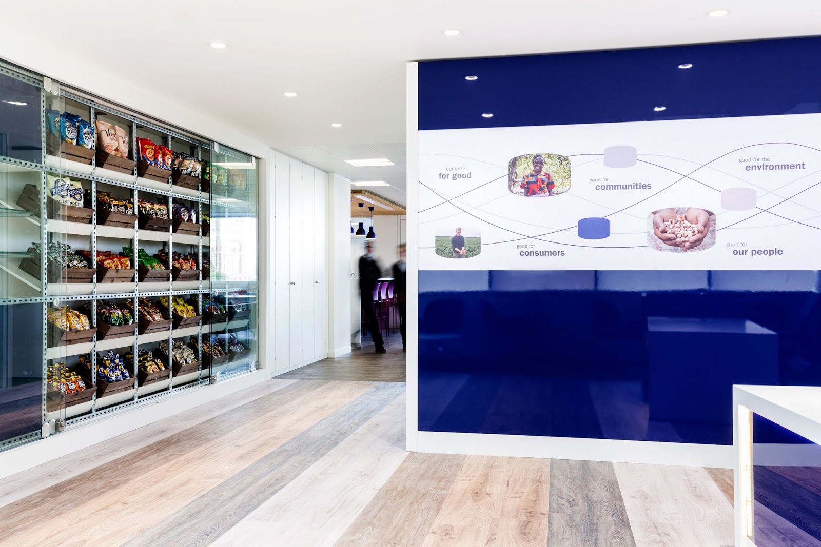
Our work on KP Snacks workspace interiors was a great project to work on and we’re thrilled Creative Pool & DesignWeek  agreed and featured us on their sites. To top this off we got a great quote from our client: "we were overrun with great ideas from a centrepiece WOW factor to small, personal details that create all the difference in making our new office feel uniquely KP."

Workspace branding is an area of our services which has grown substantially, see here, with companies realising branding should expand beyond print and an online presence to bringing personality into their physical work space by creating an engaging environment for both clients and staff.

This is no Act

You may remember our branding work for Act for the Act. Well the success of the crowd funding has meant their nationwide poster campaign launched at the end of October. Spot the posters in one of the 97 tube stations around London or on one of the Nationwide roadside billboards.

Their campaign encourages people to add their names to the letter to Justice Secretary Michael Gove, telling him the Human Rights Act is too important to us to be scrapped. If you’d like to add yours please click here.


Halloween Quiz

The entries came in thick and fast. The scores have been counted, verified and the winner drawn from the top scorers by our independent adjudicator (our Uber driver on Friday night). We are very pleased to announce Stephanie Fraser is the winner with a solid 10/10 grabbing a pair of tickets to the spooky London Bridge Experience. Keep your eyes peeled for more from the quotebank. For those of you who missed the quiz it's still on our site if you fancy a go... but no more prizes for this one... sorry!


Calendar

It’s a scary thought that we are in the penultimate month of 2015, but also exciting the festive period is almost upon us and that we’re printing our tothepoint 2016 calendar! As many of you will know, each year we send out our calendar as a little early Christmas present to see you through the following year and next year is a bit special as we'll be celebrating our 25th year in business. If you would like to receive one, drop us an email (hi@tothepoint.co.uk) and we'll do our best to send you one.


Tackling a new brand


This month the studio has been gripped by Rugby-mania, but not just because of the World Cup (or the thought of winning a tenner in the sweepstake). Recently we’ve teamed up with entrepreneurs Return2Play, who are making big strides to help clubs and schools effectively manage a player’s return to play following concussion on the pitch.

Concussion management has been a hot topic amongst contact sports recently. Claims that the number of injuries are increasing, along with more awareness on the effects of concussion and the risks to players if it is poorly managed, have rightly brought concussion to the attention of the press.


The Rugby Football Union have updated their regulations, which now includes mandatory rest, a return to play plan and sign off from a doctor before being allowed back on the pitch.

To help guide people, the team at Return2Play have created a concussion management system. It is initially being offered to schools and clubs and will allow parents, schools/clubs and doctors to track the child’s progress through the return to play process. It will also link them with a sport-friendly doctor who has undertaken special training on the subject and is able to assess and sign off the child at the end of the process.


The brand needed to appeal to schools, parents, doctors and clubs, and also take into consideration its application across web, apps and print. With this in mind we chose to use the bold orange for the core brand colour, which then appears across the website, stationery and guidelines to give the materials a fresh and modern feel.

The heartbeat reflects the medical nature of the app but also suggests measurement and forward progression. The circle and heartbeat have been adapted to introduce a series of simple icons that will be used across digital and print to reflect the brand and help break up the information into clearly defined areas. The aim is to build on this visual language.


As the brand will be focused on digital platforms we opted to create a responsive logo, which features a full logo and a shortened version to be used when space is limited.

The website and video were built by the team at Idea Group but we were on hand to act as brand guardians and supply the little touches that helped to link all of the new materials together. Social media will be handled by Smarter Reach but twitter is currently being managed by the inhouse team at R2P.

The brand and website, return2play.org.uk, will be launched into the world shortly, so watch this space but you can already follow them on twitter @return2play.


And despite busy schedules and lots of tweeting they still had this to say about us:

“Simon and his team have been a delight to work with.  They immediately demonstrated that they grasped our concept and shared our values such that we had total confidence in them.  As a start up, R2P was dealing with many business critical projects each competing for attention.  TTP's professionalism and expertise sets the benchmark for a partner to deliver the right result on time, within budget and accommodate changes without drama.” Dr Sam Barke, Medical Director and Co-Founder, Return2Play

New signage for Thames Clippers


You may recall our work with MBNA Thames Clippers from last year, when we helped with their overall rebranding. They’ve now introduced Oyster touch in, touch out payment, making it easier for commuters to sail through the rush hour and for visitors to enjoy the river. This required a refresh of their pier signage and yours truly were on hand to help.

To communicate a visual link between MBNA Thames Clippers and TfL, we adapted the colours to the TfL river transport colour palette, keeping the recognisable MBNA Thames Clippers’ orange as a highlight colour. We adopted the route colours and timetable information into the MBNA Thames Clippers signage, to help bring synergy to the information and providing greater clarity for the traveller.


The big challenge was to collate the variety of information and develop a flexible format that allowed MBNA Thames Clippers to have ownership and clearly communicate the travel details for each pier. The signs needed to include the route map, timetable and pricing structure plus how these all worked with Oyster pay as you go. The team at MBNA Thames Clippers were also keen to use the signage to promote their services rather than just featuring information, as they have done previously.


It wasn’t a case of one size fits all, as not all the piers feature the same amount of space, the same visitors, same boat routes or even the same information - it was a little tricky! To solve the problem we created a series of graphic building blocks that the MBNA Thames Clippers team could use to construct the perfect sign for each space and pier, making the most of their messaging.

Our client had this to say:
We worked with To The Point to refresh the branding across all 20 of our piers. It was a big challenge as we have lots of messages we need to get across whilst also promoting our services and key destinations we travel to. We were launching Oyster touch-in, touch-out across all of our services and zonal pricing so we had lots of new information we needed to include.

To The Point definitely rose to the challenge, creating a fresh look and feel whilst developing a template that could be used across all of the piers which differ dramatically in space and signage. The feedback from our staff and customers has been great. Thanks To The Point for all their hard work.

The new pier signage has now sprung up across the river, so make sure you keep your eyes peeled on your next riverside stroll! Maybe even tap in and treat yourself to a ride on a clipper!