Showing posts with label Exhibition. Show all posts

Thursday, 2 October 2014

Fall for our roundup


Pomak and the Painter

Over the years we have built up good relationships with clients based overseas, such as New York, San Francisco, Dubai and a little closer to home in Ireland. At the beginning of September, one of our senior designers, Jem, flew over to Dublin to oversee the installation of an exciting new project. It called for us to use some old techniques and methods we had not used for some time. One of the highlights was using Dublin based signwriter, Colm O'Connor, who brought some of our icons and messaging to life on real wood. You can see him in action in the video Gentlemen of Letters.                                                                                                                                                                  
We are still trying to work out if Jem was more impressed with the painting or the pint of real Guinness before his flight home.

Totally Bricking It!

September 24 has seen the launch of ‘The Art of The Brick’ at Truman’s brewery - to put this plainly, it's an entire exhibition filled with lego sculptures! That's right, childhood dreams do come true.

Created by New York Artist Nathan Sawaya, the sculptures are bound to leave both children and adults in awe. The highlight has to be the 20ft dinosaur, but there are also some special London influence pieces.

Reasons to be Creative

At the beginning of this month, our very own Jem Pomak went to his very first design conference and learnt a very pertinent lesson:

"The running theme of Reasons to be Creative seemed to be “design what you know and love”, although that might have just been my dreamy-eyed first-conference-wander talking. One speaker in particular, James Victore hammered home how important it is to design boldly, saying “If it doesn’t move you, how can you expect it to move anyone else?”. It was just one little thing but it really hit home, as an agency we do design with passion but it's not something I'd consciously thought of before.".

Our picks from LDF

If this year's London Design Festival has been a bit overwhelming for you we have picked a couple of our favourites for you to have a look at.
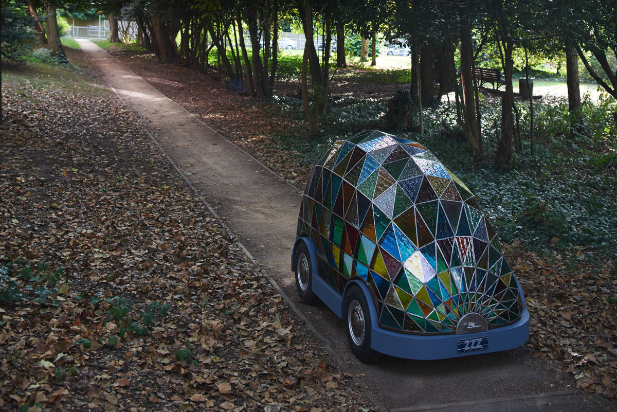
If Dominic's self-driving car is anything to go by, the future is going to be a beautiful place! Wilcox predicts that by 2058 (very specific) it will be safer to ride in driverless vehicles than ones controlled by humans. Our client, Transport Systems Catapult agree, as they're currently trialling driverless pods.

Dan's latest installation draws inspiration from the sci-fi writer Phillip K Dick, who stated that endless clutter builds up in a persons life as ‘kipple’. Through Dan’s Studio there is a pathway defined by the absence of miscellaneous clutter. From afar, it would be easy to think that the items have been spray painted to achieve the effect, but look closer and the sheer scale of the project becomes clear.


A tricky start for the iPhone 6

With more competition than ever before, Apple-sceptics had a fun September. Initial reports that iOS8 had more bugs than usual were joined with complaints on-line that the new iPhone 6 was actually bending!

Many have been quick to jump on the Apple bashing wagon with the likes of LG being swift to take the mickey “Our phones don’t bend, they’re naturally curved :) #bendgate.” (However, if you are going to poke fun at iPhones, then using one to send the tweet is probably not the smartest move!)

This all highlights the importance of some serious testing before launching something, whether it's a bendable phone or a mis-interpreted logo!
The science underdogs

This week the world of Science has recognised some of the contributions made to mankind that make very little difference (even the underdog needs a bit of recognition).There are some truly cracking entries, but we've picked our top three:


1. Researchers who have studied the slipperiness of a banana skin
2. Pork strips stuffed into peoples noses to stop severe nosebleeds.
3. The men who dressed up as polar bears to study reindeers reactions (sadly we do not have an image for this one, that said our imagination does a pretty good job).

Luckily some of our science based clients are striving for slightly more ‘impact’ and ‘imovation’.

Challenge over but not out

Well, Sam completed his Challenge-Charlie 97 days of running with his final 12k along the banks of the Bosphorus with our MD, his Dad, desperate to complete it with him.

In a tremendous effort by Sam he has raised thousands of pounds for the Team Hutton Just Giving page from sales of the now iconic ‘Join Us’ T-shirt and donations. You may have seen some of our team out running in our shirts over the bridges along the Thames on a Wednesday after work (finishing with a well earned pint at the Mudlark!).

The last weekend park run on the 14th September will be a difficult one to forget, as Sam was joined by many of those who had run with him for one epic run (and picnic) in Battersea Park. What has been truly inspirational is the lasting effect these runs have had on people, transforming non-runners into runners. We certainly intend to keep it up, so if you fancy joining us let us know... we’ve even got some T-shirts left so you wont feel left out. To find out more about the actual Challenge and Sam’s 97 days of running, visit the website. Well done Sam - we’re all proud of you, and a little bit fitter!

Sorry, summer’s gone

Now that the summer has come to an end, illustrator Seth Armstrong’s feature ‘Book your Stay’ in Mr Porter reminds us of the hot days and holidays past, as we now wait for the wind and rain of Autumn. Armstrong paints some of the world’s most famous novels held up agains the background of the novel itself. The results are something to behold.

Friday, 29 August 2014

Personal Space


The workplace for many of us can seem like second home, but more importantly it's the physical space of your company and your brand. Whether an identity has recently been created or it’s well established, why does its branding tend to stop at the usual reception desk, website or brochure? With 20 years working closely with many companies we know that a brand should span every touch-point, whether it’s taking your number from your business card, getting directions from your website or stepping into your workspace for the first time. People should feel connected to your brand.


From an internal perspective, a branded workspace helps boost moral. After all, creating a stimulating and engaging environment is only going to have a positive effect on how people engage with their company and the work they do.


However, don’t be mistaken, adding personality to your workspace does take more than a motivational poster but that’s not to say it has to be a mammoth task or pull on resources. As with any branded material you produce you need to set your goals, your timeframe and your budget and go from there.


Working with an experienced design team will ensure you not only reach your goals, but they will also help guide you through the process as you go. With many of our clients we not only provide creative but also organise site visits to measure up, ensure health and safety is adhered to and installation is managed with as little hassle to daily working life as possible.


Our creative work has spanned from large format graphics covering two floors, to equally large wooden letterpress walls; and right down to the smaller details like branded glass H&S manifestations and wayfinding. Our breadth of clients, from those pioneering the change in Britain’s transport systems, to teams providing printed press to the masses and even social media champions, proves that we really can get to the crux of your brand and deliver a space that echoes your values and engages your staff and clients.


The images above are all items we've designed and produced for our clients, so why not take a look at some more of our workplace environments here.

Friday, 29 November 2013

Putting on a show


You may recall from last month's newsround that our client CIPR were going to be hosting the first dedicated PR show, aptly named The Public Relations Show 2013, and not only did we brand the event and much of the collateral, but we were also planning to exhibit.

The event was the first of its kind to bring people from the industry together to demonstrate what they can offer, and with over 1,000 visitors, 37 exhibitors and #prshow13 trending on Twitter, it’s fair to say the event was a massive success!


On the lead up to the event, we implemented the brand across press ads, web graphics and a promotional flyer, as the CIPR worked hard to help the show gather momentum. On the day itself, the brand filled the Business Design Centre from the printed show guide and the signage, to bags and Oyster Card wallets. It’s always rewarding for us to see our projects come to life, but to see this one coupled with the buzz from the visitors was fantastic!


With the event being such a success, it was a long day for Ben and Simon, who were tasked with manning our stand along with our partners in crime ETC. We’ve worked with the team at ETC for a number of years now on projects such as St. Martin’s Quarter and the Francis Crick, so they were the obvious choice when we needed to produce our own exhibition stand.

Our stand proved to be quite a hit, thanks to our I Shot The Serif game (and of course our work), which you can play here; however be warned, it is highly addictive!

Ben who manages the digital side of the business (ttpdigital) and who created a special showreel to play in the background (see below) said,

"We've not really exhibited at these things before, so we treated it as a bit of an experiment. In the end it went really well – we met lots of interesting people and it was great to see such enthusiasm in our work and our experience. The video showreel really drew attention as did 'I Shot the Serif' running on one of our iPads – people got quite competitive! It was an exhausting day though, I now have a new-found appreciation for the guys manning their stand all day at the next show I visit!"

All in all it was great day and we’re looking forward to The Public Relations Show 2014.


Saturday, 28 September 2013

Exhibition expertise

Knowing where to start when looking for the best exhibition stand system and manufacturer for your needs can be pretty daunting as there are so many companies out there, all offering similar services. Of course, being cost aware is often the most important criteria, especially when demonstrating ROI on a stand, but as we all know, there can be a fine line between cost effectiveness and wasting resources on a ‘one size fits all’ stand.

So, when global leader in testing, inspection and certification, Bureau Veritas, needed a modular, flexible exhibition stand, they approached us for our expertise on the matter, knowing they would be in safe hands. The company needed a reusable stand for the RenewableUK Offshore Wind Conference and Exhibition held in Manchester.

RenewableUK Offshore Wind is a prestigious, European-wide event and Bureau Veritas needed their stand to reflect its high-profile presence and unique proposition. As such, the stand needed to be cost effective and easy to install, breakdown and resize for additional events as required, yet allow for a bespoke, professional design.

Working closely with Bureau Veritas’ Marketing and Communications Manager, Nadia Cadby, we established the exact requirements so we could recommend the most suitable stand systems and manufacturers, as well as being on hand to provide ongoing consultancy throughout.
initial hand sketches to help the client visualise the stand


modular system which can be tailored according to requirements
The stand and exhibition were both great successes for Bureau Veritas, and they were delighted with this first usage. Nadia Cadby said: ‘to the point is a great company to work with, following the brief to a T, but not afraid to challenge where necessary. The team kept me updated throughout the consultancy stage, offering timely and relevant advice, and helping me to achieve a final stand that exceeded my expectations."

Thursday, 28 March 2013

An innovative environment


Having already updated the look and feel of the Fostering Innovation 2013 Awards for the Biotechnology and Biological Sciences Research Council (BBSRC), the next stage was to create vibrant, stylish venue dressing, trophies and supporting printed material for the event at Altitude 360ยบ, on the top floor of Millbank Tower in London.

The Fostering Innovation Awards recognise and celebrate the innovative work of BBSRC supported scientists who are delivering economic and/or social impact. This year’s competition saw the introduction of a new award, Excellence with Impact, which joins the Innovator of the Year and Activating Impact Awards.

Our challenge was to implement the award branding across the event space, complementing the stylish location, creating an exciting, coherent look and feel and directing the people flow throughout the venue, from the initial visitor experience at the entrance to the three award areas on the 29th floor.

We split the floor space of Altitude 360 into four zones, one for each of the three awards and the fourth for the presentation area. We carried the yellow, vibrant pink and blue colours from the starburst logo across the award zones, giving each zone its own colour so they were immediately identifiable and offered visual intrigue for guests.


For each zone we created a large perspex triangle, vinyl wall lettering and graphics along with window borders in its allocated colour. Coloured lightbulbs completed the effect and provided a warm glow, especially effective as the evening approached. Coloured floor vinyls at the entrance and across the venue floor was the perfect wayfinding system for visitors, guiding them into the individual areas.


We also created supporting print and digital material for the event, including the invite, brochure cover, animated slideshows using the logo shape and colours shown on screens throughout the venue, and the three award trophies made from the respective coloured perspex.

The event was a real success and BBSRC was delighted with the look of the venue on the night.


Friday, 28 October 2011

Bloodhound – Blood, sweat and speed


Located within the state-of-the-art S&B Automotive Academy in Bedminster, Bristol, the Bloodhound Education Centre is an innovative learning environment, designed to engage, educate and inspire young people into a career in science, technology, engineering and maths. The Bloodhound SSC project team, preparing for its 1,000mph world land record attempt in South Africa in 2013, is based at the adjacent site, so it made perfect sense to transform the existing ‘big shed’ into a hands-on learning experience to showcase the technology behind the car.

The official opening of the Education Centre last week was the culmination of more than a year’s work, involving lots of collaboration, site visits to gain an understanding of the space, steering group team meetings and of course, lots of design creativity. We first became involved through EPSRC, who are funding the research behind the fluid dynamics for the Bloodhound SSC and with whom we had worked previously. They recommended us to the Bloodhound team, who asked us to come up with some ideas for using the area as well as the branding, graphic, signage and overall theme.

The challenge was to create a contemporary, engaging space that communicates the fun aspects of science, technology and engineering to children of 7-13 years and to provide a deeper learning aspect for 14-17 year olds to encourage them to study the subjects further. We brainstormed a number of exhibition concepts and content for the space and information required, and created a floorplan, demonstrating different ways to represent the most exciting aspects of the project and submitted them to the Bloodhound team.

Once a concept had been agreed, Bloodhound got to work implementing our ideas. These included light boxes and information display panels featuring the car graphics as well as interactive computer games featuring subjects that children can easily relate to such as horses and tanks, to show the basic premise of engineering. We also suggested a laptop storage unit designed to look like an engine, timeline wall graphics for the corridor, a fluid dynamics wall, and worktables where children can build models of cars as well as a 15m track to race them.

Halfway through the project Bloodhound also asked us to design the theme and graphics for a classroom within the education centre specifically for older children who have a greater understanding of engineering. We used the natural light from the windows to create several lighboxes to show the car’s structure from different angles. We also designed the wall graphics and text explaining the project mission, and a chart comparing the speeds of the world’s fastest machines and animals with the speed of the SSC, all of which featured the Bloodhound colours of orange and navy.

Glenn Wood, our senior account manager on the project, was at the official opening of the education centre and said: "Seeing the fruition of a year’s hard work was very satisfying. The children were clearly enjoying the interactive activities, so Bloodhound is well on its way in its quest to challenge and inspire young people whilst pushing the boundaries of science. It really is great to have been involved in such a fantastic project and we wish Bloodhound the best of luck wit hits world landspeed record attempt in 2013."