Showing posts with label OPINION. Show all posts

Wednesday, 30 October 2013

October scare stories

Eeeek! An Exhibition!

Our client CIPR will be hosting the first dedicated PR show, aptly named PR Show 13 on the 26th of November, and not only did we brand the event and much of the collateral; our good selves will be exhibiting! It's free to register so there are no excuses and throughout the day there are also education streams, workshops, advice hubs and even more. So why not drop by and say hello!


Wicked Wordpress

WordPress, one of the world's most popular website Content Management Systems (CMS) celebrated it's 10th birthday earlier this year. It's rapidly maturing into one of the most flexible and easy to use platforms to build anything from a simple blog to a fully functioning, content heavy website. To date there are over 72 million Wordpress based websites (about 19% of the web) and this isn't slowing down at all.

It's just been updated to version 3.7, bringing with it a few nice new features. Of particular note is the new background update process. Wordpress can now handle automated maintenance and security updates - to keep sites automatically updated to the latest version of the software. Security has been further enhanced with various additional checks – including much improved password recommendations – and the system also supports better localisation for languages other than English. Version 3.6 (which brought with it enhanced media management and a built-in HTML video player) was only released a few months ago, so at this pace we expect the next version to be out by the end of the year.

If you'd like to see some of the rather cool sites we've created using the Wordpress platform, just head on over to our new digital site at: www.ttpdigital.com

» read more (TNW)


Grand Guignol Google

Fresh on the heels of Google Reader’s demise, iGoogle – Google’s browser dashboard is about to close down. If you’re still using the service, it will go the way of everyone’s favourite Monty Python parrot on November 1st.

First introduced back in 2005, iGoogle has been my de-facto homepage for well over 5 years, so I’ll really miss it when it’s gone. This is all part of Google’s so called ‘spring clean’ – and is just one of many smaller projects and services they’re shutting down (here’s a few more) – apparently in order to have greater focus on the things they want to concentrate on.

For those who’ve never used iGoogle and are wondering what the heck I’m talking about – it’s essentially a tool for creating an ‘at a glance’ homepage based around your own interests and needs. So, for instance, it may show you: the latest news or sports results, the weather in your area, your twitter/facebook feeds, your ‘to do’ lists, useful notes or reminders, your email inbox and your online calendar – all on one page and accessible anywhere on any computer once you’ve logged in. You can easily change the layout and add new content whenever you want.

So, if you’ve never tried a dashboard homepage and fancy giving one a go, or if you’re looking around for an iGoogle replacement, here are my top 3 suggestions:

» iGHome

» iGooglePortal

» NetVibes


Whispering wallets

This nifty little creation brings your wallet to life, yes you heard right! The living wallet is paired with an app which monitors your spending habits and hopes to help the user save money. The wallet starts off by running away from you, moving on to crying for help when it's captured and as a last resort it'll send a text to your parents! It's a little spooky, but of course we're so in control of our money, it's wasted on us....(it's pay day soon right?)


Little Print Shop Of Horrors

Now, I know we shouldn't promote the work of a "rival" design agency, but this is all for a good cause! Manchester based Creative Spark have opened their Little Print Shop Of Horrors again this halloween. They are selling limited edition prints inspired by famous horror films, and to top it off, all proceeds go to charity.
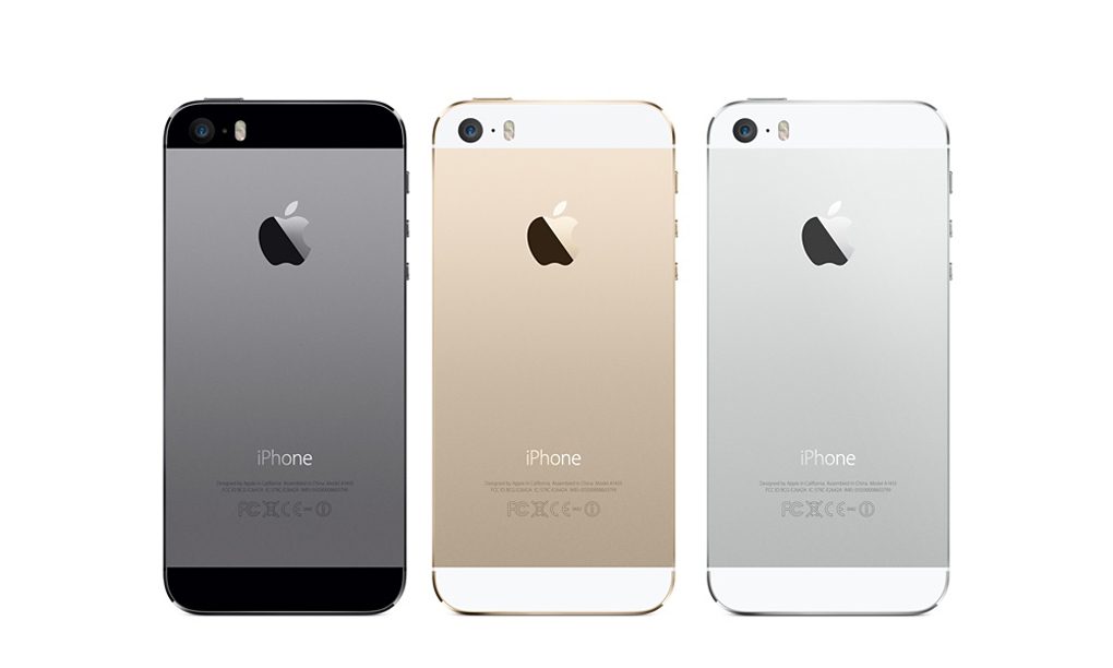
Terrifying Tesco

Another month, another Apple product release - this time they've graced us with updates to their iPad range, a new iPad Air (the bigger one) and iPad mini (the smaller one) - both sharing the new iOS7 look and rather spiffy 64bit A7 processor. The iPad mini has had probably the bigger of the two upgrades, not only significantly faster than its predecessor but now sporting a full 'retina' screen too. But with Google, Amazon, and even Argos getting in on the small tablet act - is this the best one to go for?

In short, yes it is, but with a proviso. It's probably the best tablet around right now on everything apart from the price. And at £319 for the base model it's certainly not cheap. For those wanting a email/facebook/iPlayer tablet that will handle most casual demands but won't burn a hole in the bank balance, it's worth checking out the new 7" 'Hudl' tablet from Tesco.

A brand hardly known for its cutting edge hardware, Tesco have just launched a rather nice new entry to the mini tablet market - and whilst it's not the thinnest, fastest or highest resolution tablet around, it probably offers the best value (every little helps right?). At just £119 it's a very decent bit of kit that compares favourably with anything else on the market. Perfect for those who find themselves wanting to try out a portable tablet but put off by the price of an iPad. If you're willing to go up a bit on cost to £189, then the Nexus 7 (2013) is almost on par with the iPad mini - but the iPad still holds the crown as king of the hill simply due to the tablet app support.

» Hudl review

...and while everyone else is trying to corner the 'mini' tablet market, Microsoft... well, they seem to have got their measurements a bit mixed up!


Scary skipping

Business In The Community (BITC) have recently launched a campaign highlighting the difficulties that ex-offenders face in the job market, with their goal being to have the previous convictions tick box removed from applications form. The ad features a clever use of the Skip Ad button to highlight how potential employers will skip over an applicant with a previous conviction, often without a second thought. It's a touching ad, and a very clever use of technology.

Read more (Creative Review) 


And finally...

It's Halloween again, and we had to end with some sort of spooky themed story. Although we tend to associate the carved, candle-lit pumpkins with a more 'American' version of Halloween, it's actually a tradition thought to have started in Ireland during the 19th Century (although using turnpis rather than pumpkins).

Of course, even if they didn't invent the tradition, American's always have to do things bigger and better and this years 'Great Jack O'Lantern Blaze' - a 25 night event held in New York is no exception. Still, they've really outdone themselves this year creating all manner of glowing pumpkin statues - from dinosaurs to sea monsters - see them here.

And if you're like us and feel your pumpkin carving skills could do with a bit of polishing you'll be happy to know that the Telegraph have put together a video to help you do just that!

In fact, if you've got a halloween creation you'd like to share with us – do send us photos of your pumpkins and we'll put them up here on our blog! We may even send you some treats for the effort! No tricks....

Monday, 30 September 2013

Going digital

tothepoint launches a new digital arm 'ttpdigital' to focus on digital design and communications: www.ttpdigital.com


The world of marketing and communications is changing fast. It used to be the case that websites and videos were a low priority luxury that companies could afford to ignore (or merely pay lip service to). However that has changed and digital is more important than ever.

We’re not claiming that print is dead, or even that it’s on its way out. However, it is an undeniable fact that most people's first introduction to a brand is now through some kind of digital medium - usually a website, but sometimes a video, email or even an app.

And this isn't just affecting traditional print-based design, it's having a huge effect on the idea of branding too - when people's main experience of your brand is on your website, can we still treat the branding process in the same way? Your logo now has to work hard on a huge variety of sizes, screens and formats - and the brand experience must be in tune from your poster campaigns to your annual report and your website(s).

This change isn't slowing down either - whether you're a fan of them or not, the use of smartphones and tablets is increasing year on year and it's not limited to the 'early adopters' or young geeks. Your site is as likely to be seen on a nice big Windows laptop as it is on a tiny iPhone - and so we need to turn to new ways of doing things like building 'responsive' websites that reconfigure themselves to make best advantage of the screen size they're viewed on.

Recognising the importance of this, tothepoint has been a truly 'integrated' agency for quite a while. We don't believe in separating design for print, web, video or any of the other media we work across - we think it's essential that the brand comes first and that it works successfully and consistently across all required materials. However, we also acknowledge that for many companies, digital now comes first.

So, we've created a new digital arm of tothepoint dedicated completely to the pursuit of digital excellence: www.ttpdigital.com

Whether it's a new website for a startup company, an animated corporate video that has to explain the intricacies of a company USP in an engaging way, or e-newsletters and analytics, we thought it was time to highlight our expertise in this area and show the range and depth of our work.

Our new website is now live and you can browse over some of our work, or read (our admittedly 'techie' focused) blog.

Let us know if you have any comments about the new site - we'd love to hear what you think. And of course, if you have any digital projects for us - just get in touch!

September's newsround

Have a break, have an OS


In a slightly bizarre marketing mash-up, Google and Nestle have recently joined forces and named the next version of Google's Android operating system (version 4.4): 'KitKat'.

Google has been alphabetically naming each successive version of its OS after some kind of sweet since V2.3 'Cupcake' - followed by 'Donut', 'Eclair', 'Froyo' (Frozen Yoghurt), 'Gingerbread', 'Honeycomb', 'Ice-cream sandwich' and current version 'Jellybean' - so the fact that the latest iteration is named after a chocolate bar isn't such a surprise.

What is odd is that as far as all were concerned the next name would be 'Key Lime Pie' (an admittedly odd choice) - with the KitKat name seemingly coming from nowhere at the last minute. It's also the first time Google (or ANYONE as far as I'm aware!) has ever thought to promote their OS by getting friendly with an existing, unrelated brand.

Could this be the start of a strange marketing trend, or is it just Google being a little kooky? And if it follows the same convention for the next version - could Nestle's 'Lion Bar' be gearing up for an Android make-over?

I do wonder if they've both considered the potential implications of the deal. This could be perceived as Nestlé basically endorsing Android phones, which may then be seen as 'anti-Apple' due to the two tech companies ongoing rivalry - and Nestlé really doesn't want rabid Apple fans mounting an anti-Nestlé campaign!

more info (BBC)


The Gold standard


The usual media frenzy took the interweb by storm last week as Apple announced its newest update to the iPhone range. There have been rumours for a while now that Apple has run out of steam when it comes to innovation and sales are slipping against arch rival Samsung and Google's Android OS. So, did its new phone set the world alight once again?

Well, not so much, but to be fair, Apple seems to be on a path of refinement and minor improvements recently rather than throwing as many features as possible at their handset (certainly something of which the Galaxy S range is guilty). Many were expecting a high end iPhone and a mid-range 'economy' version this time round. However, we seem to have been given an expensive option and a REALLY expensive option. But, when Apple sees itself as more of a luxury brand - why do cheap? No doubt the varied colours of the 'C' model will sell well amongst the younger audience, whilst the 'bling' of the new Gold iPhone 5S may do well among the glitterati.

Feature-wise there's nothing too ground-breaking, but the new fingerprint scanner could end up being a game-changer. It's not certain quite how accurate it is in the wild, and how Apple might then use the new security feature to connect other apps/services, but if it works as advertised, it could open up a whole new world of in-phone-payment that its competitors can't even get close to yet.

And talking of competitors, Microsoft was very quick to parody Apple's new creations - which would have worked well if those ads weren't so poor - they've now been quickly pulled after Microsoft admitted they were 'painfully unfunny' - oops!

more info (the verge)


Ya-who?

So after 30 days of teasing, Yahoo! finally launched its 'real' new logo to the world. Did it make sense of the plethora of design variations previously shown? Has it moved the company forward and refreshed the brand? For one of the Internet's earliest and longest surviving players (it's 18 years old - which is about 180 years in web years!) it will be interesting to see how it is received by users and non-users once the initial parodies and criticisms die down.

Marissa Meyer, Yahoo!'s new young and energetic CEO writes all about it in her personal Tumblr blog (well, it would be Tumblr as she oversaw the purchase of that company not too long ago) – and goes into detail about the design process ...

http://marissamayr.tumblr.com/post/60336044815/geeking-out-on-the-logo

In her words:
"I love brands, logos, color, design, and, most of all, Adobe Illustrator. I think it’s one of the most incredible software packages ever made. I’m not a pro, but I know enough to be dangerous :)"

One would think it's a rare CEO who gets their hands dirty with this sort of thing (or even knows what 'Adobe Illustrator' is). Although, having said that, Rupert Murdoch essentially designed his own News Corp logo not too long ago, skipping the need for an external design agency, or even Adobe Illustrator. Is do-it-yourself brand design the new trend? If so, are these 'dangerous' times for brand agencies?

The jury is still out but as one of our clients we see this as an opportunity to help evolve and support the new brand. Our work so far has ranged from standard signage and wayfinding to the more adventurous art installations we produced for their Rolle office last year. This work demonstrates the life that can be brought to a brand through creativity and that a brand is far more than just a logo.

Only time will tell if this new logo can last as long as the previous one - but if stock price is a good measure, perhaps the refresh really has worked a charm! http://mashable.com/2013/09/12/yahoo-stock-30/

more info (adage)

Meanwhile, back at the ranch...

So while Yahoo drops the 'flat' and brings on the 'chiseled' 3D look, the rest of the big search boys are changing their logos too - and 'flat' is definitely the trend du-jour.

Microsoft's big Google search challenger 'Bing' has just announced its logo has had a makeover - it's now bright yellow instead of the original blue and much more angular than the previous version - and flat as a pancake of course.


And if rumours are true (update: turns out they were), Google is also going through a logo refresh - dropping the long-standing drop shadow and 3D bevelled effect and going for a simpler, flatter (there's that word again) identity.

This new version first started popping up all over the company's services, but was then officially announced a few days after Bing's updated identity.

So, can it be a coincidence that all the big internet search brands are refreshing their logos at the same time?

more info: 

» bing logo change (the verge)

» google logo revamp (BBC)


A shriekingly good light show


Had a bad day? Feel stressed and need to let it all out? Why not pop along to the ‘House of Pain’ on Borough High Street, where you can unleash a cathartic scream or yell, with each scream generating an instant light show that illuminates the whole building.

We tried it out and it’s a lot of fun, but be warned, people on the street outside the building will hear you!

Part of this year’s MERGE festival, the ‘House of Pain’ is open between 5pm-10pm every night until 21 October.

And finally...

We're hiring! We're looking for a front-end web developer with an eye for design so if you're interested in joining the lovely ttp team or know of anyone who would fit right in and push new ideas, get in touch. For further info have a look at the opportunities page on our website or check out our Linkedin ad.

Thursday, 29 August 2013

August's newsround

From brand new phobias to the perils of relying on the cloud, here're a few news bits and pieces that caught our eye during August...

No Mo


nomo
Not only have we made up a brand new phobia, but apparently half of us Brits suffer from it -'nomophobia' - the fear of not having access to your mobile ('no mo', get it?). As Facebook / Twitter / Candy Crush Saga or just plain email addiction increases, will we start to see nomophobia hospitals opening around the country for all those who've had their phones stolen? Maybe even walk-in clinics for those who just left it in the car that morning or helplines for those who've used up their monthly internet allowance?

A scary thought maybe - but then it's that scary we need a word for it in the first place. And whilst we may think it slightly ridiculous now - just try a 'digital detox' and see how long you can last without it - perhaps not quite as long as you thought?

more info (the drum)


How to do renovations right.


The National Trust owned stately home Cliveden in Buckinghamshire is currently in the middle of a £3.4 million renovation, with the vast series of works anticipated to last five years.

And, being a caring organisation, The National Trust was worried about the disruption the renovation would cause to visitors, especially as part of the restoration plans involve the property’s historic staircase. So, to counter act the disruption (and inject some fun into the process), the trust has installed a 16.5m slide that lets visitors slide from the roof of the terrace down to the gardens. Now, that's our type of historic sightseeing!

More info (design week)


Jerry's map


At 79 years young, Jerry Gretzinger and the map of his fictional world have been causing a stir in the design world. For 50 years now he’s been working on the map, which now spans over 2,500 pieces of A4.

Jerry adds to the landscape each day in his coffee break, drawing a card from a specially customized deck to decide what sheet he will work on. And don’t be fooled, this is no half hearted attempt, Jerry has created airports, high courts, cemeteries and train stations. The map is coloured to represent different altitudes, and to bring it to life further, he adds tickets, photographs, magazine cuttings, drawings and other bits and pieces to the existing pages to create textures and layers.

The images and a few brief blog posts really don’t do Jerry’s life-long project justice, so if you’re still curious then watch this brilliant short detailing the Jerry’s whole process.

More info (it's nice that)


Gathering Clouds


Amazon is slowly taking over the world. And I don't mean Amazon's impressive online shopping service either - I'm referring to Amazon Web Services (AWS) - possibly the largest 'Cloud' service around. Most people don't realise that many of the big web services - from Flipboard to Instagram all run on Amazons servers. In fact it's only when something goes wrong do we realise the implications.

Last week an AWS outage took down Instagram, Vine and several others (including Amazon.com too). Being taken offline is pretty serious for anyone, but for an internet only service it's disastrous. Are these web-based services relying too much on Amazon's Cloud? Perhaps, but it's doubtful that any competitor can ever offer 100% up-time. The answer then is that more companies will have to spread their reliance around as much as possible - otherwise the next outage could leave us all in the lurch! Maybe this Cloud thing is a little less fluffy than we'd imagined?

more info (techcrunch)


 Shut the Gates on your way out


Steve Ballmer, Microsoft's CEO announced his decision to step down - leaving a very different Microsoft from the one he inherited 13 years ago from good ol' Bill. Has his reign been a roaring success? Well if you judge his on-stage performance - he certainly thinks so! (yes, that's real). However, looking back we struggle to see the real vision he's brought to the company - for every success (Windows 7) there's been an equal failure (Windows Vista) - for every innovation (Metro interface design) there's been a cheap knock off copy (Zune).

In fact it's been remarked that Microsoft really doesn't know what to do when its out in-front - it's only when some young upstart (ie. Apple) comes along that the company realises that it has to up its game - but then that's where Microsoft can be dangerous. It does seem to be turning around and realising the up-hill climb its got to face to get back on top (finally, the Microsoft team is starting to think in 'joined-up' terms - desktop, living room, mobile all now sharing a similar approach). Let's hope his replacement just has a little more vision.

more info (the verge)

update: since writing the above it's emerged that not only has Microsoft bought Nokia (for cash no less) but the current Nokia CEO is rumoured as a replacement for the top job at Microsoft... hmmm almost like it was all planned...


At a loss


Poor Katie lost her iPhone this month, and being the foolish renagade she is, it wasn’t insured and didn’t feature any of the techie tracking or back up apps on the market now. 

We thought she couldn’t be the only ill prepared smartphone owner out there, and clearly Gizmodo feel the same, as this month the technology blog reviewed the best apps to have in your arsenal just in case you ever lose your phone.

Of course just being sensible with your phone is still the best defense, but Katie does like to live on the edge.


Timelapse Photography re-imagined


Fong Qi Wei's timelapse photographs are a beautiful, yet frankenstein-esque, look through time and capture the stunning effect that sunrise or sunset can have on a land or city scape. The only thing to do with these images is simply enjoy them.

Wednesday, 31 July 2013

Newsround

Well, July has come and gone - bringing with it all manner of weather (although pretty much all of it good - makes a change!). There's also been a smattering of interesting news, here's a few things that caught our eye...  

Polishing the Chrome - Google takes on Apple TV with a budget offering
The house of mouse - the original inventor of the mouse dies aged 88  
What does Wifi look like? - art and science merge in these wifi visualisations
to Ћ point - a new symbol for 'the' is proposed, what the..?
A (webcam) view from the top - no time to visit the Eifel Tower? This is the next best thing!
Does X mark the spot? - Oxford Street has a brand new identity
Jane Austen and trolls - it is a truth universally acknowledged, that something needs to be done about trolls


Polishing the Chrome


Google, one of the largest and most influential companies in the world has been desperately trying to break into the TV space for quite some time now. From Google TV to their Nexus Q - so far, they've not had much luck.

Their most recent product launched this week aims to turn this around. The Chromecast is tiny (see image above) and isn't much bigger than your average USB stick. It's designed to plug right into your TV via an HDMI socket. It's essentially a TV extender turning your dumb, non-connected TV into a Netflix or Youtube player (and you use your phone/tablet as a remote control). At only $35 it's quite the bargain - and while anyone with a set-top box or other Netflix capable hardware won't really get much extra benefit, it does make us wonder what the point of those expensive 'Smart TVs' really are.

But will it succeed where their other efforts have failed? We'll probably have to wait till next year to see who the leaders are in this much fought over streaming hardware / broadcast service sector. For now, the Chromecast is available in the US only, rest of the world to follow.

read more (The Verge)

 The house of mouse


Doug Engelbart, one of the many unsung heroes of the computer age died this month at the age of 88. He's the man we can thank for creating the world's first computer mouse in the 1960s - long before it was taken up by Xerox / Apple in the 1980s. The mouse revolutionised the way we interact with the computer and brought precise and intuitive analogue control that's still unbeaten today (touch screen controls may be everywhere right now, but don't offer the speed or pin-point precision the mouse still gives us).

Although there are well over a billion mice around the world, unfortunately he wasn't the millionaire he could have been as, despite patenting his invention, the patent ran out in 1987 - just before the mouse became the popular and ubiquitous device it is today. His first prototype was a simple wooden box with two metal wheels and three buttons on the top - which pretty much set the 'mouse' style for many years to come. Later the rubber ball was added for smoother movement, the mechanical parts finally being replaced by the optical mice we use now.

 read more (The Guardian)

What does WiFi look like?

 
click the image to view larger

Our cities are full of all sorts of pollution – from noise and crowds to light to smog – but what other things fill the air that we can't see or sense? Artist Nickolay Lamm decided to try to visualise one of those unseen forces: the Wifi signals that surround us, emanating out from almost every home, business and coffee shop. He studied how Wifi signals work and transmit taking current data from DC.gov to pinpoint their exact locations and then visualised these waves using central Washington as his backdrop. The resulting images are both beautiful and disturbing - the city is awash with what look like swirling forcefields of electronic communication.

read more (Motherboard)

to Ћ point


It was proposed this month that we should be adding an extra character to the English language. Paul Mathis thinks that as 'and' (which is the fifth most used word in the English language) has its own character, the ampersand, then surely 'the' (which is the number one most used word) therefore deserves its own shortened version? You can't fault his logic there. And, to save us all having to replace all our keyboards or add new characters to every major font, his proposal is to use something that already exists but is little used (a Serbian language character) which is a combination of 't' and 'h'. This would become a short-hand for 'the' in the same way we use '&'. He's going to need quite a lot of support for it to catch on, but it's an interesting idea. What do you think, could you see yourself using 'Ћ' - is it needed? And if so, will we need to change our logo?  

read more (Design Week)

Does X mark the spot?


London’s Oxford Street unveiled its new identity this week, giving us a look at the latest interpretation of destination brands, on the back of others such as Victoria and the proposed Northbank. The new identity sees the name shortened to 'Ox St', which is concern enough given this is a global tourist destination, and names like Bond Street, Mayfair and Oxford Street are iconic destinations. Will calling it 'Ox St' undermine this recognition and cause confusion? Plus, the new logo, with its 'X' device, arguably places too much emphasis on the local vicinity around the Regent Street junction which is already highly successful with big brand tenants such as Apple, John Lewis, Liberty, etc.

If the intention is to 'reignite London's love affair' with the street then it is arguably neglecting its less successful element (the east end). Most destination brands focus on the total visitor experience or the values they represent. Oxford Street is a long, straight shopping thoroughfare, in the same way that Regent Street is a crescent and Covent Garden is a series of lanes around a central piazza. The ‘X’ places too much emphasis on a single part of it, albeit a very important part, which is already highly successful, and we would have liked to see more made of the area it represents.

What do you think of the new identity? Let us know in the comments section below.

A (webcam) view from the top


The Google Cultural Institute and the Eiffel Tower Operating Company have joined forces to bring us three online exhibitions based on the iconic French monument, including a panoramic view from the top, just in case you can't make it there yourself. Known affectionately as the "Dame de Fer", or "Iron Lady", she stands at 324 metres tall and with almost 7 million visitors a year, is also the most visited (entrance fee) monument in the world.

Jane Austin and trolls

Back in April it was noted in the press that with Sir Winston Churchill set to replace Elizabeth Fry on our £5 note, there would be no women (other than the Queen of course!) on our currency, prompting a high profile campaign led by Caroline Criado-Perez against the decision. Last week the Bank of England announced that Jane Austin will be the new face of the £10 note, leading George Osbourne to tweet “Mark Carney's choice of Jane Austen as face of £10 note is great. After understandable row over lack of women, shows sense and sensibility." We applaud the decision and George's play on words.


This campaign also led to some truly vile misogynistic Twitter trolling and raised an important and ongoing debate on the role of social media platforms in dealing with trolls. In response to criticism of its handling of this latest hate campaign, Twitter has said it's aware of the way some people misuse the platform and is launching a feature that allows users to report individual tweets. It will be interesting to see exactly how this works and what impact, if any, it has on trolls and the number of abusive tweets sent.

Friday, 28 June 2013

Faux vs Flat


The chances are that most people won't have come across the word 'skeuomorph' much at all until recently - perhaps this is the first time you even knew it existed? Well it's big news right now as Apple, the self appointed king of skeuomorphic design, is looking to ditch the concept completely.

So what IS skeuomorph I hear none of you asking? (and no, it's not a creature from Doctor Who). Well, it's more of a visual thing, so I refer you to the image above - it looks like a fairly standard iPad app interface right? Notice the graphic elements designed to make it look like a real notepad? That's basically skeuomorphic - ie. pretending to be real rather than pixels on a screen. It's especially strange when designers try to make an app look like something not just real, but a bit old fashioned - so all those apps showing, say, leather textures and stitching, that's REALLY skeuomorphic!

It also covers all the classic bevels, drop-shadows, wood grain, mirror reflections and the classic 'shiny' buttons so associated with Apple's iOS (the software on all iPads and iPhones). The trouble is that those elements take up precious screen room and, at least in functionality terms, are all a bit 'faux'.

Microsoft's new 'metro' user interface

Microsoft certainly thought so when they create the rather nice 'metro' interface seen on Windows Mobile (and Windows 8). In Google's latest version of Android they've also gone for a very flat visual aesthetic - keeping the user interface clean and free of unnecessary clutter. This has left Apple looking rather clunky and, dare I say it, a little 'old fashioned'? It seems that Jonathan Ive (Apple's product design guru) feels the same way - he's now in-charge of design across both products and the software itself and the next version of iOS7 is dropping all those old fashioned styles in favor of a very clean, flat look.

First glimpse of Apple's new iOS7


All good right? Well, not entirely. Apple now has two big problems: firstly, its competitors did it first and did it well - Apple is in danger of looking a bit 'me too' when previously its always been seen as an innovator. Secondly, that skeuomorphic look - all those shines and bevels and drop-shadows are virtually part of the Apple brand in many people's minds. Apple defined the smartphone and tablet using this look and feel. The company revolutionised the mobile space because it put the user first, and made all those apps fun and easy to use - no matter the age and technical ability of the user. The more tech savvy people out there might look at the 'wooden shelves' on Apples iBook app and feel a bit embarrassed about using it, but Apple needs to be very wary of moving ahead too quickly and dropping all these not strictly necessary, but very 'Apple' elements and leaving the old fashioned fun behind.

What do you think - will you miss the skeuomorphs when they're gone? Is the new iOS7 a success?

further reading:

Design Week: is there a place for skeumorphic design?

Seth Godin: Skeuomorph failure

The Verge: iOS7 design - simply confusing

Flat is good - Google's design guidelines

Flatter is better - Microsoft's design guidelines

Flattery is everything - Apple: iOS7 transition guide for designers and developers

June's news round up

This month's round up from the world of branding, design and digital, along with other random bits and pieces too:

Coming up...

» Is online privacy a 20th Century concept?
   PRISM parties like it's 1984

» Vine and Instagram - the birth of micro-vlogging
   how the micro-blogging sphere is being taken over by micro-video

» The end of software ownership
   Microsoft's DRM U-turn and Adobe's Creative Cloud

» Virgin Group's branding boot camp
   Plans to evolve the look and feel across all sub brands

» No 'No More Page 3'
  The Sun vows to keep Page 3, for now

» A day of 'sport'
   In the best British traditional

Things that caught our eye this month... 


Is online privacy a 20th Century concept?


The recent revelations about PRISM are a little scary (as is their Pink Floyd inspired logo above!) and have forced us to really think about our online privacy (yet again). It doesn't really matter whether we trust Apple, Facebook, Google, Yahoo, Microsoft et al with our personal information - now we know the NSA can get access to it anyway (without the need for a warrant) - and whilst Obama has promised that this doesn't affect those who live in the States, that's cold comfort for the rest of us in Europe. Of course services like Facebook aren't really known for their privacy controls (and a recent glitch meant millions of people had their personal details 'exposed') - but with more and more of us using online services as part of our daily lives - should we be concerned that both big corporations and governments have direct access to it all?

William Hague has assured us that as long as we're law abiding citizens, we have nothing to fear. But then it really comes down to how much we trust our own Governments - especially based on the recent news that our own NSA equivalent - GCHQ, is tapping internet connections in the same way too. But are we foolish to expect online privacy at all in the 21st Century - is it perhaps an outdated idea (as CNN and many others have suggested). In these post 9/11 times - perhaps online privacy and national security are mutually exclusive? Let us know what you think.

further reading:
The Guardian - everything PRISM
Apple received between 4000-5000 surveillance requests in December alone
5 tips for controlling your online privacy


Vine Vs Instagram - the birth of micro-vlogging


First there was the humble .GIF animation (see our newsround last month!) then a few months ago came Vine - which has exploded onto the social media scene (originally iOS only, now available on Android too). This takes the idea of visual blogging (ie. Instagram) and adds in the meme-friendliness of the short animation 'loop' once limited to the old .GIF format. With just 6 seconds of video/animation available you would have thought there wouldn't be much you could do with it - but as this nice example shows - sometimes imposed limits only serve to fuel people's creativity!

So, in one fell swoop, Instagram was relegated to last year's hot-property (and after Facebook's rather expensive buy out too!). Not to be outdone, Instagram has just launched its Vine-beating alternative - you can now add 15 seconds of video to its new service - the war of the micro-vlogging services has begun! It's still a bit too early to declare a winner, but last time I checked this site - Instagram had a slight lead. Do you use either service? Let us know which you prefer!


The end of software ownership


Just a few weeks after Microsoft's successful Xbox One launch (mentioned last month), they were faced with what was rapidly turning into a bit of a PR disaster. Basically, they were removing the old idea of buying software on disks - instead moving towards an 'always connected' download/streaming model. This meant that purchased software would not be resellable or shareable (due to the copyright protection applied). So if it works for Apple (plenty of people buy their music in a similar way on iTunes) it'll work for Microsoft right? Turns out the answer is 'wrong' - the gaming press came down VERY hard on this strategy and Sony took the opportunity to stick the boot in with a well-timed cheeky viral video

A few weeks later, Microsoft did an abrupt U-turn and completely cancelled all DRM (Digital Rights Management) plans - despite these apparently being fundamental to their offering. Whether this has affected their chances in the coming console war remains to be seen, but despite all the furore, this does show that the idea of software ownership is changing.

Elsewhere, Adobe (the software monopoly who create pretty much ALL the must-have design tools we use everyday) have already made the leap - last month marked the very last time you could buy a physical version of their Creative Suite software (Photoshop, Illustrator, InDesign etc). They've now moved over to the 'Creative Cloud' - essentially meaning that designers no longer own their software, instead we now effectively rent it.

And with the release of Microsoft's Office 365, we can see that it's not just the design studios being asked to move over from ownership to rental. We're not sure if the benefits outweigh any disadvantages yet, however, one thing is certain – the future of physical media (from CDs to DVDs and Bluray) looks even shakier than the beleaguered newspaper industry.


Branding boot camp


Virgin Group, which operates all Virgin brands, announced last week that it is evolving the look and feel across all of its sub groups, which include Virgin Trains, Virgin Media, Virgin Mobile and virgin Active, amongst others. As part of the refresh, South African consultancy The Jupiter Drawing Room, who is working on the project, organised a ‘creative boot camp’ in Cape Town to get the inspirational juices flowing. Sounds much more fun to us than a traditional boot camp!


And now for the not so design related news...


Girl power…


No More Page 3 is a campaign that has been snowballing in the media recently, and evoking a new wave of girl power. The campaign was started by Lucy Holmes in the summer of 2012 after she noticed that the largest female image in The Sun newspaper was a topless young model, despite Jessica Ennis recently winning her gold medal! She penned a letter to the editor, Dominic Mohan, in the hope it would instill him with some girl power of his own.

Since then women around the country are standing up to show their support for the campaign, from the Girl Guides to Green Party MP Caroline Lucas, and countless publications and people. The argument made is that the Page 3 image is only there for the sexual gratification of a select audience. And with such hideous figures relating to the assault and abuse of women, we are lead to question how wise it is to perpetuate the notion of women as sexual objects.

Sadly, it seems The Sun has not agreed, as new editor David Dinsmore announced this week that Page 3 will be staying, as 'it's a good way to sell newspapers.' However, we think it will take a lot more than this to stop the campaign though!

Simply spiffing 'sport'


For those of you who don’t know (or simply don’t care) that Andy Murray might just do the unthinkable and win Wimbledon this year, the Chap Olympiad might be for you. Celebrating all that is rip roaringly British, this non sporting ‘sporting’ event on 13 July includes Umbrella Jousting, Tug of Hair and Iron Board Surfing and ‘rewards panache rather than sporting prowess’ Of course, in the finest of British traditions, it will be accompanied by lashing of Pimms and, more than likely, rain.

Friday, 31 May 2013

News round

This month, we've compiled a few of the interesting, fun and quirky bits of news that caught our eye from the world of branding, design and digital (as well as other random bits and pieces too).

Coming up...

» New idents for News
   News Corp splits into two with new identities to match

» Sticky Toffee
   Everton FC and their controversial new logo

» The fight for our living rooms has begun (again)
   the announcement of the Xbox One heralds a new war over our TVs

» The future will be wearable
   smartphones and tablets are so passé, the future will be attached!

» It's a GIFt
   the inventor of the popular .GIF image format tells us where we've been going wrong

» Crazy happy running
   possibly the happiest run on the planet?


Things that caught our eye this month...


New idents for News

Image taken from Pentagram.com

The big reveal for the big split started earlier this month as the immediately identifiable '20th Century Fox' logo finally caught up with the rest of the world and re-branded for the 21st Century. Created by Pentagram, it's clean, neat and follows the new 'flat' aesthetic that seems to be doing the rounds. However, we can't help feeling like the movie logo has lost a little magic in the translation - especially when it comes to that animation - I wonder if they plan on losing the old familiar fanfare too?

Image taken from Guardian.co.uk

The second half of the company announced its new logo the other day - and it's dramatically different in style to both the original News Corporation logo (featuring a rather stern and official portcullis) and the new 21st Century Fox logo above. So far, it's not been attributed to any agency and, as it's apparently based very much on Mr Murdoch's own handwriting, we're wondering if he hasn't created it entirely himself?

The question is, does it work and is that friendly, fluid script appropriate for a multi-billion dollar news 'corporation'. It's certainly divided opinion here – we'd love to know what you think (a quick Google will give you plenty of other opinions on the new News Corp identity!)


Sticky Toffee

Image taken from bbc.co.uk

Another logo hitting the headlines is the new Everton logo. Massively unpopular with fans, over 20,000 have signed a petition calling for the ‘embarrassing, Fisher Price logo’ to be dropped. Everton has since issued a statement saying that whilst it will be used for the coming season, a new badge will be developed in consultation with fans for the 2014/15 season.

A win for the power of social media, however, it’s an embarrassing climb down for Everton (as a Liverpool fan, however, I think it’s hilarious!). It is worth noting that one of the reasons for the change was that the previous logo didn’t reproduce well digitally, an important factor that got lost amongst all the furore.


The fight for our living rooms has begun (again)

Image taken from telegraph.co.uk

On May 21st, at Xbox HQ, Microsoft announced the next-gen Xbox gaming console to the world. Why should we care? Well, apart from offering us new ways to shoot zombies (it's a pretty safe bet right?) the presentation was interesting as it focused almost exclusively - not on games - but on new ways to control and interact with your TV. Microsoft is positioning this device not really as a gaming upgrade but as a new 'all in one' box that controls everything you do on your tellie (hence the new moniker 'Xbox One' - which is a little confusing as this is actually the Xbox 3 - but we'll leave that for now).

Whilst its main competitors at Sony did a 'sort of unveiling' a few months before of the PS4 (showing the games, but not the box - in fact its recently released a hilarious teaser showing the device itself - or at least a very blurry image of it anyway - can you imagine any other brand doing this?) - Microsoft seem to be aiming at a different set of competitors altogether - that of Google, Apple and maybe even the big media companies too.

The new device features a brand new version of the 'Kinect' device - which captures user motion, gestures and speech to control the console (whether you’re telling it to 'duck and cover' or 'show today’s TV guide for BBC1'). But at a rumored retail price of £399 (although currently on Amazon at £599!) is this just too high a price for their budget conscious, mainstream target audience?

The battle for the touchscreen is ongoing, but the battle for who dominates the 'TV space' has just heated up several degrees. All eyes are still on Apple though - can it do another 'iPhone' with its much rumoured big-screen Apple TV?


The future will be wearable

the Apple 'iWatch' (artists impression!)

Unless you've been hiding under some virtual rock over the last few months, you'll no doubt be aware of the Google Glass project which has been getting a whole load of media attention recently. What is it? Well, it's basically a smart-phone on your head - not strictly virtual reality or even augmented reality (it doesn't overlay a full Heads Up Display - but projects a small image to one corner of your vision when wearing the glasses).

Some say it will completely revolutionise the way we live - finally removing all barriers between us, our daily lives and the internet at large. Others say it's a creepy invasion of privacy - constantly gathering personal data and creating a whole new barrier between humans and other humans. Recently, Apple's Tim Cook commented that he thought it really won't catch on. He may well be right, but then, he would say that wouldn't he?

Apple and Google have been at loggerheads for years over the smartphone space - and wearable computing threatens to be the next battleground. There are very heavy rumours that Apple is set to launch their new iWatch (probably early next year) - which will come as wonderful news to Apple die hards who can't own enough Apple devices and will proceed to get seriously confused as to which 'i' device they've been reading their emails on.

Whilst Google Glasses is definitely NOT a return of the fabled 80's tech: 'virtual reality' – the forthcoming Oculus Rift (we love the name!) does look like someone's finally managed to turn the dream into a reality. Whilst still being far too bulky to be considered something that you might wear as part of your daily life, the promise of genuine virtual experiences must be very interesting to anyone wanting to demo or experience a true virtual environment - from games to architects or even learning tools - the possibilities are, (as they were 30 years ago), boundless.


It's a GIFt

The 'Dancing Baby' .GIF animated 'meme'

Over the last year or so, the humble 'GIF' image has been responsible for many a meme. (Just a few of our favourites: iheartcatgifs, whatshouldwecallme and jamesvandermemes).

Invented in 1987 by CompuServe (a long dead pioneer of the internet age - since swallowed by AOL). The GIF format may not produce the same quality of image or get anywhere near the compression efficiency of the now standard 'JPEG' - but it did offer one major USP - that of simple animation. It remains as one of the only ways you can guarantee to show animating image content on ALL devices (from emails to Flash banner ads on mobiles).

However, 26 years after inventing it, the original creator: Steve Wilhite has announced that we've all been pronouncing it wrong - it's not GIF, it's pronounced 'JIF'. Well, that's us told. It seems however, that the rest of the world disagrees with the inventor - where do you stand - is it 'Jif' or 'Gif'? And does that make him an old 'Jit'?


Crazy happy running

Taken from thecolourrun.com

The Colour Run London 2013 , this is quite possibly the happiest 5k run on the planet and caught our eye this month. It's coming to Wembley on the 16th of June and is a truly unique running experience, being less about speed and more about brightly coloured paint flying through the air as you run! Our Katie is signing up... pictures to follow but for now enjoy this video.

Monday, 11 February 2013

Our type of romance


January is over in the blink of an eye and we’re already knee deep in February, or as it’s better know “The month of lurve”.

So with love, romance and general wooing in mind (well, apart from any Valentine cynics out there), we thought we’d help spread the warm, fuzzy feeling. We’ve produced a collection of cards for that special someone, all featuring a witty play on graphic terminology (if we do say so ourselves!).


All you need to do is print out your favourite, fold, cut and present with a flurry of doves*! And, if the butterflies from our Make Your Own Luck calendar have made you lucky in love, then this is definitely a better alternative to a petrol station card at 5pm on the 14th. After all, nothing says love more than “home made”…

» Get the full collection here (10 x cards - PDF)


*flurry of doves is a suggestion only, other flurries are available.

Wednesday, 30 January 2013

Looking down on London


On Jan 18th we were privileged enough to be invited by our friends at Better Bankside (did we mention they've got a lovely new website?) for a private viewing at the top of The Shard.

Situated almost on top of London Bridge station it's only a short walk away from our offices and, over the three years it's taken to build, we've watched it slowly (and occasionally not so slowly) launch itself into the sky.

Although its architecture and imposition on the skyline of London have been controversial, it's impressive both in its scale and engineering. As the second tallest building in Europe, it certainly towers above everything else in the city.

We'd been praying for clear skies for our visit, but then the snow hit, so we weren't too sure what we'd actually see up there. Given that the top half of the spire was shrouded in mist the day before, we were worried that the view out would be equally grey. However, it must have been our lucky day as the snow stopped just in time.


The main reception is still being worked on but you can instantly see that the plan is to make this a key tourist spot – there's an impressive video wall that greets you on the way in before reaching the inevitable ticket and security checks.


The gift shop features all manner of London related touristy stuff – in prime place we noticed 'Origami London' by our friend Mark Bolitho (who'll you remember created the bespoke Origami animals featured in our latest calendar - not seen it yet? If you missed that last month, go check it out here).

There's even a slightly forced, theme park style camera shoot before you make your ascent, where you get to see yourself superimposed on a rather poor image of the London skyline. They're poor quality and overpriced, but it's the thought that counts (and of course, you don't have to buy them!).

On then through the building and into the first lift - which is all very impressive with a video ceiling depicting 'typical English weather' – yes, you get virtually rained on as you shoot up 33 floors. It feels like you've just stepped inside when they're ushering you out again and into another lift. Yet again, there's barely a sense of movement and you're out on the 68th floor. It really doesn't feel like you've moved at all so it comes as quite a shock when you first look out at the vista.

So, the question on everyone's lips, is it worth the rather steep £25 ticket price?

Well, it's pretty damn impressive, let's put it that way! Have a browse of our photos on the link below, bearing in mind that these weren't taken with a professional camera and that the weather really wasn't great. In terms of viewing distance you'd be better off going during the day, but in terms of spectacle London looks simply beautiful at night. I'd recommend going just before sunset to get the best of both worlds, and therefore the best view.

A mere 800ft (250m) above London may not sound like much, but it's closer to being in an aeroplane than a tall building – you're quite literally looking down on most of central London. I can only imagine how far you could see on a really clear day, but even in the limited haze of a snowy January evening, it really was spectacular. It opens to the public on February 1st, but in the meantime...

» get a sneak preview of the view (at night)

» you can also view an interactive 360 panorama (via The Guardian)


For those of you who fancy a visit but don't want to stump up the £25 fee, we're giving away two tickets to one lucky reader, aren't we kind? All you have to do is fill out our short survey, answering a few questions on our monthly e-newsletter, so that we can make it even better... We'll then put all those who respond into a free prize draw and let the winners know at the end of February.

Some simple terms and conditions:
1. The closing date for entries is 12.02.13.
2. A name will be drawn at random on 13.02.13 .
3. Only one entry per person.
4. No cash or prize alternatives.
5. Only completed forms will be entered.
6. One entrant will win a gift certificate for two tickets for The View from the Shard.
7. They are open for 1 year from registration
8. Find out more from the official site: http://www.theviewfromtheshard.com