Saturday, 28 September 2013

Exhibition expertise

Knowing where to start when looking for the best exhibition stand system and manufacturer for your needs can be pretty daunting as there are so many companies out there, all offering similar services. Of course, being cost aware is often the most important criteria, especially when demonstrating ROI on a stand, but as we all know, there can be a fine line between cost effectiveness and wasting resources on a ‘one size fits all’ stand.

So, when global leader in testing, inspection and certification, Bureau Veritas, needed a modular, flexible exhibition stand, they approached us for our expertise on the matter, knowing they would be in safe hands. The company needed a reusable stand for the RenewableUK Offshore Wind Conference and Exhibition held in Manchester.

RenewableUK Offshore Wind is a prestigious, European-wide event and Bureau Veritas needed their stand to reflect its high-profile presence and unique proposition. As such, the stand needed to be cost effective and easy to install, breakdown and resize for additional events as required, yet allow for a bespoke, professional design.

Working closely with Bureau Veritas’ Marketing and Communications Manager, Nadia Cadby, we established the exact requirements so we could recommend the most suitable stand systems and manufacturers, as well as being on hand to provide ongoing consultancy throughout.
initial hand sketches to help the client visualise the stand


modular system which can be tailored according to requirements
The stand and exhibition were both great successes for Bureau Veritas, and they were delighted with this first usage. Nadia Cadby said: ‘to the point is a great company to work with, following the brief to a T, but not afraid to challenge where necessary. The team kept me updated throughout the consultancy stage, offering timely and relevant advice, and helping me to achieve a final stand that exceeded my expectations."

Thursday, 29 August 2013

August's newsround

From brand new phobias to the perils of relying on the cloud, here're a few news bits and pieces that caught our eye during August...

No Mo


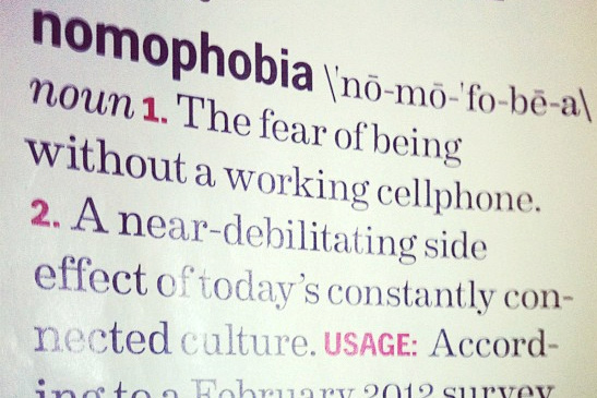
nomo
Not only have we made up a brand new phobia, but apparently half of us Brits suffer from it -'nomophobia' - the fear of not having access to your mobile ('no mo', get it?). As Facebook / Twitter / Candy Crush Saga or just plain email addiction increases, will we start to see nomophobia hospitals opening around the country for all those who've had their phones stolen? Maybe even walk-in clinics for those who just left it in the car that morning or helplines for those who've used up their monthly internet allowance?

A scary thought maybe - but then it's that scary we need a word for it in the first place. And whilst we may think it slightly ridiculous now - just try a 'digital detox' and see how long you can last without it - perhaps not quite as long as you thought?

more info (the drum)


How to do renovations right.


The National Trust owned stately home Cliveden in Buckinghamshire is currently in the middle of a £3.4 million renovation, with the vast series of works anticipated to last five years.

And, being a caring organisation, The National Trust was worried about the disruption the renovation would cause to visitors, especially as part of the restoration plans involve the property’s historic staircase. So, to counter act the disruption (and inject some fun into the process), the trust has installed a 16.5m slide that lets visitors slide from the roof of the terrace down to the gardens. Now, that's our type of historic sightseeing!

More info (design week)


Jerry's map


At 79 years young, Jerry Gretzinger and the map of his fictional world have been causing a stir in the design world. For 50 years now he’s been working on the map, which now spans over 2,500 pieces of A4.

Jerry adds to the landscape each day in his coffee break, drawing a card from a specially customized deck to decide what sheet he will work on. And don’t be fooled, this is no half hearted attempt, Jerry has created airports, high courts, cemeteries and train stations. The map is coloured to represent different altitudes, and to bring it to life further, he adds tickets, photographs, magazine cuttings, drawings and other bits and pieces to the existing pages to create textures and layers.

The images and a few brief blog posts really don’t do Jerry’s life-long project justice, so if you’re still curious then watch this brilliant short detailing the Jerry’s whole process.

More info (it's nice that)


Gathering Clouds


Amazon is slowly taking over the world. And I don't mean Amazon's impressive online shopping service either - I'm referring to Amazon Web Services (AWS) - possibly the largest 'Cloud' service around. Most people don't realise that many of the big web services - from Flipboard to Instagram all run on Amazons servers. In fact it's only when something goes wrong do we realise the implications.

Last week an AWS outage took down Instagram, Vine and several others (including Amazon.com too). Being taken offline is pretty serious for anyone, but for an internet only service it's disastrous. Are these web-based services relying too much on Amazon's Cloud? Perhaps, but it's doubtful that any competitor can ever offer 100% up-time. The answer then is that more companies will have to spread their reliance around as much as possible - otherwise the next outage could leave us all in the lurch! Maybe this Cloud thing is a little less fluffy than we'd imagined?

more info (techcrunch)


 Shut the Gates on your way out


Steve Ballmer, Microsoft's CEO announced his decision to step down - leaving a very different Microsoft from the one he inherited 13 years ago from good ol' Bill. Has his reign been a roaring success? Well if you judge his on-stage performance - he certainly thinks so! (yes, that's real). However, looking back we struggle to see the real vision he's brought to the company - for every success (Windows 7) there's been an equal failure (Windows Vista) - for every innovation (Metro interface design) there's been a cheap knock off copy (Zune).

In fact it's been remarked that Microsoft really doesn't know what to do when its out in-front - it's only when some young upstart (ie. Apple) comes along that the company realises that it has to up its game - but then that's where Microsoft can be dangerous. It does seem to be turning around and realising the up-hill climb its got to face to get back on top (finally, the Microsoft team is starting to think in 'joined-up' terms - desktop, living room, mobile all now sharing a similar approach). Let's hope his replacement just has a little more vision.

more info (the verge)

update: since writing the above it's emerged that not only has Microsoft bought Nokia (for cash no less) but the current Nokia CEO is rumoured as a replacement for the top job at Microsoft... hmmm almost like it was all planned...


At a loss


Poor Katie lost her iPhone this month, and being the foolish renagade she is, it wasn’t insured and didn’t feature any of the techie tracking or back up apps on the market now. 

We thought she couldn’t be the only ill prepared smartphone owner out there, and clearly Gizmodo feel the same, as this month the technology blog reviewed the best apps to have in your arsenal just in case you ever lose your phone.

Of course just being sensible with your phone is still the best defense, but Katie does like to live on the edge.


Timelapse Photography re-imagined


Fong Qi Wei's timelapse photographs are a beautiful, yet frankenstein-esque, look through time and capture the stunning effect that sunrise or sunset can have on a land or city scape. The only thing to do with these images is simply enjoy them.

Here today, hair tomorrow


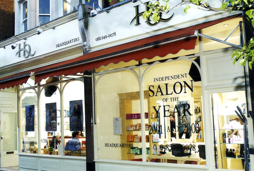
We’ve worked with premium, award winning hair salon Headquarters on many projects over the years, and this month the team asked us to create an invite for its 15th birthday celebrations.

The salon is celebrating in style with bubbly, canapés, fashion designers and, of course, plenty of top notch hair. Not only that but HQ is using the party as the perfect excuse to show off its brand spanking new salon, which has had a birthday make over.

The salon's new interior

So, the invite for the birthday party needed to have the same luxury, celebratory look and feel. We chose to keep the reverse clean and typographic, allowing the show-stopping image on the front the take centre stage.

We used Fedrigoni Splendorlux, a thin card with a gloss coating to the face and an uncoated finish on the reverse – an unusual mix of textures that gives it a high end, distinctive feel. It’s usually a paper for litho printing, but thankfully our clever printers were able to make it work on their digital press.

On another note, it’s not just Headquarters that is 15 years old; the logo is too! It’s not had any work done, and no, we don’t hold the key to the fountain of youth. We just understand branding, and what it takes to make a logo stand the test of time.


We don’t like to hark on about it (ahem) but it is true that by getting ‘to the point’ (sorry, we couldn’t resist) of your business, understanding your values and your audience, there’s no reason why you can’t have a logo that will last.

Wednesday, 28 August 2013

A bridge not too far

On the 11th August, on a chilly but bright morning, with the Thames two degrees colder than expected, Sam undertook yet another challenge on Team Hutton's fundraising journey in aid of the RNLI and in memory of their brother Charlie. Mum and Dad (our FD and MD) were there to see him off and despite second thoughts he entered the water with over 300 other swimmers. The event is only in its third year and has already tripled in size.


The 14km Bridge to Bridge swim starts at Henley and is billed as non competitive but the challenge is to beat the Thames, keeping out of the way of boats, kayaks, angry swans, ducklings and swimming dogs. With stops at locks, there's just time to grab a bite of a banana or chocolate snack before jumping back in with all the other seasoned swimmers, including a few cross channel fanatics.


The murky waters of the Thames are enough to freak out even the best swimmers but after a very shaky start, coming to terms with both the emotion of the event and his first experience of swimming in the Thames, Sam settled into his natural stroke and started to enjoy what is a magnificent stretch of theThames. The supporters were able to walk along the banks watching their friend or family member making steady progress towards the next stop. A great day and another great achievement. A small photo diary can be seen here of the day: http://bit.ly/Sam_henleyB2B


This stretch of the Thames Path is great for a weekend walk or cycle, but if you do decide to swim, do make sure you get the tide right and swim with it or it may be a bridge too far...

Footnote:
Tom and Sam's next event is the Charlie Hutton Hockey Festival to be held at Whitgift School South Croydon on Saturday 7th September 2013 from 10am. It should be another great day so if you fancy it, come along and support the teams and watch the passion, skill and fun that was so much part of Charlie's life. Team Hutton's giving page will remain open for further donations to the RNLI http://bit.ly/RNLIfundraising

--

Wednesday, 31 July 2013

Newsround

Well, July has come and gone - bringing with it all manner of weather (although pretty much all of it good - makes a change!). There's also been a smattering of interesting news, here's a few things that caught our eye...  

Polishing the Chrome - Google takes on Apple TV with a budget offering
The house of mouse - the original inventor of the mouse dies aged 88  
What does Wifi look like? - art and science merge in these wifi visualisations
to Ћ point - a new symbol for 'the' is proposed, what the..?
A (webcam) view from the top - no time to visit the Eifel Tower? This is the next best thing!
Does X mark the spot? - Oxford Street has a brand new identity
Jane Austen and trolls - it is a truth universally acknowledged, that something needs to be done about trolls


Polishing the Chrome


Google, one of the largest and most influential companies in the world has been desperately trying to break into the TV space for quite some time now. From Google TV to their Nexus Q - so far, they've not had much luck.

Their most recent product launched this week aims to turn this around. The Chromecast is tiny (see image above) and isn't much bigger than your average USB stick. It's designed to plug right into your TV via an HDMI socket. It's essentially a TV extender turning your dumb, non-connected TV into a Netflix or Youtube player (and you use your phone/tablet as a remote control). At only $35 it's quite the bargain - and while anyone with a set-top box or other Netflix capable hardware won't really get much extra benefit, it does make us wonder what the point of those expensive 'Smart TVs' really are.

But will it succeed where their other efforts have failed? We'll probably have to wait till next year to see who the leaders are in this much fought over streaming hardware / broadcast service sector. For now, the Chromecast is available in the US only, rest of the world to follow.

read more (The Verge)

 The house of mouse


Doug Engelbart, one of the many unsung heroes of the computer age died this month at the age of 88. He's the man we can thank for creating the world's first computer mouse in the 1960s - long before it was taken up by Xerox / Apple in the 1980s. The mouse revolutionised the way we interact with the computer and brought precise and intuitive analogue control that's still unbeaten today (touch screen controls may be everywhere right now, but don't offer the speed or pin-point precision the mouse still gives us).

Although there are well over a billion mice around the world, unfortunately he wasn't the millionaire he could have been as, despite patenting his invention, the patent ran out in 1987 - just before the mouse became the popular and ubiquitous device it is today. His first prototype was a simple wooden box with two metal wheels and three buttons on the top - which pretty much set the 'mouse' style for many years to come. Later the rubber ball was added for smoother movement, the mechanical parts finally being replaced by the optical mice we use now.

 read more (The Guardian)

What does WiFi look like?

 
click the image to view larger

Our cities are full of all sorts of pollution – from noise and crowds to light to smog – but what other things fill the air that we can't see or sense? Artist Nickolay Lamm decided to try to visualise one of those unseen forces: the Wifi signals that surround us, emanating out from almost every home, business and coffee shop. He studied how Wifi signals work and transmit taking current data from DC.gov to pinpoint their exact locations and then visualised these waves using central Washington as his backdrop. The resulting images are both beautiful and disturbing - the city is awash with what look like swirling forcefields of electronic communication.

read more (Motherboard)

to Ћ point


It was proposed this month that we should be adding an extra character to the English language. Paul Mathis thinks that as 'and' (which is the fifth most used word in the English language) has its own character, the ampersand, then surely 'the' (which is the number one most used word) therefore deserves its own shortened version? You can't fault his logic there. And, to save us all having to replace all our keyboards or add new characters to every major font, his proposal is to use something that already exists but is little used (a Serbian language character) which is a combination of 't' and 'h'. This would become a short-hand for 'the' in the same way we use '&'. He's going to need quite a lot of support for it to catch on, but it's an interesting idea. What do you think, could you see yourself using 'Ћ' - is it needed? And if so, will we need to change our logo?  

read more (Design Week)

Does X mark the spot?


London’s Oxford Street unveiled its new identity this week, giving us a look at the latest interpretation of destination brands, on the back of others such as Victoria and the proposed Northbank. The new identity sees the name shortened to 'Ox St', which is concern enough given this is a global tourist destination, and names like Bond Street, Mayfair and Oxford Street are iconic destinations. Will calling it 'Ox St' undermine this recognition and cause confusion? Plus, the new logo, with its 'X' device, arguably places too much emphasis on the local vicinity around the Regent Street junction which is already highly successful with big brand tenants such as Apple, John Lewis, Liberty, etc.

If the intention is to 'reignite London's love affair' with the street then it is arguably neglecting its less successful element (the east end). Most destination brands focus on the total visitor experience or the values they represent. Oxford Street is a long, straight shopping thoroughfare, in the same way that Regent Street is a crescent and Covent Garden is a series of lanes around a central piazza. The ‘X’ places too much emphasis on a single part of it, albeit a very important part, which is already highly successful, and we would have liked to see more made of the area it represents.

What do you think of the new identity? Let us know in the comments section below.

A (webcam) view from the top


The Google Cultural Institute and the Eiffel Tower Operating Company have joined forces to bring us three online exhibitions based on the iconic French monument, including a panoramic view from the top, just in case you can't make it there yourself. Known affectionately as the "Dame de Fer", or "Iron Lady", she stands at 324 metres tall and with almost 7 million visitors a year, is also the most visited (entrance fee) monument in the world.

Jane Austin and trolls

Back in April it was noted in the press that with Sir Winston Churchill set to replace Elizabeth Fry on our £5 note, there would be no women (other than the Queen of course!) on our currency, prompting a high profile campaign led by Caroline Criado-Perez against the decision. Last week the Bank of England announced that Jane Austin will be the new face of the £10 note, leading George Osbourne to tweet “Mark Carney's choice of Jane Austen as face of £10 note is great. After understandable row over lack of women, shows sense and sensibility." We applaud the decision and George's play on words.


This campaign also led to some truly vile misogynistic Twitter trolling and raised an important and ongoing debate on the role of social media platforms in dealing with trolls. In response to criticism of its handling of this latest hate campaign, Twitter has said it's aware of the way some people misuse the platform and is launching a feature that allows users to report individual tweets. It will be interesting to see exactly how this works and what impact, if any, it has on trolls and the number of abusive tweets sent.

Got the bug...


Tom and Sam Hutton have been raising funds for the RNLI since the tragic loss of their brother Charlie last year in a boating accident. This year's London Marathon was the big one, with Tom breaking his 4hr target and Sam coming in at just under 4hrs 15mins. Banners were supplied by our friends at ETC (thanks Kam) and Carl, our resident design advocate, made sure we had a good spot to cheer them on.


Sam has now got the challenge bug and decided to go one step further. He's signed up for the 14 kilometre Bridge to Bridge Thames swim on the 11th August and his training is well under way. Tooting Bec Lido was a great training pool until the heatwave hit, but since then finding space in a pool to paddle, let alone swim 5k for training, has been near impossible as the whole of london tries to cool down. So, he braved The Serpentine, which was an interesting experience and a lot closer to the murky waters of the Thames than the cleaner waters of London's lidos.

Obviously, we're wishing him well and hope that he doesn't catch any other bugs in the process...We'll let you know how he gets on and if you'd like to support him and Tom in their efforts to reach their £15,000 target you can donate on their fundraising page here.

Hot off the press.


With all the sunshine we’ve had this month, drizzly May seems like a distant memory. However, some of you may remember that we mentioned our work with Samworth Brothers on the redesign of its internal newspaper, the Samworth Standard.

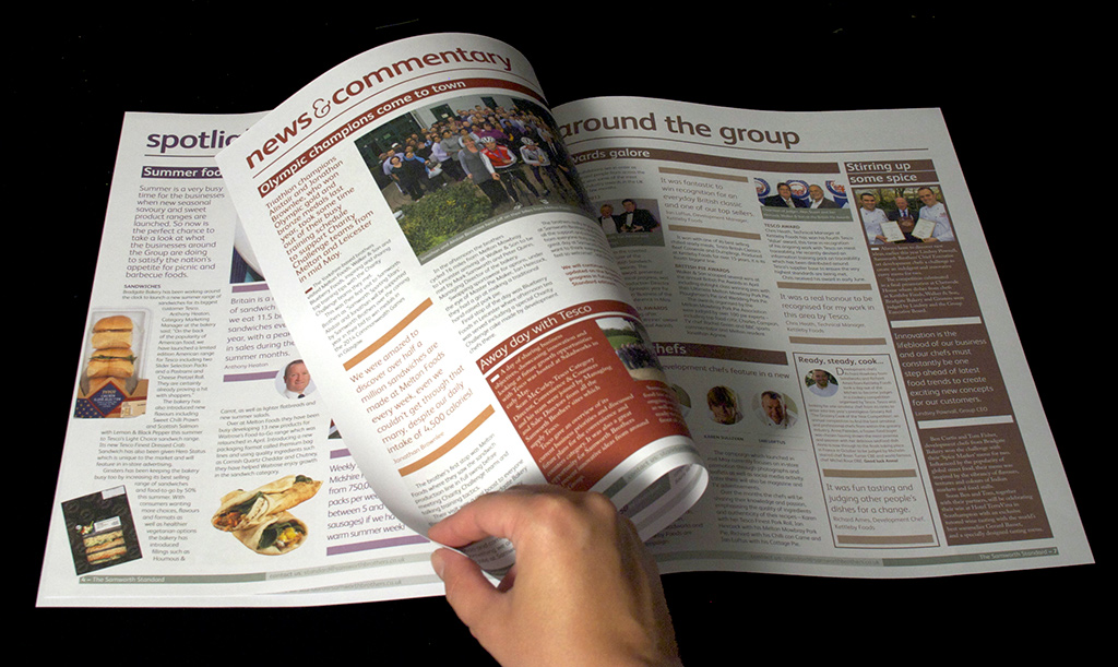
After some hard work by all involved, we are proud to announce that the first issue has been packed and posted to the 7,500+ Samworth Brothers employees; and we can finally give you a glimpse of the finished article.

As well as being the 70th Samworth Standard, this edition also celebrates the Samworth Brothers Charity Challenge, a company wide event that takes place over 2 weekends, where 300+ people compete in a gruelling ten hour course of hiking, canoeing, abseiling and biking all in the name of raising money for charity. To mark such an epic event, the team commissioned a 6pp roll fold in addition to the newspaper.


This event is entirely about people, not only those who put their bodies to the test, but also those who arrange the event and the charities who benefit. So we were all keen to make these people the focus by flooding the pages with the fantastic images from the 2 weekends and quotes from the charities. There were plenty of facts about the event itself, over £327,000 was raised and over 1000 Ginsters pasties and slices served to the hungry competitors!
We worked closely with our print partners to ensure the safe delivery of The Standard to various homes and sites across the UK.


The finished result is an engaging, bright and friendly internal newsletter that celebrates the individuals who make up one of the UK’s leaders in chilled foods. And, as a bonus, the team at Samworth Brothers have assured us that we will be expected to compete in the next Charity Challenge (gulp!). Although you know us, never ones to turn down a challenge…


Check Out Croydon

The new loyalty card
We often find that the hardest part of any branding project is coming up with an engaging, powerful name that resonates with the target audience and naming Croydon BID’s loyalty card scheme for the town was no exception.

The name needed to be snappy, friendly and welcoming, be synonymous with the deals that the card will offer and facilitate vibrant and positive marketing campaigns to promote usage. The new scheme will be open to residents and visitors as well as employees, replacing ‘Croydon Works’, the previous loyalty initiative just for Croydon town employees.

Working with the Croydon BID team we came up with 'Check Out Croydon', developing the look and feel of the card to reflect a chatty, engaging tone. We created a logo for Check Out, using a vibrant orange for the text, and added in speech marks to give the name (and card) impact and personality. The background blue of the card, with ‘Croydon’ in the roundel, ensures the Check Out stands out and is instantly recognisable and ties in with the branding and campaign work we’re doing with Croydon BID.

We worked with Footfall123, a loyalty marketing technology company, who is producing the card and running analytics for the scheme, to make sure our designs worked with the card template. Footfall123 will help Croydon BID to monitor the effectiveness of the scheme and individual offers, and develop future offers based on this feedback. 

To help raise awareness on the street,we’ve also designed an eye catching 3D effect window sticker for businesses to advertise their participation in the scheme, which combines the roundel of the Croydon BID logo with the look and feel of the card to ensure brand recognition.

Window stickers

Matthew Simms, Chief Executive, Croydon BID is delighted with the new loyalty card and said:

“In the comparatively short time that we’ve been working with To The Point, I’ve been impressed by their creativity and the speed with which they have interpreted the brief. There is a huge amount of change and re-development planned and taking place in Croydon. It is important that our loyalty scheme stands out and stands the test of time, galvanising support from both businesses and everyone who visits, works and lives in the town.

We were looking for a name that was short, succinct and memorable that would encourage people to think differently about Croydon and Check out Croydon does it all.”

Friday, 28 June 2013

Faux vs Flat


The chances are that most people won't have come across the word 'skeuomorph' much at all until recently - perhaps this is the first time you even knew it existed? Well it's big news right now as Apple, the self appointed king of skeuomorphic design, is looking to ditch the concept completely.

So what IS skeuomorph I hear none of you asking? (and no, it's not a creature from Doctor Who). Well, it's more of a visual thing, so I refer you to the image above - it looks like a fairly standard iPad app interface right? Notice the graphic elements designed to make it look like a real notepad? That's basically skeuomorphic - ie. pretending to be real rather than pixels on a screen. It's especially strange when designers try to make an app look like something not just real, but a bit old fashioned - so all those apps showing, say, leather textures and stitching, that's REALLY skeuomorphic!

It also covers all the classic bevels, drop-shadows, wood grain, mirror reflections and the classic 'shiny' buttons so associated with Apple's iOS (the software on all iPads and iPhones). The trouble is that those elements take up precious screen room and, at least in functionality terms, are all a bit 'faux'.

Microsoft's new 'metro' user interface

Microsoft certainly thought so when they create the rather nice 'metro' interface seen on Windows Mobile (and Windows 8). In Google's latest version of Android they've also gone for a very flat visual aesthetic - keeping the user interface clean and free of unnecessary clutter. This has left Apple looking rather clunky and, dare I say it, a little 'old fashioned'? It seems that Jonathan Ive (Apple's product design guru) feels the same way - he's now in-charge of design across both products and the software itself and the next version of iOS7 is dropping all those old fashioned styles in favor of a very clean, flat look.

First glimpse of Apple's new iOS7


All good right? Well, not entirely. Apple now has two big problems: firstly, its competitors did it first and did it well - Apple is in danger of looking a bit 'me too' when previously its always been seen as an innovator. Secondly, that skeuomorphic look - all those shines and bevels and drop-shadows are virtually part of the Apple brand in many people's minds. Apple defined the smartphone and tablet using this look and feel. The company revolutionised the mobile space because it put the user first, and made all those apps fun and easy to use - no matter the age and technical ability of the user. The more tech savvy people out there might look at the 'wooden shelves' on Apples iBook app and feel a bit embarrassed about using it, but Apple needs to be very wary of moving ahead too quickly and dropping all these not strictly necessary, but very 'Apple' elements and leaving the old fashioned fun behind.

What do you think - will you miss the skeuomorphs when they're gone? Is the new iOS7 a success?

further reading:

Design Week: is there a place for skeumorphic design?

Seth Godin: Skeuomorph failure

The Verge: iOS7 design - simply confusing

Flat is good - Google's design guidelines

Flatter is better - Microsoft's design guidelines

Flattery is everything - Apple: iOS7 transition guide for designers and developers

June's news round up

This month's round up from the world of branding, design and digital, along with other random bits and pieces too:

Coming up...

» Is online privacy a 20th Century concept?
   PRISM parties like it's 1984

» Vine and Instagram - the birth of micro-vlogging
   how the micro-blogging sphere is being taken over by micro-video

» The end of software ownership
   Microsoft's DRM U-turn and Adobe's Creative Cloud

» Virgin Group's branding boot camp
   Plans to evolve the look and feel across all sub brands

» No 'No More Page 3'
  The Sun vows to keep Page 3, for now

» A day of 'sport'
   In the best British traditional

Things that caught our eye this month... 


Is online privacy a 20th Century concept?


The recent revelations about PRISM are a little scary (as is their Pink Floyd inspired logo above!) and have forced us to really think about our online privacy (yet again). It doesn't really matter whether we trust Apple, Facebook, Google, Yahoo, Microsoft et al with our personal information - now we know the NSA can get access to it anyway (without the need for a warrant) - and whilst Obama has promised that this doesn't affect those who live in the States, that's cold comfort for the rest of us in Europe. Of course services like Facebook aren't really known for their privacy controls (and a recent glitch meant millions of people had their personal details 'exposed') - but with more and more of us using online services as part of our daily lives - should we be concerned that both big corporations and governments have direct access to it all?

William Hague has assured us that as long as we're law abiding citizens, we have nothing to fear. But then it really comes down to how much we trust our own Governments - especially based on the recent news that our own NSA equivalent - GCHQ, is tapping internet connections in the same way too. But are we foolish to expect online privacy at all in the 21st Century - is it perhaps an outdated idea (as CNN and many others have suggested). In these post 9/11 times - perhaps online privacy and national security are mutually exclusive? Let us know what you think.

further reading:
The Guardian - everything PRISM
Apple received between 4000-5000 surveillance requests in December alone
5 tips for controlling your online privacy


Vine Vs Instagram - the birth of micro-vlogging


First there was the humble .GIF animation (see our newsround last month!) then a few months ago came Vine - which has exploded onto the social media scene (originally iOS only, now available on Android too). This takes the idea of visual blogging (ie. Instagram) and adds in the meme-friendliness of the short animation 'loop' once limited to the old .GIF format. With just 6 seconds of video/animation available you would have thought there wouldn't be much you could do with it - but as this nice example shows - sometimes imposed limits only serve to fuel people's creativity!

So, in one fell swoop, Instagram was relegated to last year's hot-property (and after Facebook's rather expensive buy out too!). Not to be outdone, Instagram has just launched its Vine-beating alternative - you can now add 15 seconds of video to its new service - the war of the micro-vlogging services has begun! It's still a bit too early to declare a winner, but last time I checked this site - Instagram had a slight lead. Do you use either service? Let us know which you prefer!


The end of software ownership


Just a few weeks after Microsoft's successful Xbox One launch (mentioned last month), they were faced with what was rapidly turning into a bit of a PR disaster. Basically, they were removing the old idea of buying software on disks - instead moving towards an 'always connected' download/streaming model. This meant that purchased software would not be resellable or shareable (due to the copyright protection applied). So if it works for Apple (plenty of people buy their music in a similar way on iTunes) it'll work for Microsoft right? Turns out the answer is 'wrong' - the gaming press came down VERY hard on this strategy and Sony took the opportunity to stick the boot in with a well-timed cheeky viral video

A few weeks later, Microsoft did an abrupt U-turn and completely cancelled all DRM (Digital Rights Management) plans - despite these apparently being fundamental to their offering. Whether this has affected their chances in the coming console war remains to be seen, but despite all the furore, this does show that the idea of software ownership is changing.

Elsewhere, Adobe (the software monopoly who create pretty much ALL the must-have design tools we use everyday) have already made the leap - last month marked the very last time you could buy a physical version of their Creative Suite software (Photoshop, Illustrator, InDesign etc). They've now moved over to the 'Creative Cloud' - essentially meaning that designers no longer own their software, instead we now effectively rent it.

And with the release of Microsoft's Office 365, we can see that it's not just the design studios being asked to move over from ownership to rental. We're not sure if the benefits outweigh any disadvantages yet, however, one thing is certain – the future of physical media (from CDs to DVDs and Bluray) looks even shakier than the beleaguered newspaper industry.


Branding boot camp


Virgin Group, which operates all Virgin brands, announced last week that it is evolving the look and feel across all of its sub groups, which include Virgin Trains, Virgin Media, Virgin Mobile and virgin Active, amongst others. As part of the refresh, South African consultancy The Jupiter Drawing Room, who is working on the project, organised a ‘creative boot camp’ in Cape Town to get the inspirational juices flowing. Sounds much more fun to us than a traditional boot camp!


And now for the not so design related news...


Girl power…


No More Page 3 is a campaign that has been snowballing in the media recently, and evoking a new wave of girl power. The campaign was started by Lucy Holmes in the summer of 2012 after she noticed that the largest female image in The Sun newspaper was a topless young model, despite Jessica Ennis recently winning her gold medal! She penned a letter to the editor, Dominic Mohan, in the hope it would instill him with some girl power of his own.

Since then women around the country are standing up to show their support for the campaign, from the Girl Guides to Green Party MP Caroline Lucas, and countless publications and people. The argument made is that the Page 3 image is only there for the sexual gratification of a select audience. And with such hideous figures relating to the assault and abuse of women, we are lead to question how wise it is to perpetuate the notion of women as sexual objects.

Sadly, it seems The Sun has not agreed, as new editor David Dinsmore announced this week that Page 3 will be staying, as 'it's a good way to sell newspapers.' However, we think it will take a lot more than this to stop the campaign though!

Simply spiffing 'sport'


For those of you who don’t know (or simply don’t care) that Andy Murray might just do the unthinkable and win Wimbledon this year, the Chap Olympiad might be for you. Celebrating all that is rip roaringly British, this non sporting ‘sporting’ event on 13 July includes Umbrella Jousting, Tug of Hair and Iron Board Surfing and ‘rewards panache rather than sporting prowess’ Of course, in the finest of British traditions, it will be accompanied by lashing of Pimms and, more than likely, rain.