Thursday, 15 December 2011

A year in words

A custom word-cloud we've made from key news events of the year (click to view larger)

The top 10 words and phrases of 2011 include ‘occupy’, ‘Arab Spring’ and ‘Steve Jobs’, although given the industry we’re in, we can only claim to have links with the latter. Not quite in the same intellectual vein - given that Charlie Sheen comes in at number four - we’ve also looked at Facebook’s top 10 global topics. However, it is quite an interesting mix of the historic and the banal, ‘military operations begin in Libya’ versus ‘Call of Duty” being a case in point.

Facebook - top 10 global topics (click to view larger)

To find out what words would be in our top 10 over the year we created word clouds from our e-news stories and blogs throughout the year, with ‘Society’, ‘print’ ‘website’, ‘new’, ‘business’, ‘digital’ and ‘brand’ coming out on top. This links in very nicely when we look back at the projects we’ve worked on over the last year, as there has been an interesting mix of digital and print based work.

a custom word cloud from all of our 2011 blog posts (click to view larger)

Our digital services have definitely grown this year, and we’ve designed and created a number of websites for clients including e-Front (naming and producing new site Pevara), Montagu and CLS. However, the branding side of the business has remained strong, and we’ve created new identities for Clip and Ping, Optalis and The Physiological Society, amongst others. We’ve also become very much involved in the science sector, working with EPSRC, BBSRC, Bloodhound and The Technology Partnership as well as Optalis and The Physiological Society as above.

Property projects have also been successful for us this year, having worked with Carillion Richardson on the branding for St Martin’s Quarter in Worcester as well as Palazzo Dorottya in Budapest. The internal office graphics at CBRE’s headquarters also provided us with a fantastic opportunity to expand our expertise in experimental branding with the iColour tiles piece.

It's all doom and gloom for 2012 according to the news, however, it’s not all bad news here at TTP. Yes of course, the continuing difficult economy has had an impact and we have seen repeat work from old clients taper off as the downturn continues, but what is refreshing is that we’ve gained a number of new clients, either those coming to us direct or from introductions or recommendations, which shows we’re doing something right!

We have plenty of prospects for 2012 bubbling under and we’re looking forward to working on a number of projects, both digital and print, with new clients including Yahoo in Switzerland, YahSat in Abu Dhabi, Informa and PIE in London (and no, it’s not the apple variety).

Merry Christmas and wishing you a happy and successful New Year from all of us at tothepoint.

Tangram Teaser


With the Olympic games coming to London next year, giving our 2012 calendar a sporting theme was a natural choice. As the Games make the journey from Beijing to London, we thought we’d be clever and link them (and our calendar) to another game that travelled the same journey, albeit hundreds of years ago.

The tangram originated in ancient China before reaching America and England through trade in the early 1800s. To play a Tangram, you simply arrange the seven pieces – five triangles of varying sizes, a square and a rhomboid – without overlap, to exactly reproduce the given image. Sounds easy, doesn’t it? Believe us, it isn’t. We needed a number of attempts to produce recognisable Olympic sports. If you don't receive your calendar or know someone who would like one, let us know as we always have a few spare.

Continuing the theme, our Christmas card also features a tangram in the shape of a tree, which thankfully, was much easier to create. We'd love you to punch out the pieces and create your own symbols/icons and send the pictures to tangram@tothepoint.co.uk. We'll send a real tangram puzzle to the best ones.


We've also created a little screensaver just for christmas and inspired by the 12 tangram illustrations we've used on our calendar, you can download it (for Mac or PC) here.


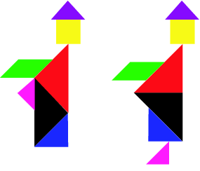
Finally, an odd, and intriguing aspect of the tangram is the phenomenon of paradoxes. A tangram paradox exists where two puzzle configurations are almost the same, yet a part in one magically ‘disappears’ in the other version. One of the most famous examples is the Dudeney paradox featuring two monks, where on one version the figure is a complete person and on the second version, the figure appears to lose its foot. Have a look at this head-scratcher here and see if you can solve it.


The real Christmas lights


CBRE’s Architecture and Design division approached us earlier this year to create an innovative concept for their new headquarters in Henrietta Place. As part of the project we installed a sculptural lighting installation in the reception area (see our previous blog on this here). This was really well received and has become a great talking point, so we decided to help bring some Christmas cheer to visitors and CBRE employees by designing a bespoke Christmas animation sequence for the festive season.

The ambient animation consists of a number of sequences and is around 12 minutes in total. The aim was to create something vibrant and colourful without it being too garish or distracting. It seamlessly blends a series of seasonal images, including gently falling snowflakes, exploding fireworks, flickering candles, Christmas tree and baubles. Santa even puts in a brief appearance, complete with reindeers and sleigh.

The lighting installation is on permanent display in their main reception area and the Christmas animation will be running there until the new year.

Martin Lewis, Chief Operating Officer at CBRE had this to say: “Once again TTP has created an inspiring and visually appealing lighting installation, and it is an imaginative conversion of well trodden images into a fresh format that catches people’s attention.”

Ben Jackson, who created the sequence adds: "This was a fun and unusual project to work on, after all, it's not every day that we get to create something more as abstract art than functional design. The LED tile displays are perfect for a more ambient kind of animation - whilst lacking in the crisp detail of a TV screen, they convey movement and colour really well and I tried to take advantage of that with various sequences that convey some of the fun and 'sparkle' of Christmas."

You can see a section of the sequence above (or visit their headquarters to see it yourself).


Branding Macmillan's Next Chapter


Macmillan - The Next Chapter (click to view)


Macmillan is one of the world's leading publishers, home to Nature Publishing Group, Palgrave Macmillan, Macmillan Education and Pan Macmillan. To improve collaboration and give its employees a fresh, modern working environment, the company is bringing together its various publishing divisions, which are currently split between Oxford, London and Basingstoke. Macmillan is also investing in new premises in Basingstoke, which will become its main service centre for fulfillment and distribution.

We first got involved in branding the move when Mat Rumblelow, head of internal communications consultancy, Rumbers Ltd - whom we had worked with before on an internal branding project for News International - asked us to create a new logo and strapline for the project. As part of the brief, the internal communication needed to be on brand, work with the Macmillan 'red wave' logo and be bold, quirky and fun.

We were conscious that the project identity couldn’t focus solely on London given Macmillan's investment in Basingstoke, as well as the fact that although Macmillan’s identity is rooted in print, digital is a growing and vital part of its business.

We came up with a number of concepts, before opting for a fun, simple, iconic identity that reflected the joined-up thinking of bringing all the different publishing divisions under one roof. Using a bold red linear treatment that took its cue from the Macmillan logo, we created an overarching icon featuring a book and turning page to represent the project strapline of ‘The Next Chapter’. The turning page graphic also featured an extended line treatment to link the individual publishing divisions together.

We then created a number of images and accompanying straplines in the same style to represent the reasons for and advantages of the move. These included ‘sharing knowledge’ and ‘embracing innovation’ which were represented by arrows converging and a laptop, while Q&A and Next Steps sections of the briefing pack were represented by mortar boards and pencil illustrations.

The move was announced to all staff on 9 November 2011, with the overarching logo and The Next Chapter strapline used on all internal communications, including briefing packs (given to over 2000 staff globally), presentations, newsletters and the staff intranet. The campaign was underpinned by a video from the CEO that covered the vision and changes ahead. The video was scripted by Mat and shot by Stickman Productions, who worked with us on the EDF video for upstreaming.

The project’s branding was really well received by employees at Macmillan, who felt it was highly professional, with a clear tie-in with the Macmillan logo and culture. Some even went as far as to say it as the ‘best internal communications ever seen at Macmillan.’

Mat Rumblelow says: "As always, TTP demonstrated their ability to capture the essence of the Macmillan Brand, while creating a new vibrant identity for the co-location project. The team pulled together a range of concepts under extremely tight deadlines, giving us a number of viable options. The chosen identity was a real success and will be carried forward over the course of the project to create a range of high-impact deliverables."

Tuesday, 29 November 2011

Park that problem

As the initial stages of a wider marketing campaign, ParkatmyHouse asked us to design a colourful and impactful flier targeting people living near transport hubs who have a driveway. The flier needed to raise awareness of the opportunity and cost benefits of renting out parking space through them.

The fliers were delivered last week and the results are being collated as we speak. The ParkatmyHouse team are monitoring website traffic and running analytics to measure the flier’s success. Once the results of this campaign are known, the flier will be adapted to ensure the most effective messaging is used on further mail drops in particular areas.

The ParkatmyHouse team have very kindly agreed to share the analytics with us, so we’ll let you know the results in a future e-news. In the meantime to find out more about the service, visit www.parkatmyhouse.com


A TTP Partnership

Working in partnership with its clients, TTP combines the strengths of science, engineering and business development to bring new products to market. Having successfully tackled the sales presentation to communicate the key messages that differentiate TTP from its competitors, TTP now wanted to do the same externally and to a much wider audience through print advertising.

There was already an existing set of ads but these lacked clarity and branding, so the challenge was to create a suite of ads that were fresh and current, drew on TTP’s expertise in exploiting new technologies and which could be rolled out over a period of time.

So, we brainstormed a number of ideas to present to TTP, and then got to work developing the two chosen routes. We built on the look and feel that was established for the presenter, utilising the red blocks of the logo for brand continuity across both routes. One route features bold imagery of disruptive technologies with minimum copy, whilst the other features imagery that is more in the background with a bold typographic approach. This route also focuses on the idea of a ‘successful partnership’, which works across a business and recruitment perspective, as well as offering a direct link to the TTP brand.

TTP’s Dr Allan Carmichael was really pleased with our efforts, so a successful partnership indeed!


Let's get Physiological

We first got involved with the project in April when we were invited by the Society (on recommendation from EPSRC, with whom we have an ongoing relationship) to take part in a competitive pitch, which we subsequently won. The Physiological Society last undertook a rebrand in 2006, gaining a new logo and brand guidelines.

The existing printed materials loosely reflected these guidelines, but as a collection the leaflets and posters lacked consistency and a strong visual identity. As such, our role was not only to refresh the visual identity of the Society but to also ensure this new identity was applied consistently and correctly across all of its printed materials, helping to increase the profile of the Society amongst its varied audiences, including within Industry and Parliamentarians.

We obviously managed to impress the right people at the Society as Clare Kingston, Head of Media and Communications at the Society, had this to say:

“Not only have ttp been brilliant in delivering a fantastic new brand identity and design on budget, they have been great fun to work with too. Refreshing a brand in a member organisation can sometimes be a tricky process but Jim, Mark and the team have produced a contemporary look that is still sympathetic to our roots as an established scientific organisation. They have been a pleasure to work with and our Members love the new designs.”

There were a number of things we had to be aware of when we started the project. As part of the brief we were advised that the Society was not looking for a complete overhaul of the branding, but more of a refresh/evolution. This was because the existing logo was firmly established amongst the scientific community, and, given the economy the Society didn’t want to be seen to be spending frivolously on design. The Society however was looking for ways in which to evolve the brand cost effectively. We also had to consider that as a science organisation, the Society is reliant on strong branding and eye-catching design to make the occasionally ‘dry’ subject matter more appealing.

As physiology is the science of how different systems function in the body, the existing logo was based on a visual representation of an ‘action potential’ – the electrical impulse in a nerve cell. This change in electrical activity is represented by the rise and fall of graphic lines in the logo – a nice idea but we felt the graphic was a bit dated.

So, using this as a reference point, we came up with a number of options for the logo, designing a couple of safe options where we stuck closely to the existing style and retaining the action potential concept, along with some that pushed the boundaries in a variety of directions. After presenting our ideas to the Society, we then developed one of the ideas routed in the action potential curves and a cleaner, more accessible and contemporary logo was born. Featuring a primary colour palette of navy and cyan, the five waves create a bolder and more impactful identity whilst reflecting the gravitas and expertise of the Society.

The new logo has been implemented across all printed materials including booklets, posters, exhibition banners and pop up stands, stationery and business cards. We also produced a set of brand guidelines, which detail electronic use as well as print. The updated website is based on these guidelines and has just gone live.

Furthermore, the update of printed / marketing materials forms part of a wider communications review conducted across the Society this year to ensure it is communicating as effectively as it can with its variety of audiences which include senior scientists, early career scientists, undergraduates, schools, policy makers, Industry and the general public.

You can download the full guidelines here or view image examples below.


Monday, 31 October 2011

The death of print?


The demise of the printed version of Design Week earlier this year after 25 years was a real blow for the print industry as well as the design industry as a whole. Here at TTP we looked forward to receiving each copy, with its mix of news, comment and profiles. Many of us were to be found at lunchtime, actually reading, not just skimming through it. Given that we spend most of our time staring at screens, it can be a welcome relief to read something on paper.

The death knell has supposedly been sounding for print for the past few years. Does the demise of Design Week (the printed version at least) mark the final nail in its coffin?

In a word, no. Whilst there’s no doubt that print media has suffered since the digital age exploded, it’s down, but not out. Yes, Amazon’s ebook division may have comprehensively outsold its print counterparts in the US (115 to 100 respectively), but there are other signs that suggest print isn't out for the count.

The latest research to come out of the US found that new magazine launches in the first half of 2011 were up 53% from the same period in 2010, from 90 to 138. The number of publications that closed fell 15% from 87 in the first half of 2010 to 74 in the first half of 2011. The UK market is seeing similar trends. The end of 2010 saw the launch of a new quarterly publication, Delayed Gratification, by the international editor of Time Out. The very title and its unapologetic tagline, “last to breaking news” is surely the antithesis of the immediate, yet throwaway news culture embodied by the digital age, featuring in-depth analysis of the previous three months’ news. The success of the free Stylist magazine, the rise in circulation of the now free Evening Standard and the launch of i from the Independent all hint at recovery.

Of course, the advent of the Internet and the increase in hand-held, digital devices has irrevocably altered the way we consume news and brings many benefits. When it comes to breaking news, the immediacy of online has a real advantage, but for longer articles, analysis and features, I believe print will always triumph. Digital formats, whilst interactive and exciting, just don’t lend themselves very well to this type of in-depth reading, being suited to more easily digested, easily disposed of snippets.

Let’s not forget the sheer physicality of print media. It's probably its saving grace. Books, magazines and newspapers are tangible and appeal to many of our senses; they are heavy, glossy, tactile, the pages crackle when they’re turned, and then there’s that newly printed smell of magazines, not to mention the romantic smell of musty old books.

Books, magazines and newspapers are evocative in a way that no electronic format can ever be. And that’s a very good thing.

I will freely admit I’m a Luddite when it comes to technology. I can barely work my iPhone, more than one TV remote confuses me and when it comes to books, I’m a romantic - I want the feel, smell and experience of an actual book. But I know not everyone agrees with me and, ultimately it should be the content that’s important, not the medium.

Electronic formats do of course have numerous benefits and e-readers are in many ways far more practical than books. They are incredibly light, readable in any light, store hundreds of novels and are bringing books to a new generation of people constantly on the go. They also save paper, enable a less expensive distribution of books and can help first time or unknown authors publish without an agent.

The problem is, as with all technology, what happens when the next generation of e-readers hits shops? Will all the obsolete models be destined for silicon heaven? Electronic waste is a huge issue due to our reliance on machinery– but that’s a topic for another blog.

However, the best argument I have heard against e-readers is that you can’t tell what other people are reading on the tube! Now, for those who have to suffer the daily commute on the tube, craning your neck to spy on others’ reading material takes your mind off the stale aroma emanating from the stranger’s armpit wedged above your head. Whether it’s interest in the book, a way to pass the time or plain old sniggering at someone else’s embarrassing book choice (come on, we’ve all done it) it’s a great form of people watching. Leaning in to get a proper look at someone’s e-reader means getting far closer than is socially acceptable, and surprisingly enough, people don’t seem to appreciate it very much.

But then again, the flip side of this is that no one else can see what you’re reading either. A quick poll of the ttp office suggests that boys really don’t want to be caught reading ‘chick lit’ or DIY manuals, whilst women are ashamed to admit they read self help books, dating guides, or any cheesy romance novel. But thanks to e-readers we can indulge that Twilight habit in complete anonymity!

Here at tothepoint we’ve embraced digital but a great deal of our work is print; whether it’s corporate literature, ads, staff handbooks, brand guidelines or bid documentation. The advent of digital was a huge cultural change and has altered the playing field irrevocably. The scope of what we can do now in terms of design is staggering, and looks set to become even more so.

Neither print nor digital is better; they are just different, with one sometimes more appropriate than the other to deliver a specific message. Having said that, many of our clients want both print and digital, working together so that they can maximise the effectiveness of their campaigns. Therefore, the challenge always remains the same, to deliver something that is innovative, relevant, unique and exciting - regardless of the medium.

Penny Davies.
Account Manager / Copywriter.


Additional comment by Ben Jackson (Head of Digital):

Whilst I agree with pretty much everything Penny's written above, I'm not sure the best argument for print is its lack of privacy! Whilst I probably embrace new technology more than most at TTP, even I was very sceptical when I heard about the Kindle (et al). However, I must admit, I wouldn't be without mine now - of course it's not the same as reading a real physical thing, but the clarity of the screen, the simple controls and (most importantly) the ease of lugging around all your books – whether on the daily commute or on the sun-lounger makes it the perfect book replacement for me. And I definitely prefer the Kindle to something like the iPad - whilst Apple's device is capable of so much more, that's also its downfall as a reading device - the screen, weight and dimensions just aren't so well suited to longer periods of reading.

That doesn't mean the Kindle will ever replace print in general though. Reading a glossy magazine, brochure or a throw-away copy of the Metro is a totally different experience and it would be very sad indeed to think the days are numbered for the more physical medium. And while technology marches on, there still isn't a perfect solution in terms of a single device that can do it all (although Apple's iPad and Amazon's new 'Fire' would like you to believe otherwise).

As ever, the disruptive effect of digital communications does not mean that the old ways of communicating are dead, they simply mean that there are ever more channels with which to impart your message and interact with your audience. Where the latest iPad newspaper apps may offer new ways to view and interact with media, I still hope that there will be a place for printed versions too.

The next big frontier for printed news is quite how to create a business model that incorporates both and actually makes money. News International are still experimenting with their grand pay wall that excludes anyone who's not signed up. Whereas the new releases of the Guardian on Kindle, iPad and Android focuses on a more open approach - but are they making any money from it?

Who knows, it may not be digital at all that ends up killing print - it could instead be a combination of poor journalism (regurgitating PR bias, poor fact checking, bad practices in order to get a story) combined with the widely held belief that the huge abundance of online content should always be freely accessible (perhaps it's all Google's fault?) But only time will tell on that score.

Ultimately, I think we should stop talking about one medium replacing another and realise that we need to play to each medium's strengths - printed newspapers may well have to give up trying to top Twitter as the first to the news and instead focus on great, well written content and opinion that's been created (and checked!) by those who really know their stuff (let's face it, Twitter and the average blog will NEVER replace that).

Feel free to express your opinion below (or maybe send a postcard?).

Ben Jackson,
Head of Digital.

Pevara - The measure of success


Pevara is a dedicated online system for financial experts - created by Efront (you can read their official press release here). It's designed specifically to provide performance and benchmarking solutions to support Limited Partners investing in private equity. It enables investors to monitor their portfolio’s performance, measure fund investments and evaluate new investment opportunities.

Having been briefed on the project, our first task was to find a name for the new service. It needed to be both unique and memorable (globally, across multiple languages) and more importantly, it needed to be available as a .com domain. After plenty of brainstorming (and constant domain availability checks) we came up with ‘Pevara’ - taking the ‘pe’ from the private equity whilst ‘vara’ is an old Spanish term for measurement – which aligned perfectly with the purpose of the site.

We were also asked to help create the overall look and feel of the software system itself to this end, we worked closely with the eFront team aswell as UI specialists in the States and the development team in Paris. As the purpose of Pevara is to improve operational efficiency for its users, ease of use of the programme and the website was paramount. The structural design needed to support this and provide simple, intuitive navigation.

Once this was underway, we then worked closely with the client, our recommended copywriter and an SEO specialist company 4Ps Marketing to plan and create the main website and make sure it did well in both natural and paid search. This involved planning the site structure and creating multiple wireframes of the site before moving on to create the main template designs. The site is essentially a marketing and promotional tool and so must grab its users’ attention, quickly imparting the key information (as well as event news) whilst establishing the overall Pevara brand. Once our template designs had been approved, we worked with our developer to create the CMS and website content.

Ben Jackson who created the site design, adds: "The project was a great one to be involved with and adds to our growing digital media portfolio. The name and overall brand is both modern and eye-catching and works really well across a variety of media - from the software itself to the website, stationary and even PowerPoint templates. We focused on making sure that right from the homepage, users are aware of the main benefits the system without bombarding them with too much detailed information. The Pevara team will be promoting their service world-wide with the first event kicking off tomorrow in New York. They've had a lot of people registering via the website, so it's obviously doing something right!"

You can view the website here: www.pevara.com

Montagu – bringing personality to private equity


Montagu considers its website as an essential communication channel to the European Private Equity industry and as such, wanted to develop a new website to distinguish itself from its competitors using the latest technology and design principles. A key part of the brief was to develop the website based on a Content Management System that was easy to use for people with limited experience in web publishing.

Following a competitive pitch against several consultancies, we were awarded the contract and got to work. We undertook a complete site review and redesign, creating the site from scratch, with new content and photography. Once designs were approved we worked in partnership with developer Skyron, choosing to go with a customised version of the open source Umbraco system for its features and ease of use.

An essential part of the brief was that the new site should be flexible and allow for future extension of its functionality as and when required, without the need for a major overhaul. So, along with being mindful of this, we also had to ensure the design facilitated easy navigation, was compatible with Montague’s internal systems and was accessible on tablets and smart phones.

Working closely with both the client and the developers, Ben Jackson, our head of digital, ensured our design team produced designs that were both engaging and functional. The final design features a clean and simple layout, utilising the primary and secondary colours available within Montague’s existing brand identity to make the site visually appealing whilst ensuring it was in line with existing marketing collateral and branding.

Whilst the client and their target audience sit firmly in the corporate arena, we brought a much needed sense of personality to the site, using clear layout and liberal use of their main brand colour. We commissioned a photoshoot of Montague’s staff, allowing us to feature them throughout the site, whilst the animated banner of the homepage showcases both Montague’s key messages and its individuality. The updated news, investment portfolio and video case study sections all further reinforce this professional, yet approachable personality.

Ben adds: "The challenge was to balance the more corporate, conservative look that many of their clients expected with a sense of life and personality that didn't feel fake in any way. Ultimately, more than the current news and latest deals, it was their people who really set them apart and we tried to get this across in the featured photography. We concentrated on keeping the site simple and free of 'clutter', we tried to avoid a homepage that was full of irrelevant content and just focused on what their audience was looking for. Where pages became very content heavy, we used simple drop-down filters to help avoid information overload. Their main brand colour was perfect at really highlighting key areas of the page - whether headlines, stats or important information, we used it to help guide the user around the site."

The site recently went live and is already being updated to include French, German and Polish translations.

You can view the website here: www.montagu.com

Friday, 28 October 2011

Bloodhound – Blood, sweat and speed


Located within the state-of-the-art S&B Automotive Academy in Bedminster, Bristol, the Bloodhound Education Centre is an innovative learning environment, designed to engage, educate and inspire young people into a career in science, technology, engineering and maths. The Bloodhound SSC project team, preparing for its 1,000mph world land record attempt in South Africa in 2013, is based at the adjacent site, so it made perfect sense to transform the existing ‘big shed’ into a hands-on learning experience to showcase the technology behind the car.

The official opening of the Education Centre last week was the culmination of more than a year’s work, involving lots of collaboration, site visits to gain an understanding of the space, steering group team meetings and of course, lots of design creativity. We first became involved through EPSRC, who are funding the research behind the fluid dynamics for the Bloodhound SSC and with whom we had worked previously. They recommended us to the Bloodhound team, who asked us to come up with some ideas for using the area as well as the branding, graphic, signage and overall theme.

The challenge was to create a contemporary, engaging space that communicates the fun aspects of science, technology and engineering to children of 7-13 years and to provide a deeper learning aspect for 14-17 year olds to encourage them to study the subjects further. We brainstormed a number of exhibition concepts and content for the space and information required, and created a floorplan, demonstrating different ways to represent the most exciting aspects of the project and submitted them to the Bloodhound team.

Once a concept had been agreed, Bloodhound got to work implementing our ideas. These included light boxes and information display panels featuring the car graphics as well as interactive computer games featuring subjects that children can easily relate to such as horses and tanks, to show the basic premise of engineering. We also suggested a laptop storage unit designed to look like an engine, timeline wall graphics for the corridor, a fluid dynamics wall, and worktables where children can build models of cars as well as a 15m track to race them.

Halfway through the project Bloodhound also asked us to design the theme and graphics for a classroom within the education centre specifically for older children who have a greater understanding of engineering. We used the natural light from the windows to create several lighboxes to show the car’s structure from different angles. We also designed the wall graphics and text explaining the project mission, and a chart comparing the speeds of the world’s fastest machines and animals with the speed of the SSC, all of which featured the Bloodhound colours of orange and navy.

Glenn Wood, our senior account manager on the project, was at the official opening of the education centre and said: "Seeing the fruition of a year’s hard work was very satisfying. The children were clearly enjoying the interactive activities, so Bloodhound is well on its way in its quest to challenge and inspire young people whilst pushing the boundaries of science. It really is great to have been involved in such a fantastic project and we wish Bloodhound the best of luck wit hits world landspeed record attempt in 2013."


Friday, 30 September 2011

The dogs...

Clip&Ping has been a fantastic project and we first got involved purely on a branding aspect, not expecting the project to snowball in quite the way it did. We had previously worked with the MD of Clip&Ping, Rob Steele, when he was consulting for Alpheus (see earlier blog on this).  Rob was looking for a London based consultancy and approached us, having seen our work and thought that we had our fingers on the pulse of the latest design trends and sound digital experience. We like to think so too!

Rob liked our work, ethos and professional approach so much that after the Alpheus project he asked us to help develop the brand awareness for his new clipping service, including our thoughts on the name. We were not convinced the original name was fit for purpose. We wanted to find a professional, easily remembered, yet quirky moniker, where its simplicity is its strength and meaning would highlight the ease of using the service. Ultimately, we wanted a name that does what it says on the tin – and Clip&Ping was born.

As well as the name, we created the corresponding logo, featuring a modern and bold monogram from the Clip&Ping initials that represent the sharing and discussion of the information provided. We opted for a simple colour palette of black and pink – black for the words ‘Clip’ and ‘Ping’ and pink for the ampersand and monogrammed logo – along with an open, friendly typeface to represent the approachable, fun brand identity.

Our talented design team also came up with a brand mascot, or rather mascots, creating two canine characters, one black and one white, to add personality, as well as instant recognisability, to the brand name. These characters can be used in a variety of ways to communicate what Clip&Ping offers its target audience, acting as ‘sniffer’ dogs, seeking out information and delivering it to their ‘owner’


All in all, we were very pleased with how it turned out and so was Rob, who says: “I had a great working relationship with TTP right from the start, and I felt that they had a thorough understanding of what we wanted. The collaborative and creative process delivered a fantastic brand identity that I feel really represents the aspirations, personality and offering of Clip&Ping.”

The concept of Clip&Ping came about from a need to have a service that enabled websites to stay current and feature refreshable content for SEO rankings, as well as an ethos of helping people share information and knowledge. And the premise of how it works is pretty simple.

It aims to keep its clients’ websites relevant, current and fresh by providing them with relevant articles, comment and social media - acquired under license from over 50,000 publishers, blogs and websites - to populate and refresh their websites daily. The added ability to automatically tweet the Clip&Ping content to twitter, Facebook and LinkedIn means that companies can also promote their business and services across social media platforms. All of this helps to increase readership, site ‘stickiness’ and improve search engine rankings.

“Many SMEs simply don’t have the capacity to employ someone in-house to regularly update and refresh web content and social media activity, which are essential to keep websites near the top of search engines,” explains Rob. “So, we developed this service for our clients, providing focused, relevant, timely and filtered content. Our increasing network of publishers means we have access to millions of individual articles daily, on every conceivable topic.”

So, having heard all about the wonderful things that Clip&Ping can do, we decided to test it for ourselves. We’ve provided Rob with our relevant keywords and are currently bedding the system into our web feed. We’ll have an update as to how we’re getting on testing out the service, including any SEO stats, for next month’s e-newsletter, so keep an eye out for this.

And if you want to speak to the man himself about this service and how it could improve your SEO then why not ping him an email

And now for some culture

Maryann Maguire, Cultural and Political Advisor at InterCultures first got in touch with us back in March this year, asking us to brainstorm a number of logo options for the new company brand identity and website. We created several creative routes for her to mull over.

InterCultures was established to assist private sector companies in understanding and engaging with political institutions and local populations in post-conflict environments; especially to address the need to better map the cultural, political and development environments in emerging markets in Asia, Africa and the Middle East. The company works for a small number of select clients, acting on their specific requirements, with community engagement, partnership and sustainable development as core operational values. They also work with public service clients, including various police forces, to help them better understand culturally diverse communities and how to communicate with them given sensitive issues such as religion or customs.

So, whilst on her work travels around the world over the last few months (including that well known tourist spot, Libya), Maryann asked a number of people for their thoughts on which logo option she should choose. A decision finally made, the minute she touched back down onto home soil, Maryann called us and it was all systems go.

Our challenge was then to finalise the logo and create a holding page that could help her start to convey the open, engaging and professional ethos of the company.


The logo comprises an informal circle, representing the world and people, and consists of four different coloured ribbons – red, orange, green and yellow – which also represent the four key messages of InterCultures: Map, Understand, Enable and Communicate.

“It was hard to find a team of designers who were creative and imaginative and who got the concept behind InterCultures", says Maryann. "The tothepoint team were not only enthusiastic, their initial work captured the spirit of what we do, which is about better understanding, bridging differences and finding better ways to communicate”.

Mark Stevens, our designer and man of the moment, says: “Given InterCultures’ wide remit and approach of utilising community partnerships and sustainable development, it was essential that we conveyed this ethos within the logo design. This holistic approach is reflected in the circular shape and bright colours of the logo, which convey the positivity of the company as well as representing its four key concepts.”

We’ll be helping Maryann develop the brand identity, including the website and stationery, so watch this space for an update on both our and her progress.

Some more Worcester sauce

When complete St Martin’s Quarter, in the heart of the industrial centre of Worcester, will be a thriving retail, restaurant and leisure destination. Produced by the scheme’s principal architects, Mountford Pigott, the video is a walk through of the development, and consists of a series of stills of the existing city centre blending seamlessly with mocked up stills of how it will look once finished, highlighting the possible new shops and restaurants.


The mocked up stills also bring our branding to life through the proposed signage, and help viewers identify the location and different aspects of the new development. We are working with our contractors on the wayfinding and hope to get all the signage installed on site as soon as possible – and we’ll obviously keep you updated in our enews.

The scheme is built on an old industrial site and as such has conservation status, meaning the design and all new brickwork had to remain sympathetic to the traditional character. The combination of this heritage with the contemporary feel that the development brings which, as those of you who have read our previous blog on this project will know, was an important element when creating the branding.

Finally, the virtual tour takes the viewer past the main anchor store, Asda, and through to the focal point of the development, a sculpture made from the stonework from one of the city’s last remaining industrial kilns.

Read more about the video here on their official press release

note: this is a follow up story to this original post

Wednesday, 31 August 2011

Living Light, living green


We were approached by CBRE’s Architecture and Design division to come up with an innovative concept for their new headquarters in Henrietta Place, London. As part of the brief, we included an interpretation of their early stage brand phrase, ‘living green.’ This phrase became a trigger for one of our concepts, which was to make the building as a whole feel like a sensory experience with the integration of innovative lighting, sculptural and audio visual applications, as though the building itself was alive (living green).

On the ground floor, one of the principal innovative lighting features was the installation of an art-based structure (utilising Philips iColour tiles technology), which allowed abstract, large format video to be displayed within a sculptural lighting installation. These were housed in the reception area and became a real talking point with visitors due to their abstract, almost hypnotic quality and were one of the first of their kind to be installed anywhere in the UK. You can see a short video of them in action here:


This is also now featured on the Philips Lighting Youtube channel.

From a textural/sculptural aspect we created a wave graphic that was applied to interior windows and interpreted around the wall surfaces. We used large format three dimensional tiles that reinforced the ‘living’ concept as well as adding an element of boutique style and sophistication. The tiles were carried through the ground floor break out area, working in tandem with LED floor lighting. This enabled the whole wall to change colour so that CBRE could change the mood of the area from a cool business environment to one suited to client entertainment, when the area took on a more exclusive bar-like quality.

We also proposed installing a large format LED display for the lower ground floor CBar area (4metres x 2.5 metres). The flexibility of this technology would enable CBRE to either create the effect of an abstract moving wall of light or again change the mood to display cinema sized film or video for entertaining staff or clients. In the interim, CBRE has installed a projector, housed in the ceiling, which acts in the same way but without the luminosity and visual impact of the LED mesh.

Throughout the six month project we were also involved in a consultancy and project management role, advising on other aspects of the interior, from signage and wayfinding to colour coding and imagery.

The finished building provides a stylish, innovative and modern corporate headquarters that not only reflects the gravitas that one would expect from one of the world’s largest global real estate organisations, but the inventiveness, energy and dynamism of the CBRE brand and its employees.

update: Estates Gazette has a video feature on the new space, watch it here: http://bcove.me/8cdgst25

(click on any of the images above or below to view full size)


Engineering a graphic solution for EPSRC

We have just finished work on a challenging data visualisation project for the Engineering and Physical Sciences Research Council’s (EPSRC) website. The brief was to communicate where EPSRC - the UK government agency for funding research and training in engineering and physical sciences – allocates funding to its many research disciplines.

So how to communicate this in an innovative, aesthetic and accessible way? Sounds simple, doesn’t it? Believe us, it wasn’t!

EPSRC divides its research portfolio into a number of different challenge themes: Healthcare Technologies, Global Uncertainties, Digital Economy, Manufacturing the Future, Energy and Living with Environmental change and capability themes: – Engineering, ICT (Information and Communications Technologies), Physical Sciences and Mathematical Sciences. Our task was to visually represent these so that they are clear and easy to understand.

So far, so straightforward. However, given the nature of EPSRC, there is huge overlap within the different themes and within each central theme there are numerous individual research areas that interconnect with each other. Take Physical Sciences for instance. There are 28 research areas within the theme, (yes, we counted them), all of which connect with one or more of the other 27. Therefore, we needed to design something that showed clearly the overall research portfolio, the challenge and capability themes, and their related research areas whilst also representing them as individual entities.

An essential part of the project was to show the current funding for every research area and represent their relative funding over the next year.

There were a lot of numbers involved so we needed to find a way of simply representing these figures. After brainstorming a number of creative concepts, we opted for graphic maps. Our first task was to create a main overview map to show the challenge and capability themes.. Each of these then had its own graphic map, featuring circles representing each specific research area and interconnecting lines to link related areas together. The circle size represents the level of funding received up until April 2011, with the colour indicating whether the relative value of funding over the coming year is expected to grow, reduce, maintain or if it is still under review.

To make matters more complicated, we also had to ensure all the maps were accessible for visually impaired audiences – again, a core part of the brief. So we had to be creative whilst constrained by the limited choices in the visually impaired palette. We used yellow, pink, green and blue to represent funding status, along with white text on darker backgrounds and black text on the lighter colours.

Altogether, we created nine maps, all connected to the head diagram. It was our aim to create something that combined aesthetics with functionality and we are very proud of our efforts. And EPSRC felt that the resulting graphics helped to communicate the complexities of their portfolio.


(click the diagrams below to view full size)


Thursday, 21 July 2011

we're hiring!

This is just a quick post to say that despite all the gloom and doom and economic woe, we seem to be as busy as ever as the moment, therefore we're looking for someone new to join our team.

We're looking for a Mid to Senior level designer. Our ideal candidate will have at least 6 years plus experience, be passionate about design and have a hands on approach. So, if you have spent some time in one of the big corporate branding consultancies, or you have been instrumental in the growth of a small consultancy that is no longer challenging your ambitions, this could be the job for you.

We're looking for a great all-rounder, capable of everything from from pitch presentations to creating artwork – from excellent knowledge of print processes to the complexities of website design.

For a bit more info on the requirements, visit our website here:
http://www.tothepoint.co.uk/contact/opportunity.html

Thursday, 30 June 2011

to the powerpoint

Sometimes it's the simplest solutions that get the best results. Case in point, we've just completed a project for The Technology Partnership (who spookily also refer to themselves as TTP - no relation!).

As a bit of background, TTP is a technology and product development company. They work in partnership with their clients to bring new products to market, creating new business from advances in technology – developing and commercialising diverse technologies and products across a broad range of sectors.

So how to communicate this in an interesting, dynamic and innovative way? The original plan was to create an interactive corporate presentation featuring an animated company overview and multiple case-studies. To make matters more complicated they wanted to be able to edit and add to these case-studies at any time. Hmmm.

Lots of different technical solutions were considered but for time, cost and practicality we ended up producing the whole thing in PowerPoint. Now, at the mere mention of Powerpoint, most designers groan in disappointment. It's well known that PowerPoint often produces tedious, poorly designed presentations with nothing going for them apart from the fact that they can be edited with ease and usually have some sort of clip-art or tacky sound-effects attached.

However, with judicial use of embedded video and plenty of interactive links to take the user around the presentation, it's amazing what can be produced. In order to personalise the company and 'keep it real' (as the kids say) they commissioned us to undertake both a team photoshoot at their own offices and a separate product shoot at a photography studio. This gave us striking images to work with that kept the whole presentation both impactful and consistent.

The full video animation was split into five different sections - each can be viewed independently within the main PowerPoint presentation using a simple menu. You can see all five sections together in the full piece here.


Worcester source

We have recently completed the name generation and branding for a new shopping destination in the heart of Worcester. The development called St Martin’s Quarter is a joint venture between Carillion and Richardsons Capital LLP, and is our first project for them. The scheme will be offering the city, new, large floorplate, food and retail units that previously have not been catered for in the small traditional shops on the High Street.

The chosen identity, designed by our senior designer Nikki Saunders, is based around a rare, local variety of pear (known as the Worcester Black Pear). Sourced from its appearance on the city’s coat of arms, it perfectly combines the city’s tradition and heritage with the freshness and modernity that the scheme will bring to the city. The colour palette of charcoal grey and lime green underpins this and will help the scheme transform a previously run down area of the city into a thriving destination.


It was important to us and the client that the brand not only has the flexibility of translating across the immediate deliverables such as signage, leasing brochures and hoardings but to more abstract interpretations, with potential for the brand to be used for public art and commissioned sculptures. We liked the idea that the brand would translate into a three-dimensional experience that the public would interact with and that becomes a talking point for the community. Shown below are our initial ideas for a metal Pear Tree structure occupying centre stage on the pedestrianised public space and large commissioned metal gates at the entrance of the scheme that comprise of pattern repeats of the logo.

The scheme will occupy what was previously an old industrial site which is of historic value and now a conservation area. A few of the existing buildings will be retained and restored such as the Old Infirmary, Counting House and New Filling Shed, and these will sit alongside the new development which is due to open next year.

update 1: view local press (and plenty of comment!) here

update 2: a nice write up in Design Week (may require subscription to view) here


there is a follow up to this story here

Thursday, 9 June 2011

Working with Wokingham

Our latest recruit, Jim Demeza, is certainly hitting the ground running. Hot on the heals of his work with Actis for their AIM 2011 conference, his first project win was launched this week. Working closely with the design team here, he steered us to victory on the the tender to create a new identity for Wokingham Council’s new independent local authority trading company, Optalis. As a local authority trading company (LATC), and only the second independent LATC to be formed in the UK, Optalis will be able to operate competitively in the adult social care market, providing it’s customers with more choice and greater control in their support services and spend. It will also allow those who are not eligible to receive help from the Council, to buy services privately. The final design was created with the assistance of the Sensory Needs team to reflect a bright, friendly and modern organisation. The design can be viewed on our 05/11 news page here.


Designer Mark Stevens, who worked on the branding said:
"Transferring existing adult social care services into an LATC offers those in need of care, a greater choice over their support arrangements, allowing their needs to be met in a more individualised way. Working closely with the Optalis team, we used colour to communicate the importance of these 'new choices for living' and backed it up with a succinct tagline, to create a warm, approachable marque for an auspicious new scheme."
Design Week took an interest in what we had done too, so if you are a subscriber you can view the article here.

We are currently in the process of working on the brand guidelines, and a range of templates, to help them save money on both their internal and external marketing, whilst also ensuring they retain brand consistency across all collateral.

Here's the official Optalis Press Release:

OPTALIS TAKES OVER THE REINS OF WBC’S ADULT SOCIAL CARE PROVIDED SERVICES

Vulnerable adults with a disability, and older people who need care and support, will have more choice from today (June 6) as Wokingham Borough Council launches Optalis; its new adult social care company.

Optalis, which is wholly council-owned, has today taken control of all the borough council’s adult social care provided services. This includes day centres, employment services, home care, residential care and supported housing services, as well as brokerage and support and sensory needs services.

The council was prompted to set up a separate company by a combination of its policy decision to become an increasingly commissioning authority and the national policy of Putting People First, which allows adults who are entitled to personal budgets to choose who provides their social care, rather than being told by social services. This has meant people have more choice and control about how they spend their budget. Whilst this is extremely positive for the borough’s residents it has meant that the councils’ long-established care services couldn’t be guaranteed to be able to survive.

Moving to a separate company allows those services to better manage their costs and to better respond to personalised care needs, ensuring they will continue to be attractive to personal budget holders. It will reduce operating costs and overheads, and grant new flexibilities and freedoms that are not possible as part of a council set up. As Optalis is now operating competitively in the social care market, it will be available to those who previously may have wanted to buy Council’s services, but were not able to because of legal restrictions on the council selling its services. The launch of Optalis will therefore offer more choice than in the current market. This way our existing and future clients will get the best of both worlds – having the choice of a proven high quality service and also one that has freedom from public sector requirements.

Stuart Rowbotham, strategic director commissioning, said: “Doing nothing and remaining as we were was simply not an option. In order for our services to flourish and to continue to provide our excellent services to the public, we needed to be able to trade and contend with both established and emerging market competitors. Transferring our in-house adult social care services into a new company is our best option for doing this. We have invested £250,000 to set up this exciting new company which the council will recoup over time.
“We expect Optalis will be able to grow and develop new and improved services, including those that are currently missing from the social care market and are in demand. This will, in turn, offer more support options and activities that until now vulnerable adults haven’t been able to access.”
Cllr Julian McGhee-Sumner, executive member for health and wellbeing, said: “Our key priority is to sustain and improve the services we already provide and to give continuity and high quality support to the people who already use our services as well as those who may do so in future. Transferring our services gives us the best chance of achieving this.“

Mike Walsh, managing director at Optalis, said: “We have been working hard to ensure the transition period is smooth and those customers already receiving a social care service should not notice much difference day-to-day other than the change of organisation name and image. Most importantly, people should continue receiving support from staff that they know and are happy with because the council staff delivering the service have been transferred to Optalis. Those vulnerable adults who receive a service from us will experience greater choice and control over their support arrangements; and the risk of disruptions to their service or a loss of service altogether will be far lower. It’s an exciting time to launch Optalis.

Wednesday, 8 June 2011

air freshener...

We've just helped our BID team at Better Bankside, who teamed up with Vertical Garden specialists Treebox , Network Rail and Skanska, to bring a 35metre length of green wall to Bankside. Across the street from the Hop Exchange on Southwark Street, the original hoarding has now been transformed from a hard and flat surface to a lush green living wall of ivy, incorporating graphics by to the point.

The area around the Borough High Street / Southwark Street junction sees high traffic volume and as a result can often experience poor air quality. The living wall is being monitored by students from Imperial College, London, to see what impact the planting has on local air quality.

The Mayor of London launched the London Air Quality Strategy in late 2010. Better Bankside hope that this small contribution within Bankside will provide valuable learning and practice that can be replicated elsewhere in London. The living wall also helps to increase the amount of green space in the neighbourhood, again helping achieve Mayoral targets of increasing green cover in London by 5% by 2025.

Valerie Beirne of Better bankside signs off "We know it will help make Bankside become a thriving place to work, visit and live!"


Thursday, 28 April 2011

Preserving trust...

The signs of recovery are clearly here. The new clients we are currently working with are innovative, driven and hunting out the opportunities that exist in the changing landscape of their local, and global, economy. We've had a lean couple of years and seen private sector work drop off while public sector continued and then the recent reversal as private sector picks up and public sector halted slightly more  immediately than expected!

However, with our broad spread of sectors, and balanced split between public and private sector work, we have come through these tough times stronger and in a position to still offer the breadth and depth of experience that is essential to help drive the visions of these new businesses forward. Whether it's helping in-house teams set up systems and templates using Microsoft Office to communicate consistently and on brand, helping businesses evolve through accessible change management programmes or naming and creating new identities and branding for start-ups, our skill sets are again being challenged and enjoyed by our clients.

With the naming exercises we've undertaken recently, the unsuccessful search for related URLs demonstrates why so many companies are opting for made up or mis-spelt names. But the name is an integral part of the brand so a little more lateral thinking relating to meaning and how the name might be developed as an identity helps create a stronger more effective brand. 

This month, we looked at two new business wins that are capitalising on changes and requirements within their environments. Both early stage but already the feedback that design is helping them to differentiate and raise awareness of their services is great. Efront started with the naming exercise that has worked on both the meaning front and from a visual perspective with the 'Pevara' solution. But beyond naming, the fact that we challenged both companies preconceived ideas, can look at their vision and requirements objectively and that they listen and adapt, is testament to the preservation of partnership relationships built on trust.  Long may this continue. Feedback from our contact at Alpheus sums it up nicely - thanks Robert:
 “Working with TTP has been a refreshing change from other deign agencies with whom we have worked in the past.  TTP are more inclined to spend time understanding and challenging our ideas and assumptions by getting under the skin of what is important to our business.  Simply re-hashing old ideas is not an option, but thinking laterally and understanding the big picture is second nature.  This process has allowed us to, collectively, reach the desired goal, and, as such, we have already recommended them to our customers!”
You can find out more about FLOW:Coherence from Alpheus here: www.flowcoherence.alpheus.com