Showing posts with label marketing. Show all posts

Thursday, 2 October 2014

Tickled Pink

You may have noticed little splashes of magenta in our Enews and local area over the past couple of months. This has been our work for our local Business Improvement District (BID), Better Bankside’s 2015 ballot campaign. From a leave behind leaflet, a 2m high roller display to branding a bike, with the BID proposal brochure as the finale, we've been helping them to get their message out there.


The upcoming ballot has also provided the perfect catalyst for positive change and an evolution of the Better Bankside’s sub brands – Visit Bankside, Bankside Venues, Bankside*, Bankside Buzz and Bankside Urban Forest. Each subbrand has a strong identity and personality that was beginning to appear distant from the Better Bankside brand and at ballot time it is essential that people know what the BID has delivered.

We started with a joint audit and rationalisation of their identity and communications, creating a clear and consistent brand hierarchy for the group. This enables us to clearly communicate the offerings and structure of the BID for their 2015 campaign, whilst building on the recognition of the main Better Bankside identity.


‘Bankside’ acts as the main connection in both location and the titles. Highlighting this was a core principle with the new visual language. Our work introduces the range of offerings all under the Bankside ‘umbrella’ and helps both businesses and locals to recognise the breadth and success of work completed by the Better Bankside team.


It was key to keep the main Bankside logo unchanged, as their colour palette and slab font are established and widely recognised. By retaining these two key elements, the design relies on clear and sympathetic typography to reinforce the hierarchy and distinguish the sub brands from the main identity.


Each of the campaign pieces followed this theme of clear, concise communication (great minds think alike!) using their bold recognisable colour palette and making use of strong imagery.


At the same time we challenged the volume of communications and looked at simplifying these to shorter more succinct pieces that linked through to the websites we had previously designed. Creating one simplified e-newsletter was the vehicle for this strategy. The template was built so Better Bankside can now create, edit and send their enews quickly and efficiently in-house. Check out their monthly updates here.


The culmination of this work is the ballot brochure that is hot off the presses and winging its way to all the Better Bankside businesses… of which we are one. You’re doing a great job guys, you’ve got our vote!


Making Waves

Most of our clients keep our feet firmly on land, however recently we’ve taken to the high seas (well, the Thames…) to work with Thames Clippers and their newest partner MBNA.

Louise Errington, MBNA Thames Clippers’ Head of Marketing, had worked with us before joining Thames Clippers’ crew and so contacted us to help with rolling out their new logo, which was designed by MBNA’s inhouse team.


The ceremonial Champagne is still drying on the bow, but you may have already spotted the newly branded fleet on the river and the revamped pier signage. However, still to come are the river and commuter guides. A large amount of people use the Clippers to sail through the rush hour (thank you MBNA Thames Clippers for that pun) and so these guides will give them bite sized chunks of information about the service.

Katie and Jem enjoyed the launch event - Picture from www.thebiglondon.com
Along with implementing the logo across their marketing materials, we also created their brand guidelines to help the team with creating any new or day-to-day pieces.

We often find clients can be wary of approaching a branding and design agency to help implement an existing logo, not to mention creating brand guidelines. The perception being that these agencies will want to change the logo and start from scratch. Poppycock! If it ain’t broke, don’t fix it; and other such clichés as this particular project proves. (But if it is broke then we’ll let you know!)


There are benefits to a fresh pair of professional eyes for the implementation of an identity through to easy to use guidelines. Strong and memorable identities are far more than just the logo, so this is where the knowledge and attention to detail of those fresh eyes can really add value to your brand. Guidelines then go on to look at things that may not have been covered in the logo’s design, such as what happens when you need to place it on a coloured background, and what font do you use with it? Whether staff leave or you change your design agency, professional guidelines help ensure that a company can apply and implement their identity consistently across all brand touchpoints.


Collaborating with a creative team, like those at MBNA Thames Clippers, isn’t something that’s new to us (we are a friendly bunch after all). We’ve also worked with teams at Turley and The Technology Partnership, creating initial visuals and designs for the team to carry forward.

Hopefully our recent work with MBNA Thames Clippers proves the power of collaboration, and if you would like to create a dream team with us, why not get in touch?

Wednesday, 30 October 2013

It's all change in Croydon!

We started working with the team at The Croydon Business Improvement District (BID) back in April. They approached us to pitch for their marketing & communications, website redesign and loyalty scheme launch, having heard from Better Bankside such positive things about our work for them. Revising the brand was not included in the original brief, however we felt it was both achievable and important to incorporate a brand refresh alongside the other deliverables, and after putting our case forward the team at the Croydon BID agreed.
“This is a time of real change for Croydon, not only in terms of what the BID is doing but also with the proposed new Westfield & Hammerson shopping centre on the horizon and developments across the town as a whole. It was important to find an agency who were as excited as us about these changes and Simon’s connection with the town and his experience as a Better Bankside levy payer made it an ideal match.”

Matthew Sims, Chief Executive, Croydon Town Centre BID.  
Old Croydon BID logo
New and improved!

The team wanted to improve the positioning of Croydon BID and promote the benefits the BID has already brought to the town for business owners, residents and visitors alike.

We started off by looking at the BID’s five key pledges to the business community – to make the town safer, cleaner, better promoted, more attractive and more accessible. We kept the original pledge colours, but developed a rationale to ensure consistency and harmony across the brand.


The logo was already established, however it needed a stronger presence. We focused on making the typography bolder and more vibrant, changing the colours in favour of something more contemporary (and a little less Wimbledon-ey!).

With the logo spruced up (and looking very smart if we do say so ourselves!), the core messaging needed to be updated. “All Change! Croydon” lent itself perfectly to the cause. Its subtle play on words not only indicate Croydon’s position as a major transport interchange, but also reflect the positive changes the BID brings to the town. On a secondary level “Making a Difference” concisely highlights what the BID is doing and reinforces its role and the reality of change.


Alongside the logo and messaging, a new website was also needed as it provides a key channel for the team to communicate the positive changes happening in Croydon. The site 'soft-launched' last week and although only a few weeks in, site visits are already up by over 3300% - you can see the new site and find out all about that side of the project here.

This strategy is being rolled out across various collateral from Christmas Banners, their Annual Report and the all-new Check Out Croydon loyalty card.


The Check Out Card gives exclusive offers and discounts in many of Croydon’s shops. The name we conceived, Check Out Croydon, offers a conversational and friendly tone, whilst the play on words also act as a call to action for people to check out what’s happening for themselves.

The card is proving to be a popular addition to Croydon BID’s positive changes, exceeding expectations with the number of sign-ups.


“Our partnership with the team at tothepoint has been great, they’ve produced some really creative, forward-looking work and have demonstrated a vested interest in our cause. It’s been a pleasure to work with the team and we wouldn’t hesitate to recommend them!”

Matthew Sims, Chief Executive, Croydon Town Centre BID.
As they always say (particularly at Halloween) there’s no rest for the wicked – we’ll be continuing our work with the BID. So when you’re next in Croydon, keep your eyes peeled for their influence, as we’ll have new collateral springing up in the coming months.


Thursday, 29 August 2013

Here today, hair tomorrow


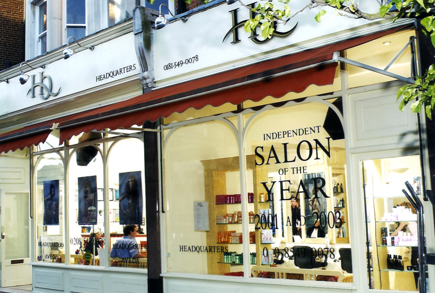
We’ve worked with premium, award winning hair salon Headquarters on many projects over the years, and this month the team asked us to create an invite for its 15th birthday celebrations.

The salon is celebrating in style with bubbly, canapés, fashion designers and, of course, plenty of top notch hair. Not only that but HQ is using the party as the perfect excuse to show off its brand spanking new salon, which has had a birthday make over.

The salon's new interior

So, the invite for the birthday party needed to have the same luxury, celebratory look and feel. We chose to keep the reverse clean and typographic, allowing the show-stopping image on the front the take centre stage.

We used Fedrigoni Splendorlux, a thin card with a gloss coating to the face and an uncoated finish on the reverse – an unusual mix of textures that gives it a high end, distinctive feel. It’s usually a paper for litho printing, but thankfully our clever printers were able to make it work on their digital press.

On another note, it’s not just Headquarters that is 15 years old; the logo is too! It’s not had any work done, and no, we don’t hold the key to the fountain of youth. We just understand branding, and what it takes to make a logo stand the test of time.


We don’t like to hark on about it (ahem) but it is true that by getting ‘to the point’ (sorry, we couldn’t resist) of your business, understanding your values and your audience, there’s no reason why you can’t have a logo that will last.

Wednesday, 31 July 2013

Hot off the press.


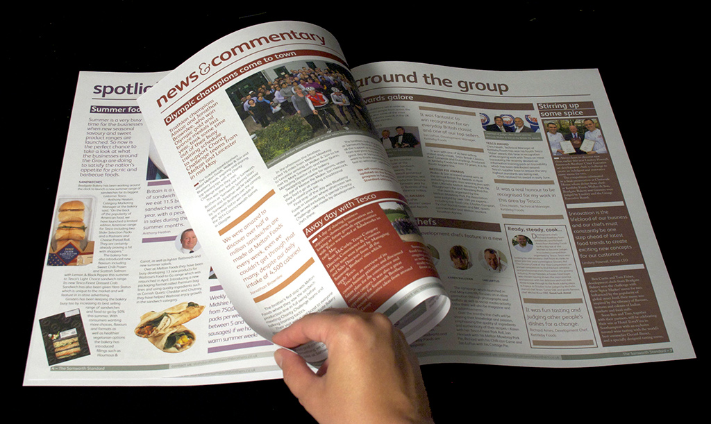
With all the sunshine we’ve had this month, drizzly May seems like a distant memory. However, some of you may remember that we mentioned our work with Samworth Brothers on the redesign of its internal newspaper, the Samworth Standard.

After some hard work by all involved, we are proud to announce that the first issue has been packed and posted to the 7,500+ Samworth Brothers employees; and we can finally give you a glimpse of the finished article.

As well as being the 70th Samworth Standard, this edition also celebrates the Samworth Brothers Charity Challenge, a company wide event that takes place over 2 weekends, where 300+ people compete in a gruelling ten hour course of hiking, canoeing, abseiling and biking all in the name of raising money for charity. To mark such an epic event, the team commissioned a 6pp roll fold in addition to the newspaper.


This event is entirely about people, not only those who put their bodies to the test, but also those who arrange the event and the charities who benefit. So we were all keen to make these people the focus by flooding the pages with the fantastic images from the 2 weekends and quotes from the charities. There were plenty of facts about the event itself, over £327,000 was raised and over 1000 Ginsters pasties and slices served to the hungry competitors!
We worked closely with our print partners to ensure the safe delivery of The Standard to various homes and sites across the UK.


The finished result is an engaging, bright and friendly internal newsletter that celebrates the individuals who make up one of the UK’s leaders in chilled foods. And, as a bonus, the team at Samworth Brothers have assured us that we will be expected to compete in the next Charity Challenge (gulp!). Although you know us, never ones to turn down a challenge…


Friday, 28 June 2013

Celebrating Excellence

The CIPR’s annual Excellence Awards recognise and reward the best in public relations and are the most prestigious in the PR calendar. The CIPR asked us to create a concept for this year’s awards that would not only reflect this prestige but also highlight the glamour and celebratory nature of the event.

We created a marque for the event by subtly implementing the ‘forward slash’ device that we’ve used in recent CIPR collateral in to the ‘X’ in ‘excellence’. The angular type creates a bespoke, progressive identity whilst the gold, black and white colour palette provides the element of glamour and celebration.


We carried the look and feel through to all supporting print and digital collateral including call for entries postcards and web banners, the event invite, programme, guest list, and certificates.

The programme in action - image courtesy of www.TheDigitalAssestLab.com


The CIPR was delighted with our efforts, and Sarah Ion, CIPR’s Marketing Manager said:

"We wanted to create a new look and feel that reflected the strengths and prestige of our industry leading awards. We are delighted with the results and now have a strong identity that is distinguished from other communications awards and will work for us in years to come."

More than 800 guests gathered at the London Hilton on Park Lane this month for the black-tie dinner and awards, which was compered by Matt Baker of The One Show and Blue Peter fame. The night was a great success, confirmed by our hangovers the following morning!

Friday, 31 May 2013

The skillet takes to feed Britain

Kettleby Foods, where the magic happens
New client Samworth Brothers, one of Britain’s leading producers of chilled foods providing everything from sandwiches to ready meals, has been keeping us busy this month. Each quarter the company produces an internal newsletter, The Samworth Standard, and sends a copy to the homes of each of the 7,500+ employees across 15 sites.

The Samworth Standard is sent to every employee, whether they’re in the heart of the production line, exploring flavours in the development kitchen or based at the Group Centre at Chetwode House. Therefore, we knew it needed to cater for not only the Group Chief Executive, but also a worker on the factory floor who might have English as a second language.
Chris the development chef cooking up a storm...
With these factors in mind, we've introduced colour-coded signposting at the top of each edition, which allows readers to easily navigate their way through the newsletter. We have also introduced the pie-dea (sorry, we couldn’t resist!) of quotes and pullouts to help draw the reader to a key piece of information.

With 100 years of history comes a business rich community spirit, which we knew was important to bring out in The Samworth Standard. We’ve kept the layout very people focused, introducing lots of imagery and interspersing articles with cut out photographs to soften the layout and make it more personable.

After all this thinking about the 7,500 members of the Samworth Brothers family, it was time for Katie to meet them...well some of them!

Then the team take Chris's recipes and turn them into food for the masses
“I made the trip up to Melton Mowbray, along with Emma Foster, the Standard's new copywriter, for a tour of Kettleby Foods, which specialises in ready meals for Tesco. I’d been debriefed that I had to be fully make-up free, and would be required to wear an oh-so-attractive hair net (thankfully I have inner beauty…and no pictures are allowed from inside the site!).

As part of the tour, we met the talented development chefs who are responsible for both creating exciting new dishes and improving the classics. Their inspiration for a new dish can come from anywhere, from a surge in popularity for traditional cuts of meat like beef cheeks, to dishes they find on a global fact finding mission.
Finally it all gets packed and shipped out!
Then it was time for a tour of the nine acre site to see how their recipes are turned into dishes to feed the masses. Contrary to what I've “learnt” from the classic film Chicken Run, each meal is made from scratch with everything marinated, minced, mashed, prepped and packed on site. Not a stretchy arm or Mrs. Tweedy in sight! The team can get through around 50 tonnes of mashed potato and more than a blue whale’s weight in beef a week (that’s 160 tonnes just in case your whale knowledge isn’t up to scratch)!

My eyes have been opened to what goes into each ready meal (both effort and ingredients) and could talk for hours about it, just ask the team here! It’s given me a real insight into Samworth Brothers, which will be invaluable moving forward.”


An exchange of ideas


London-based foreign exchange specialist FC Exchange asked us for help to create a national ad campaign for both corporate and private clients to increase awareness of its offer and expertise in a crowded market. The campaign, running in a number of broadsheets, including The Times, The Daily Telegraph and The Sunday Times as well as a number of consumer lifestyle magazines, launched this month.

As well as increasing brand awareness and developing a campaign that reflected its offer of a fast, easy and secure service, FC Exchange also wanted to differentiate itself from the people focused approach used by its competitors. We retained personalisation by introducing quotes from FC Exchange’s staff and its financial director to highlight the benefits of the service.


We created two campaign headlines to differentiate the private and corporate offers. For corporate audiences we focused on services with the copyline, ‘make your money go further, faster’, and reinforced this messaging with the graphic arrow device from the company’s logo to create an iconic look and feel. We used the same device for private clients but introduced the new copyline, ‘why not save £9,332 on your currency transfers?’, focusing on the money customers can save over using a bank. This was backed up by market research, with new ads updated with the latest figures from ongoing research, the latest being in May.

We tailored the messaging further depending on the sector and publication, whilst the orange, grey and white colour palette provides visual intrigue and works across both corporate and private client audiences to build brand recognition and cross sell the business.

FC Exchange received a positive response to the first ads, which generated several good quality leads as well as some new corporate customers. These results highlighted to the company that less is more, and that a clean, simple message allows the reader to focus on the elements that matter most.

Tuesday, 30 April 2013

SeaBird R&A explores design shift


SeaBird Exploration, a global provider of marine seismic data for the oil and gas industry approached us to design its 2012 Annual Report. The brief to take the report to the next level was a welcome challenge. The client wanted a style and layout for the report that would provide a more contemporary look and feel, whilst ensuring it was professional, impactful, easy to navigate and a clear reflection of the SeaBird brand. We could also see there was scope to develop an enhanced visual language that could be applied across other materials. This would help to elevate the brand in tandem with improved market conditions and its positioning within the sector.


As a starting point, we wanted to create something that captured the essence of the brand. We adapted the seismic graphic device from the logo to capture this character on the front cover and then carried this device through the rest of the report to provide a consistent brand feel and visual interest. We created a main colour palette of grey and white, with bursts of yellow and blue providing more intense dashes of colour to draw the audience’s attention to the positive messages of growth and success, supported by key facts and figures. The use of grey and white allowed the mix of black and white and full colour photography to feel more unified and stand out against a neutral base.


We had a pretty tight timeframe for this so it was all hands on deck to turn it around, but with Sundays as working days in Dubai and the four hour time difference, we were able to meet every critical deadline.

See the full Report and Accounts as a PDF page turner here.

The personality of a brand


Last month was our turn to host the latest G7 event, a networking forum for the property, design and construction sectors. At each event, the hosts give a short presentation about an industry topic to encourage some lively debate, over a glass (or several) of wine.

We chose leading real estate company CBRE’s headquarters in Henrietta Street for the event. Not only is it a great entertaining space but it was also the perfect way for us to show off the interior environment work, including wayfinding, wall and window graphics and experiential digital graphics, we had created for its offices...which leads us nicely onto the topic of our presentation.

Taking a tongue-in-cheek look at brand personality - what it is, the importance of carrying it across all touchpoints, including the office environment and how we’ve done just that for clients - we challenged guests to a game of celebrity ‘Guess Who’. Based on a list of personality attributes, such as ‘impeccably dressed, stylish and proud to be British’ for one and ‘thought provoking, contemporary cool and quirky’ for another, we asked guests to guess the four personalities.

To show how we have bought personality to our clients’ environments/interiors, we then linked each personality and their attributes to one of our clients, with CBRE as James Bond going down very well with COO Martin Lewis.


We used Dawn French, whose attributes included ‘cheeky, light-hearted and energetic’ to represent Newsprinters, whilst Brian Cox was perfect to showcase the creativity we’d brought to The Francis Crick Institute, as he’s ‘approachable, young’ and ‘making science fun.’ Finally, Damien Hirst was ‘thought provoking, cool and quirky’ to reflect the work we did for Yahoo!’s Swiss headquarters.

Although intentionally light hearted, we did have a serious message behind our talk, in that design does have a major impact on people’s experience of an environment, the perception that it gives and the impression it can create.

See our presentation here and if you need any help expressing your brand personality or with your workplace environments, do let us know.

Thursday, 28 March 2013

Growing our own stories


Having created the identity for the Engineering & Physical Sciences Research Council’s (EPSRC) Growth campaign last year, we’ve designed a range of marketing materials, both print and digital, to promote the campaign, including an iPad/iPhone app, microsite, concertina brochure and A5 postcards.


The aim of the Growth Stories campaign is to highlight the ways in which the EPSRC is promoting economic growth within the UK through its funding of research projects to as wide an audience as possible. These stories range from an award winning, wireless heartbeat monitor for premature babies to the invention of new, flexible organic solar panels.

To bring the stories to life across the different media and grab people’s attention, we used large, bright and colourful photography that represented each story whilst short, snappy copy explained the background to each story. Each image is featured in all its hi res glory on the custom designed and built iPad/iPhone app, which takes advantage of its ‘retina' screen. We also designed a promotional microsite to showcase these stories to a wider audience through editorial and social media. This ensured the content is accessible to everyone, whether viewed on a mobile, tablet or desktop.

EPSRC used its stand at The Big Bang Fair in London this month to create interest in the app and website, with a pocket sized concertina brochure featuring some of the stories and A5 teaser postcards given to school children. The app and website were launched a few days later with the first batch of 20 stories and a further story will be added each week for the rest of the year.

EPSRC was delighted with the app, and Communications Manager Gemma Hulkes had this to say:

"We worked with TTP to create EPSRC’s first app, the contributions from them were invaluable and it was great to have their digital communications knowledge and expertise."

You can get hold of the free 'GrowthStories' app for both iPhone and iPad from the App Store. You can also see some of these stories on the custom microsite created to promote the app: www.epsrc.ac.uk/growth/ - look out for new stories being added each week throughout the year.