Tuesday, 28 February 2012

Where the past meets the present


www.palazzodorottya.com

Back in July last year we featured a short story on our e-news about the branding and marketing tools – website, iPad tool and sales literature – we were creating for Palazzo Dorottya, a luxury residential and commercial building in the heart of Budapest.

After a lot of hard work (and unfortunately, only the one trip out to Budapest) the project is now complete, and we, not to mention, Richardsons Capital LLP and Fingen, the joint developers and property owners, are thrilled with the results. This has been a great project to flex both our digital and creative muscles and it's a great one to add to both our digital and property portfolio.

A grand, historic 19th century building, Palazzo Dorottya has been transformed into a premium six storey mixed use development, combining 87 apartments with commercial and retail space.

We wanted to communicate that Palazzo Dorottya is a sophisticated destination for living, working and entertaining, whilst conveying harmony between classic and modern. We created the strapline ‘where the past meets the present’ and developed the logo, giving it a typographic treatment by using two fonts to reinforce the juxtaposition of old and new.

This combination of past and present was also reflected in the marketing materials we developed. The innovative website includes a homepage featuring scaling and full screen images, a distinctive image gallery, along with a custom designed interactive map of the area. Individual floorplans are available as both zoomable images and downloadable PDFs. The site has also been optimised to work well on smart phones or tablets and is easy for the sales team in Budapest to update.

Alongside this, we developed an iPad tool to help facilitate sales. There were several issues to overcome when creating this as it needed to be fairly quick to develop with no constant bug-testing or waiting on App Store approval. It also needed to be relatively simple to keep up-to-date and easy to use.

As iPad Apps and CMS are expensive and time consuming to create, we came up with an innovative, cost effective tool (essentially a supercharged interactive PDF). This enables the sales force to show potential clients all the relevant property information if there is no Wi-Fi connection, and allows them to access the website to show real time availability and pricing when an internet connection is available.

If you'd like to find out more about the various solutions we can create for you regarding Apps or presentations on the iPad (or other tablets) - talk to our Head of Digital, Ben Jackson to find out more.


To complement the website and iPad tool, we created a luxury wallet, informative brochure, and floorplan inserts for each of the 87 apartments. We specified a high quality digital print solution for these inserts, which enabled the client to call off shorter runs, printing floorplans only when needed to tailor presentations for specific client needs, as well as reducing the environmental impact associated with printing.

Constructing a brand

One of the UK’s top project management and construction companies, Warwick Avenue, asked us to refresh its current identity to reflect the next stage of its development.

The company has expanded from its core business of project management to provide highly integrated services covering the full property and construction life cycle, across Europe and the Middle East, and needed its identity to reflect the breadth of its services as well as conveying experience and professionalism.

We put together a number of creative concepts, looking at the possibility of retaining the existing cross device as well as a number of completely different routes. We also considered ways of reflecting the construction industry within the logo itself.

The chosen route retains the cross device, but replaces the flat red colour with two shades of orange to give it more depth and energy. The orange provides an interesting juxtaposition against the grey of ‘Warwick Avenue’ whilst the ‘L’ of each side of the cross shape not only implies a positive working relationship between Warwick Avenue and its clients but also alludes to the idea of walls and rooms.

The addition of a strapline ‘Projects and Construction’ completes the logo and conveys Warwick Avenue’s sector and experience to potential customers.

We are also redesigning the website, producing a corporate brochure, a range of stationery and PowerPoint templates for Warwick Avenue, all of which are currently in progress. Once complete. these will feature in a forthcoming e-news story, so watch this space.

Finally, Warwick Avenue found us through a Google search, having looked for digital agencies located in SE1, so it’s a nice example to show that our SEO is working. If you want to find out more about SEO and how we can help you to stand out then please contact Ben Jackson, our head of digital.

As easy as PIE

the new PIE identity

PIE is a specialist mapping data and routing business, supplying industry-leading mapping and routing products for local authorities and freight operators. It also provides up-to-the-minute mapping datasets and downloads for freight routing and software manufacturers.

PIE has developed the data for the new TFL Freight Journey Planner for the Olympics (due to go live in March) and saw this as an ideal opportunity to promote the service and related products more widely.

Originally, PIE approached us to develop the naming and logo for this service, however, the project quickly developed into a full brand evaluation of the group. The existing logo lacked dynamism, was overly complex and was used inconsistently across the various sub brands both in print and digital applications.

original PIE identity

Having undertaken an audit of the brand hierarchy and business structure, we recommended that all of the businesses were brought under one comprehensive brand identity and developed a clear structure for the company.

The PIE company structure

Furthermore, we advised dropping the original and longer full name, Public Information Exchange and wholly adapting the recognised short version - PIE. Dropping ‘Public Information Exchange’ removed the impression that PIE was a public sector organisation, whilst the new strapline ‘the source of insightful mapping’ clearly conveys PIE’s offering to existing and potential customers.
We came up with a number of ideas for the logo, that ranged from corporate to quirky, before deciding on a logo that was an evolution from the existing brand look and feel, but more representative of the service offer. We used a location peg as a recognisable icon in a bold purple, whilst the diagonal text of PIE added intrigue and an element of quirkiness.


We also produced simple brand guidelines, which along with a rationale and diagram of the four core services, have helped bring some much needed coherence to the brand.

page from the PIE identity guidelines

Having established the new identity, we’re now in the process of designing the look and feel for the website and microsites which, once complete, will feature in a forthcoming blog, so watch this space.

Monday, 27 February 2012

Size does matter

Last month’s proof marks guide proved very popular, so hopefully this month’s guide to paper sizes, scaling and usage will be just as helpful.

Almost everyone is familiar with the standard A4, A3 etc sizes of paper (well, except for North America which is resolutely sticking to imperial measurements).

This ISO A series of paper uses the metric system, with all sizes based on a height-to-width ratio of the square root of 2, where the base format is A0, a sheet of paper measuring 1m² in area. Successive paper sizes in the series A1, A2, A3, A4, A5, A6, A7 and A8, are all half the size of the preceding paper size.

Unsurprisingly, the most frequently used paper size is A4 (210 × 297 mm). The B and C series are far less common than the A, with B slightly larger than A and mainly used for posters and books, whilst the C series is generally used for envelopes and folders.

A series usage:
    • A3: typically used for drawings, diagrams and large tables.
    • A4: usually used for general and business stationery, brochures, booklets etc.
    • A5: commonly used for smaller items such as leaflets/flyers etc.
    • A6: international postcard size.
    • A7: labels etc.
    • A8: business cards
    Download our handy paper size guide here (PDF)

    Tuesday, 31 January 2012

    To infinity and beyond!

    We've just won a four-way tender to produce the guidelines for the UK Space Agency, to help create a strong, recognisable brand, that has consistency and an authoritative voice.

    Space is an essential part of all our everyday lives and one of the key enablers of the global economy. The UK Space Agency were looking for a design partner with whom to design and compile full brand guidelines, to ensure brand protection and create consistency across all of their materials, whilst at the same time enabling them to evoke more of a personality across their deliverables.

    The guidelines will be versatile enough to work across a wide range of media and will meet the needs of their various individual audiences. As such, we will be developing and enhancing the existing interim guidelines, providing a toolkit that ensures communications are consistent, creative and engaging. We're really excited about getting started and this will be another science related identity project to add to our portfolio.

    Mark my words

    TTP's Top Tips – January

    Welcome to the first of our monthly top tips column. Each month we’ll be looking at an industry related topic, trend or simply sharing something that we’ve found interesting.

    And to kick us off we’re taking a quick look at the most commonly used proofreading marks and what they mean.

    Proof marks are globally recognised symbols and squiggles that are used when correcting draft documents and typeset pages. It’s a way of making what can be a painful process far simpler and efficient, helping to improve consistency and miscommunication.

    Although proof marks aren’t as widely used as they once were, they are still useful tools whether marking corrections on paper or electronically, and you never know when you might need them.

    Download our proof marks guide here (PDF)

    Monday, 30 January 2012

    Bringing Informa’s knowledge to life

    We have started work on a corporate video for Informa, the global academic, publishing and exhibition providers, combining illustrations, animations and live footage.

    This is a really exciting project and is going to be a combined team effort, utilising our skills as illustrators, animators, scriptwriters and editors. Our first video shoot was of Lloyd’s List – a core part of Informa’s business and the world’s oldest, continuously running daily newspaper – coming off the printing press.

    Informa is a dynamic, rapidly changing company, with the ethos of ‘bringing knowledge to life’. We’ve been asked to create a short, snappy, dynamic video that reflects Infoma’s history, what the company is today and conveys the sectors in which they are active whilst being engaging, quirky and clever. Phew, just a simple job then!

    Building the foundations for charitable giving

    CAF is a charity dedicated to finding the most effective and efficient ways to connect donors to the causes that matter to them and for money to get where it’s needed.

    We’ve been tasked with coming up with creative concepts and an engaging, inspiring brochure design that also conveys knowledge and trust, helping to raise awareness of the full range of services CAF offers to companies regarding their corporate community investment and social responsibility planning.

    We’ll keep you updated on this challenging project and will share the concepts and final designs in an e-news story once they’re complete, so watch this space. If you want to find out more about CAF and their services visit https://www.cafonline.org/

    Thursday, 15 December 2011

    A year in words

    A custom word-cloud we've made from key news events of the year (click to view larger)

    The top 10 words and phrases of 2011 include ‘occupy’, ‘Arab Spring’ and ‘Steve Jobs’, although given the industry we’re in, we can only claim to have links with the latter. Not quite in the same intellectual vein - given that Charlie Sheen comes in at number four - we’ve also looked at Facebook’s top 10 global topics. However, it is quite an interesting mix of the historic and the banal, ‘military operations begin in Libya’ versus ‘Call of Duty” being a case in point.

    Facebook - top 10 global topics (click to view larger)

    To find out what words would be in our top 10 over the year we created word clouds from our e-news stories and blogs throughout the year, with ‘Society’, ‘print’ ‘website’, ‘new’, ‘business’, ‘digital’ and ‘brand’ coming out on top. This links in very nicely when we look back at the projects we’ve worked on over the last year, as there has been an interesting mix of digital and print based work.

    a custom word cloud from all of our 2011 blog posts (click to view larger)

    Our digital services have definitely grown this year, and we’ve designed and created a number of websites for clients including e-Front (naming and producing new site Pevara), Montagu and CLS. However, the branding side of the business has remained strong, and we’ve created new identities for Clip and Ping, Optalis and The Physiological Society, amongst others. We’ve also become very much involved in the science sector, working with EPSRC, BBSRC, Bloodhound and The Technology Partnership as well as Optalis and The Physiological Society as above.

    Property projects have also been successful for us this year, having worked with Carillion Richardson on the branding for St Martin’s Quarter in Worcester as well as Palazzo Dorottya in Budapest. The internal office graphics at CBRE’s headquarters also provided us with a fantastic opportunity to expand our expertise in experimental branding with the iColour tiles piece.

    It's all doom and gloom for 2012 according to the news, however, it’s not all bad news here at TTP. Yes of course, the continuing difficult economy has had an impact and we have seen repeat work from old clients taper off as the downturn continues, but what is refreshing is that we’ve gained a number of new clients, either those coming to us direct or from introductions or recommendations, which shows we’re doing something right!

    We have plenty of prospects for 2012 bubbling under and we’re looking forward to working on a number of projects, both digital and print, with new clients including Yahoo in Switzerland, YahSat in Abu Dhabi, Informa and PIE in London (and no, it’s not the apple variety).

    Merry Christmas and wishing you a happy and successful New Year from all of us at tothepoint.

    Tangram Teaser


    With the Olympic games coming to London next year, giving our 2012 calendar a sporting theme was a natural choice. As the Games make the journey from Beijing to London, we thought we’d be clever and link them (and our calendar) to another game that travelled the same journey, albeit hundreds of years ago.

    The tangram originated in ancient China before reaching America and England through trade in the early 1800s. To play a Tangram, you simply arrange the seven pieces – five triangles of varying sizes, a square and a rhomboid – without overlap, to exactly reproduce the given image. Sounds easy, doesn’t it? Believe us, it isn’t. We needed a number of attempts to produce recognisable Olympic sports. If you don't receive your calendar or know someone who would like one, let us know as we always have a few spare.

    Continuing the theme, our Christmas card also features a tangram in the shape of a tree, which thankfully, was much easier to create. We'd love you to punch out the pieces and create your own symbols/icons and send the pictures to tangram@tothepoint.co.uk. We'll send a real tangram puzzle to the best ones.


    We've also created a little screensaver just for christmas and inspired by the 12 tangram illustrations we've used on our calendar, you can download it (for Mac or PC) here.


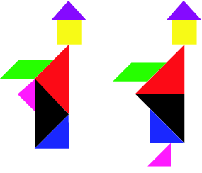
    Finally, an odd, and intriguing aspect of the tangram is the phenomenon of paradoxes. A tangram paradox exists where two puzzle configurations are almost the same, yet a part in one magically ‘disappears’ in the other version. One of the most famous examples is the Dudeney paradox featuring two monks, where on one version the figure is a complete person and on the second version, the figure appears to lose its foot. Have a look at this head-scratcher here and see if you can solve it.