Friday, 28 February 2014

Round up, round up!

Letter Impressed 

This week Katie paid a visit to the Fedrigoni Imaginative Papers Studio for a talk on the history of printing, and a very rousing game of letterpress scrabble (for Katie maintains holding the top score for sometime). The Triple Word Score event was kicked off with a talk by Brooke Palmieri, book historian extraordinaire, who took the group through the history of printing. From the project that bankrupted the “Father of Printing” to the Broadside Ballads (Brooke used the story of a Whale, a strange and miraculous fish, washed up in Ipswich!) that made the printers their real money during that time, Katie left the event feeling much wiser on the whole subject. Although sadly did not win the Scrabble set we had our hearts set on…

Installation of the moment(um)

The latest interactive installation has arrived at the Barbican, the United Visual Artists (UVA) have launched Momentum in the Barbican's unique space of the Curve. Random International’s Rain Room from earlier in 2013 is a hard act to follow, but if anyone can it’s UVA, who have worked with Massive Attack in the past and have created installations across the world.

Legography

This month we stumbled across the delightful Legography by photographer Andrew Whyte, in which he documents the day-to-day activities of his Lego sidekick. It’s a lovely bit of lighthearted fun next time you have a lunchbreak to spare!


Capturing the commute

In celebration of the Tube’s 150th birthday, photographer Brendan Doherty has captured the London Underground commuters, snapping 150 commuters across 150 Tube stations. The exhibition location is set to be confirmed by Camden Collective, however a sneak peak can be seen here. We can confirm that none of us look that photo-ready (or cheerful) on our commute into the office!

Social Secrets

There's a new kid on the Social Media block and this one's all about secrecy (named secret.ly, naturally). While Facebook insists on real names (or at least tries to) this network is the complete opposite - everyone's anonymous. Of course this tends to encourage rather salacious posts - some truthful, many probably completely made up. Whether this becomes a new force in anonymous gossip and whistle-blowing or just another vehicle for trolls and cyber-bullying has yet to be seen. Read more about it here.

Good enough to eat

Who knew a Mondrian piece could look (and be) good enough too eat. No, we’re not a few Pollocks short of a picnic, the Art Fund has launched a new fundraising initiative aimed at art-lovers and keen-bakers to help raise money for UK galleries and museums. Our client Samworth Brothers (one of the UK’s leading chilled food manufactures) would be a dab hand at this…

Blazing through the night

We all know the roads of Central London can be a dangerous beast, from buses and cabbies to pedestrians that wander out aimlessly! However, a shining ray of protective light has come in the form of Brighton graduate Emily Brooke, who has produced the Blaze bike light, which beams the image of a bike onto the road about 5-6 metres ahead of you. Emily started the project a few years ago, gaining funding on Kickstarter and it’s now out there holding its own.

Tea and Cat
Katie has been eagerly awaiting the opening of this little gem, and the day is finally here. Lady Dinah's Cat Emporium is London's first ever cat cafe and is open as of the 1st of March. You can get a cup of tea, gluten free cake and a side of tabby cat to pet. 

New depths of design

Here at tothepoint we’re not afraid to offer our opinion, so when Rockpool originally came to us to work on the design of a folder, we offered up our challenges not only to the brief but the brand itself.

With such an impressive history (founders include one of the City’s first “superwomen”, Nicola Horlick) and two arms to the business; Rockpool Investments and Rockpool Network, we could see great potential for the identity and the brand. With an office move imminent, the team at Rockpool decided to seize the opportunity to undergo our proposed brand refresh.


We put forward a budget to look at a series of concepts to help enhance and build the brand. However, if none of these were liked or used no fees would be charged. This approach (in a non-group tender situation) created an opportunity for a bigger project for us, and a no risk undertaking for our new client.

Our first concern was the logo and its legibility. Tints of grey, intended to mimic foil blocking, were over complicating the logo and hindering legibility. At the same time the quirky little device used to reflect water on the 'O' was too subtle at small sizes.


Once the issues were identified it was time to set to work on their solutions. The ripple in the ‘O’ was something the client and we were keen to maintain, by simplifying the device we were able to make it work better at smaller sizes. The letter ‘O’ was evolved to become an icon in itself, representing the water element of the brand, and the indepth research they undertake to find investment opportunities.

Rockpool are so named due to their ability to find undiscovered investment opportunities (less so because of memories of youthful summers spent rockpooling in the hope of finding crabs…), but we liked the analogy and proposed 'finding the opportunity' as their new strapline. This integrates the new 'O' symbol, which is also used with other key words like 'NETWORK'.


Rockpool have now settled into their new office, so the new identity is being rolled out across stationery, the folder (we didn’t forget about the original brief!) and other materials. We’re working on a series of symbols, for both areas of the business, to add to their toolkit, which will help build the unique and striking visual language that will help Rockpool stand out in their crowded marketplace.

Our main goal is always to produce something our clients are going to love (isn’t that everyone’s goal?), but what sets us apart is our willingness to challenge something if we can see a more effective solution for their brand, and a better way to allow our clients to take ownership of it. Our 20+ years of experience is what stands us in good stead when we do challenge a brief, but we like to think of it as a partnership approach.


Elizabeth Orbell , Marketing Director at Rockpool said “tothepoint developed a simple but effective new design style for us. Our unique and contemporary identity takes Rockpool’s branding beyond being just a logo and, importantly, reflects our position in the marketplace.”

Thursday, 30 January 2014

New Year, New Capital

We’ve been working with EFG Asset Management (EFGAM) for a number of years now and across a variety of projects, from their monthly and quarterly thought leadership publications to stationery and presentation materials. So when EFGAM approached us to create a new logo and website for its newly launched New Capital Funds division, we couldn’t wait to get started.


New Capital focuses on high conviction investments and requires a deeper understanding of targeted, rather than speculative, investment, with this insight at the core of its business. It was essential that the identity reflected the strong research, data analysis and insight that inform the selection of each investment, and which sets this fund apart.

The identity reflects the data charts that will often be used within their research; this coupled with the core of the C being picked out subtly suggests that their research is at the core of their investments.


The identity is reflected in the infographics used across the brand, and the colour palette is also taken directly from it. The team was also keen to look towards Invest Plus, the quarterly magazine we produce for EFG Asset Management, for inspiration when it came to the look and feel of New Capital. Strong typography, pullouts of key data and images of the fund managers overlaid with dynamic cityscapes, have been developed to give New Capital its strong visual appearance.


This was then carried through to the website, where the fund managers feature prominently, helping to position New Capital as experts in the field. We worked closely in collaboration with EFG’s incumbent web development company ‘Embrace’ in order to create wireframes for all required templates (bearing in mind the strong look we wanted to achieve and also keeping mobile users in mind).

During the course of the branding and website process, various pieces of print work have also been produced for the brand, including business cards, agenda card and wrap for Citywire, an investment specific publication. It’s been an exciting project to work on, and we hope to be able to show you more work for New Capital soon.

You can see the new website here: www.newcapitalfunds.com

New News!

CES pit

Gadget fans were in tech heaven earlier this month as the annual CES show unveiled the latest round of gadgets and innovations headed our way this year. Although most attendees seem to think this was the best show yet - showing innovations that will change our life across the board, others were less convinced. And when you see some of the ideas on offer you can start to see why. For instance, a helmet that tells you how hard you were punched!? However, many will consider the ability to 3D-print your own chocolate bars does make all this worth while. 


Have you heard about Dangerdust?

An anonymous duo at Ohio’s Columbus College of Art and Design have been working undercover of darkness to transform their college chalk boards into inspirational works of art. Known only as Dangerdust, the pair have been using the unusual canvas as an escape from their class assignments since September last year. Since then their work has exploded onto the digital scene, if you look at only one thing this month, make it this!

Read more: Creative Review

Help, my fridge is full of spam!

The long talked about 'internet of things' could finally start to become a reality this year with more connected devices coming onto the market than ever before. We're used to our phones and computers being permanently connected to the world and more 'smart' TVs are now joining the party. Other items such as fridges (that can re-order milk for you before you even knew you'd run low) washing machines and other household goods are becoming internet enabled too - it's a brave new world! However there are downsides to this internet-centric future, as The Guardian recently noted. Internet connected fridges were discovered to be sending out huge quantities of spam and phishing emails over Christmas - and not just fridges, but all manner of other devices too... 

Read more: The Guardian

Tiny appetites

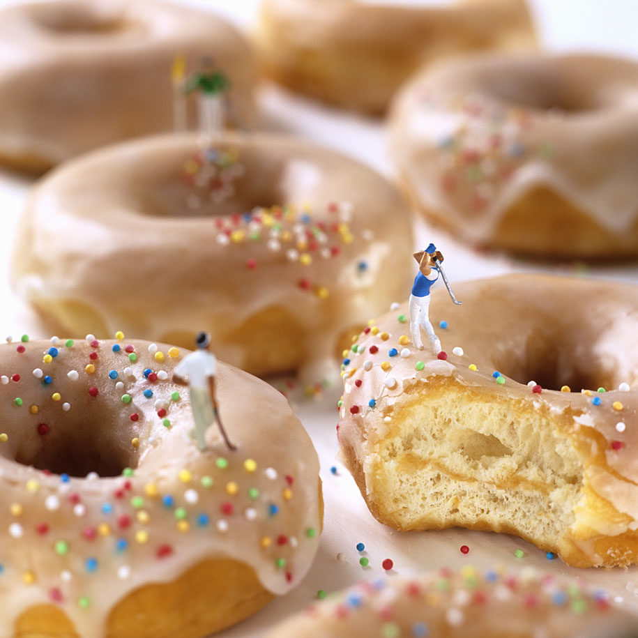
“Who hasn’t dreamt of driving through chocolate mousse? Or skiing down a slope of Chantilly cream?” Minimiam is the ingenious work of Akiko Ida and Pierre Lavelle, two French photographers who have been playfully pairing model train figurines with pastries, fruits, vegetables and other foods for several years. Don’t be fooled though, the figurines often take on more serious issues such as global warming whilst they ice skate in pastry dishes.


iWonder what the BBC will do next

Good old Auntie Beeb, a national treasure. So when they pull out something new we can’t help but talk about it, and iWonder; the new digital learning platform, is no exception. The platform combines archived and original content to unlock the learning potential of all BBC content. iWonder kicks off with a set of guides about World War One, which coincides with the start of its WW1 programme series.

Read more: Creative Review

Fireworks at night are so 2013 

Black Ceremony is the work of artist Cai Guo-Qiang, his love of exploring gunpowder in his drawings eventually developed into the outstanding explosive displays that have become his signature. It’s just a little something to brighten your day (excuse the pun).


Remember when Facebook was cool? 

There's long been a rumour that whilst Facebook still boasts millions of active users (and is by far the most widely used social network) there's been a steady decline of teenagers using the service. According to most recent studies, this is definitely a concern, with a huge drop in users early 2013. This drop-off levelled out somewhat later in the year, but the trend is still downwards with 'young people' moving to more focussed messaging services such as Snapchat.

Read more: Mashable

A little encouragement…

It might be a little late in the day for this, but we believe in you! You can keep that healthy eating New Year’s resolution! To help you along the way here are 22 simple ways to start eating healthier. If you’re like us and have gone too far past the resolution to turn back now, never mind, it’s the thought that counts.

Where we’re going we don’t need roads

My friends, we are one step closer to Hover Boards, as a team of three Japanese engineers have unveiled an ambitious device that uses sound waves to move objects through three dimensional space. Not only is that an incredible scientific breakthrough, but “the dream” could be a year ahead of schedule.

Read more: This Is Colossal

In our rear-view mirror


2014 has sprung into life and the studio is as busy as ever, with plenty of exciting projects from clients old and new. However, as we keep up the hard work, and our New Year's resolutions slip a little further, we thought we’d take a moment to reflect on some of the work of 2013.


January 
The fruits of our labour
It's always satisfying seeing our work come to life, especially at the start of the year, and the fruits of our labour were there for all to see at St Martin's Quarter in Worcester when the latest signage was put in place. This was the final pieces of the puzzle for this project, where we worked on everything from naming, branding, literature, website and the lovely signage.

February 
The concept of the cube
February saw us working on an exciting project on the other side of the world (the early morning Skype calls were less fun), developing the identity for a New Zealand start up, 'The Concept Cube', whilst helping with its first venture, a very delicious New Zealand 100% Blue Agave (which is a non-Mexican tequila for the uninitiated!).

March 
An innovative environment
It was in March that the BBSRC Fostering Innovation Awards 2013 took place in Millbank Tower, London. Guests were not only treated to spectacular views, but also to the striking branding and venue dressing that we created for the awards.


April
SeaBird R&A explore design shift
The R&A for SeaBird Exploration, a leading provider of marine seismic data was released in April. We enhanced the design and created a report that more effectively communicates SeaBird's improved performance in this specialist sector. We went on to work on a number of other projects for them, and the 2013 Annual Report is also just around the corner.

May
An exchange of ideas
May saw our work in the national press, as we created a national broadsheet ad campaign for foreign exchange and international payments specialist FC Exchange, developing an iconic look and feel, reinforced by direct, bullish messaging to help the company differentiate itself in a competitive market.

June
Celebrating excellence
We've been helping the CIPR add a touch of glamour to its annual Excellence Awards for a number of years now. In 2013 we created a sophisticated and celebratory event identity along with supporting print and digital collateral, which all came to life on the awards night in June. Work for this year’s award is already underway.

July
Hot off the press
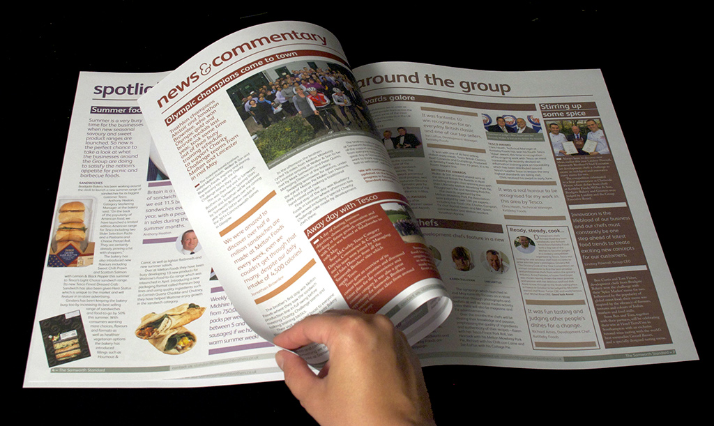
July marked the first issue of the redesigned Samworth Standard – an internal newspaper for the huge chilled foods producer. Since then we’ve produced 2 further issues and are currently working on the fourth issue, which hits the doormats of over 8,000 employees.

August
Long time coming
In August we welcomed our designer Sarah Long into the warm embrace of tothepoint. Sarah wasted no time in making her mark on the design team, helping hairdressing salon Headquarters to celebrate its 15th birthday with an invite for the big birthday bash. And yes, that is our logo that the salon is still sporting 15 years later, and it's looking as youthful as ever!

September
Going digital
Recognising that the digital landscape is constantly changing, we launched a new digital arm of tothepoint in September, to focus solely on digital design and communications. The site, www.ttpdigital.com, showcases our experience and expertise in this area, plus there's a dedicated blog where we share our opinions on all things digital.


October
All Change!
We finally unveiled the evolved Croydon Business Improvement District (BID) logo, loyalty card scheme 'Check Out Croydon' and website in October. Although it had only been live for a couple of weeks, the new website achieved an increase of over 3300% more site visitors since launch! Since then we’ve been working on their town centre banners and window graphics, and there’s plenty more projects coming up.

November
Putting on a show
On the 26th November Ben and Simon were released from their shackles to man our stand at The Public Relations Show 2013 and challenge people to a game of 'I Shot the Serif'! Not only did we exhibit at the event, but we also developed the branding and much of the collateral for it. The day was a huge success, with over 1,000 visitors and the event itself trending on Twitter in London.

December
A year to view
Drum roll please... The 2014 tothepoint calendar is here! With all things digital seeming to be favoured by today's Tweeters, bloggers and Facebook disciples, we're always surprised (and flattered) that our printed calendar has remained so popular. This year's calendar is a visual expression of us. You can find out a little more and download your own copy here.

Thursday, 19 December 2013

Our 2014 Calendar

The reports of the “death of print” you may have heard have been greatly exaggerated, and the positive feedback we receive every year about our calendar support the fact that it is indeed alive and kicking.


As with any self-initiated project, our calendar is a labour of “love”, as we strive to think of a new concept that will top the one from the year before. We started by putting our heads together in the Autumn. Ideas ranged from the team dressing up in all manner of outfits, to a cocktail recipe for every month (what does that say about us?), however in the end our inspiration came from the ethos that we proudly live by: “Clear, concise communication”.


As they say, practice what you preach. This year we put that into action by creating a series of typographic illustrations that visually represent us, and what we bring to our work and your brand. To really tie each idea into our brand we stuck to our black and white colour palette, using a subtle grey pantone to pick out parts of the design and lift them from the black. We then turned to the print team at Scanplus to bring our design to life, as usual their work was fabulous!


Some of you may also recall that we went one step further and animated these illustrations for the video on our stand at the recent Public Relations Show 2013, just to prove that print and digital can live together in harmony.


The Clear, Concise Calendar is being shipped out, but if you don’t receive one do not fret, all is not lost! Drop us an email and we’ll do our best to put one in the post for you. There have been whispers of a series of limited edition prints for some of the illustrations, so keep an eye on our e-news as we’ll announce them there first.

You can also download a free copy of our calendar in PDF format here

Do let us know what you think - inspiring or a waste of time? Let us know!

Deck the halls with news...

Festive Knitting

Nothing says “Festive Season” more than the gift of socks, mulled wine and rather snazzy Christmas jumpers, and they don’t get much snazzier than those created by some very talented illustrators and “printed” on a hacked 80’s knitting machine.

That’s right, you can hack a knitting machine! As proved by Andrew Salomone, who is leading this festive venture in collaboration with Hoxton Squares KK Outlet gallery.

More info (Creative Review)


A word?

What words defined 2013? For the Oxford English Dictionary, the word they chose was 'Selfie' - not exactly highbrow, this refers to the act of taking a quick narcissistic snap of yourself via your camera phone (usually accompanied by everyone's favourite 'duck face' expression).  Whereas, the Collins Dictionary chose the slightly less shallow word 'Geek' as their word of 2013. For our money, Dictionary.com chose 'Privacy' as their word of the year – and we think they nailed it.

And if we're not happy with those words, how about the words we were all searching for this year? According to Google, this is the top 10 list of searches over 2013:
  • Paul Walker
  • Boston Marathon Bombing
  • Nelson Mandela
  • Cory Monteith
  • iPhone 5s
  • Government Shutdown
  • James Gandolfini
  • Harlem Shake
  • Royal Baby
  • Adrian Peterson

They've even created a video that represents their view of 2013, check it out here...
More info: Google Zeitgeirst 2013


Don't forget the fun!

Did we mention that we've created a little memory game just for Christmas? If you haven't already tried it yet, do give it a go and test those brain cells of yours. There's even an HTML5 version specially for you iPad owners...

» play the Christmas Memory Game!

But if you REALLY want to give the brain a stress-test, our colleagues at The Cyber Security Challenge have concocted their own Xmas brain teaser, but be warned, you'll need tip-top code breaking skills to crack it!

The Cyber Security Challenge sets these competitions throughout the year to find young talented code breakers and introduce them to the world of Cyber Security. When you see some of the sponsors of this charity initiative you can see why they're hunting for them. We thought we'd share the challenge and see if any of you are up to the task. Follow the link below to try it out and find out more about this great initiative.


Read all about it!

This month the Independent revealed its new design, which was the result of a 3-month long process with their inhouse team and designer Matt Willey.

The Independent has changed its guise several times over the last few years with each change of editor or milestone it reaches, however this iteration of the British staple offers a much cleaner layout and differentiates it from its sister publication, i.

It’s clear from the finished product that the team were looking to create something with a more confident, sophisticated aesthetic, and this new look seems to offer clarity on the paper’s position as a compact broadsheet rather than a tabloid.

We think the use of typography and Dan Williams’ illustrations are lovely, and the clear, concise layout is of course a big hit with us!


Mmmulled drinks

As the weather gets colder and Christmas draws in, our minds turn to warming up on delicious mulled drinks (or is that just us?).

Do not be fooled into thinking red wine and cider are the only drinks to be doused in a warming, cinnamon glow. Everything from rum to pear brandy can be turned into a Christmas delight, and thankfully this post from Buzzfeed has listed all the best recipes. Go forth and mull my friends!


Tech mecca
As you know we’ve been working with the Croydon BID on re-developing the brand and websites, so of course we’re already big fans of the area, and so it would seem are some of London’s trendy tech bods as Croydon is set to become the new Tech City.

With rent in the proclaimed tech mecca of Shoreditch continuing to rise, many start-ups are looking for new areas to colonise. Believe it or not Croydon is already a hot tech scene, playing host to some big players such as dotMailer and games developer Hotgen, so it’s now starting to attract some of London’s growing digital talent. Last year Croydon took matters into its own hands and launched Croydon Tech City, the initiative is now a 400-strong community of software developers, VCs and tech start ups.


Mimi's carefree

This month saw the release of the If Only For A Second campaign for the Mimi Foundation, a French foundation aimed at supporting cancer patients. Inspired by the quote from one patient “You know what I miss the most? Being carefree”, the foundation, alongside Leo Burnett France aim to bring this feel back to 20 patients, if only for a brief second – via the use of a unique make-over experience. The reactions are captured in this touching 3 minute video, and are also documented in an accompanying book.


Christmas Matters

It seems that everyone is getting into the spirit of Christmas, from this IT department to the clever clogs in the science industry. The guys at Matter PR (who we worked with earlier this year on their identity and website) have rounded up the best, and most amusing, of the Christmas themed stories, videos and experiments for us all to enjoy.