Showing posts with label installation. Show all posts

Friday, 28 February 2014

Round up, round up!

Letter Impressed 

This week Katie paid a visit to the Fedrigoni Imaginative Papers Studio for a talk on the history of printing, and a very rousing game of letterpress scrabble (for Katie maintains holding the top score for sometime). The Triple Word Score event was kicked off with a talk by Brooke Palmieri, book historian extraordinaire, who took the group through the history of printing. From the project that bankrupted the “Father of Printing” to the Broadside Ballads (Brooke used the story of a Whale, a strange and miraculous fish, washed up in Ipswich!) that made the printers their real money during that time, Katie left the event feeling much wiser on the whole subject. Although sadly did not win the Scrabble set we had our hearts set on…

Installation of the moment(um)

The latest interactive installation has arrived at the Barbican, the United Visual Artists (UVA) have launched Momentum in the Barbican's unique space of the Curve. Random International’s Rain Room from earlier in 2013 is a hard act to follow, but if anyone can it’s UVA, who have worked with Massive Attack in the past and have created installations across the world.

Legography

This month we stumbled across the delightful Legography by photographer Andrew Whyte, in which he documents the day-to-day activities of his Lego sidekick. It’s a lovely bit of lighthearted fun next time you have a lunchbreak to spare!


Capturing the commute

In celebration of the Tube’s 150th birthday, photographer Brendan Doherty has captured the London Underground commuters, snapping 150 commuters across 150 Tube stations. The exhibition location is set to be confirmed by Camden Collective, however a sneak peak can be seen here. We can confirm that none of us look that photo-ready (or cheerful) on our commute into the office!

Social Secrets

There's a new kid on the Social Media block and this one's all about secrecy (named secret.ly, naturally). While Facebook insists on real names (or at least tries to) this network is the complete opposite - everyone's anonymous. Of course this tends to encourage rather salacious posts - some truthful, many probably completely made up. Whether this becomes a new force in anonymous gossip and whistle-blowing or just another vehicle for trolls and cyber-bullying has yet to be seen. Read more about it here.

Good enough to eat

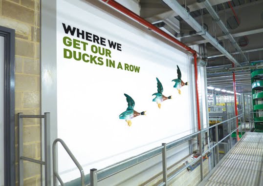
Who knew a Mondrian piece could look (and be) good enough too eat. No, we’re not a few Pollocks short of a picnic, the Art Fund has launched a new fundraising initiative aimed at art-lovers and keen-bakers to help raise money for UK galleries and museums. Our client Samworth Brothers (one of the UK’s leading chilled food manufactures) would be a dab hand at this…

Blazing through the night

We all know the roads of Central London can be a dangerous beast, from buses and cabbies to pedestrians that wander out aimlessly! However, a shining ray of protective light has come in the form of Brighton graduate Emily Brooke, who has produced the Blaze bike light, which beams the image of a bike onto the road about 5-6 metres ahead of you. Emily started the project a few years ago, gaining funding on Kickstarter and it’s now out there holding its own.

Tea and Cat
Katie has been eagerly awaiting the opening of this little gem, and the day is finally here. Lady Dinah's Cat Emporium is London's first ever cat cafe and is open as of the 1st of March. You can get a cup of tea, gluten free cake and a side of tabby cat to pet. 

Wednesday, 31 October 2012

Art works

When chartered surveyors Eddisons approached us to create office interior concepts for its client – a well-known global online media company – we knew it would be a great project, but a challenging one, and how right we were!

The concepts for the offices in Paris, Cairo and the company’s European headquarters in Switzerland included wall/glass manifestations, interior signage, wayfinding solutions and large format 3D art installations for the headquarters.

We opted for a different theme in each office that reflected its location. So, the Cairo office graphics featured famous Egyptian landmarks, whilst we explored a tongue-in-cheek take on influential French people from different walks of life including fashion, culture, literature and science for the Paris office.

We pulled out all the stops to create a number of modern 3D art installations for the Switzerland office that reflected the different areas in which the business operates, including finance, news, film and lifestyle. We used contrasting themes to create each installation, such as building a large dove with toy soldiers to represent peace and conflict for the news division.

News: peace and conflict

Lifestyle: glamour and comfort

Movies: good and evil


However, who knew sourcing around 1000 toy soldiers, miniature teddy bears and children’s flipflops would be so difficult? Oh well, we do like a challenge…


Wednesday, 25 July 2012

Just the trick for the Francis Crick


We’ve been putting our experience of producing hoardings to good use this month, producing core messaging, concepts and graphics for the perimeter hoardings around the Francis Crick Institute as construction on the site gathers pace.

Due to open in 2015, The Francis Crick Institute is an interdisciplinary medical research facility, comprising a unique partnership of six of the world’s leading scientific and academic organisations. The £650m institute’s aim is to attract and train the world’s best researchers in the pursuit of greater understanding of what makes us ill and keeps us well.

And this is where we came in. We needed to come up with a theme for the hoardings that would both address the short and long term needs of the institute: engage with visitors using public transport during the Olympics, who, when queuing, will be essentially a captive audience as well as promote the institute and what it represents to a wide audience whilst it is under construction.

When coming up with the concepts for the hoardings there were a number of things to consider. We needed to communicate what the institute will deliver in a visually stimulating, accessible manner, help make science fun and relevant to everyday life and ensure the designs would work across giveaways given to the queuing crowds.

In addition, during the Olympics period, the institute is commissioning street entertainers to engage with the crowds/queues to promote the field of science and the institute itself. As such, our designs and messaging would also need to work across the t-shirts and hats that the performers would be wearing so that the audience is immediately aware that there is a direct link between the two.

We developed the core messaging of ‘Ideas that change lives’ to communicate the purpose of the institute, and using shapes taken from its existing brand identity, created a set of colourful, modern and dynamic graphics, including lungs to represent cancer research and DNA helixes to reflect the collaboration between the different fields to achieve a common goal.

We also designed t-shirts, hats and bags for the street performers using the same graphic treatment and created a fortune teller ‘science snapper’, along with instructions on how to make it for the performers to interact with younger audiences and as a giveaway.

The hoardings are now up and well worth a visit for those passing by.


Wednesday, 27 October 2010

Where the interiors come to life!

Our relationship with Newsprinters has been going steady now for over four and a half years. During this time we've concentrated on evolving their brand, from the identity and marketing materials through to onsite signage and internal wayfinding.

Our latest undertaking is to bring personality to their largest print plant in Broxbourne with the design and installation of interior graphics. Whilst Newsprinters as a business is setting the benchmark in their industry through state-of-the-art technology and a specialised workforce that is second-to-none, the building itself has suffered somewhat from being devoid of any character. Turning that to our advantage, we have literally treated the site as a blank canvas on which we can inject some fun and humour through 50+ wall graphics.

The project has been layered – starting with dividing the site into working zones and introducing colour coding that is translated through colourful walls and a co-ordinated internal wayfinding system. We are now putting the finishing touches to the next layer which applies a theme across the entire building that adds visual interest and provides a stimulating working environment. The concept is simple in its execution yet also thought-provoking for both employees and visitors.

Each graphic is centred around describing a working area or task and is titled 'Where the, Where we, Where it...' and so on... This straightforward, no-nonsense tone of voice is an integral part of their brand and reflects perfectly the people that work in this company, and this industry. Newsprinters' core aim is to simply be 'the best newspaper manufacturer in the world'. No corporate waffle, no long-winded mission statements, just straight to the point. Each 'strapline' is illustrated in a strong, bold and modern font and accompanied by an image of an object that then brings another meaning to that task/area, and in turn, adds a lighthearted element.

The paper reel storage area


The paper reel delivery area


It has been refreshing to work with a client that is open to a creative solution and has the confidence to create a 'non-corporate' environment. Even from the initial brief, Newsprinters made it clear that the scheme should appeal directly to the employees, to provide an uplifting ambience in the surroundings in which they work. Much of the plant is windowless so bringing colour and visual stimulation was imperative. Alongside this, the graphics have to communicate to visitors, many of whom are groups of schoolchildren that take tours of the factory, and so far our humour seems to appeal to those who have seen the ideas.

The press hall
The press control area

We feel that we have fulfilled the potential of the project to the full – through our creative thinking and concept in providing an exciting environment that offers the unexpected but also brings a wry smile to those that see the theme unfold as they go from area to area within the huge plant. We have delivered a vibrant system through the use of various materials, bringing to life the environment in which the staff work, and all within a budget that could well have escalated when considering the sheer scale of the building and the amount of wall space available. We didn't get too carried away and installation takes place next month when the true results and benefits will be seen, and hopefully heard...

The logistics centre
The boardroom