

2014 has sprung into life and the studio is as busy as ever, with plenty of exciting projects from clients old and new. However, as we keep up the hard work, and our New Year's resolutions slip a little further, we thought we’d take a moment to reflect on some of the work of 2013.

The fruits of our labour
It's always satisfying seeing our work come to life, especially at the start of the year, and the fruits of our labour were there for all to see at St Martin's Quarter in Worcester when the latest signage was put in place. This was the final pieces of the puzzle for this project, where we worked on everything from naming, branding, literature, website and the lovely signage.

The concept of the cube
February saw us working on an exciting project on the other side of the world (the early morning Skype calls were less fun), developing the identity for a New Zealand start up, 'The Concept Cube', whilst helping with its first venture, a very delicious New Zealand 100% Blue Agave (which is a non-Mexican tequila for the uninitiated!).

An innovative environment
It was in March that the BBSRC Fostering Innovation Awards 2013 took place in Millbank Tower, London. Guests were not only treated to spectacular views, but also to the striking branding and venue dressing that we created for the awards.

SeaBird R&A explore design shift
The R&A for SeaBird Exploration, a leading provider of marine seismic data was released in April. We enhanced the design and created a report that more effectively communicates SeaBird's improved performance in this specialist sector. We went on to work on a number of other projects for them, and the 2013 Annual Report is also just around the corner.

An exchange of ideas
May saw our work in the national press, as we created a national broadsheet ad campaign for foreign exchange and international payments specialist FC Exchange, developing an iconic look and feel, reinforced by direct, bullish messaging to help the company differentiate itself in a competitive market.

Celebrating excellence
We've been helping the CIPR add a touch of glamour to its annual Excellence Awards for a number of years now. In 2013 we created a sophisticated and celebratory event identity along with supporting print and digital collateral, which all came to life on the awards night in June. Work for this year’s award is already underway.
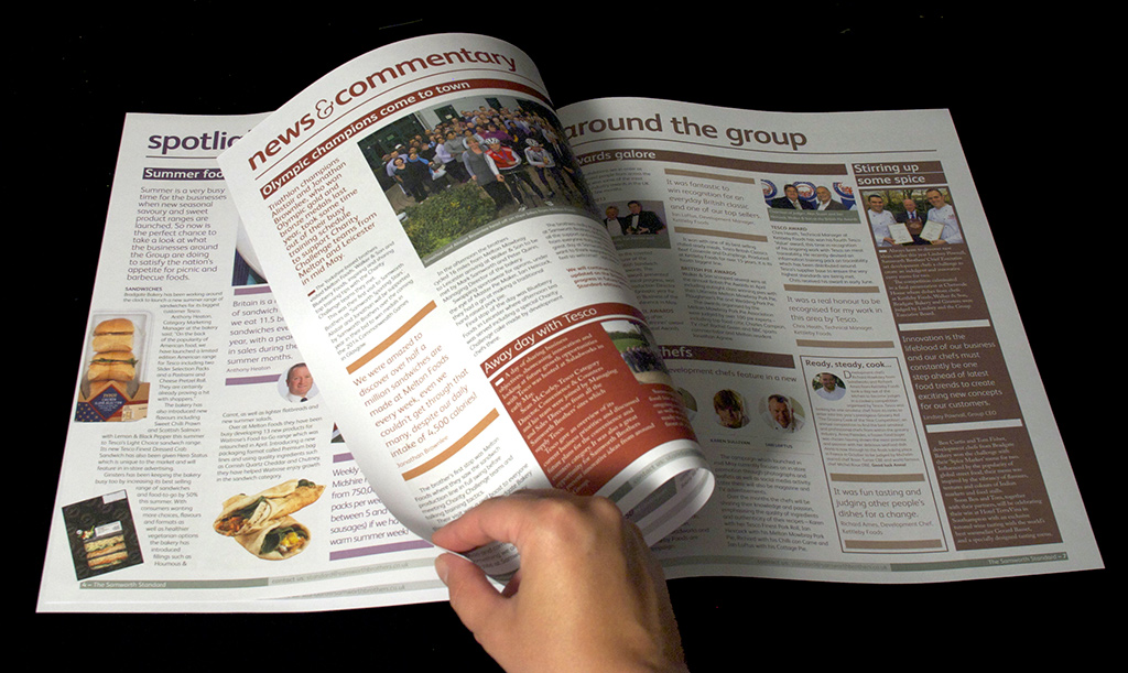
Hot off the press
July marked the first issue of the redesigned Samworth Standard – an internal newspaper for the huge chilled foods producer. Since then we’ve produced 2 further issues and are currently working on the fourth issue, which hits the doormats of over 8,000 employees.

Long time coming
In August we welcomed our designer Sarah Long into the warm embrace of tothepoint. Sarah wasted no time in making her mark on the design team, helping hairdressing salon Headquarters to celebrate its 15th birthday with an invite for the big birthday bash. And yes, that is our logo that the salon is still sporting 15 years later, and it's looking as youthful as ever!

Going digital
Recognising that the digital landscape is constantly changing, we launched a new digital arm of tothepoint in September, to focus solely on digital design and communications. The site, www.ttpdigital.com, showcases our experience and expertise in this area, plus there's a dedicated blog where we share our opinions on all things digital.

All Change!
We finally unveiled the evolved Croydon Business Improvement District (BID) logo, loyalty card scheme 'Check Out Croydon' and website in October. Although it had only been live for a couple of weeks, the new website achieved an increase of over 3300% more site visitors since launch! Since then we’ve been working on their town centre banners and window graphics, and there’s plenty more projects coming up.

Putting on a show
On the 26th November Ben and Simon were released from their shackles to man our stand at The Public Relations Show 2013 and challenge people to a game of 'I Shot the Serif'! Not only did we exhibit at the event, but we also developed the branding and much of the collateral for it. The day was a huge success, with over 1,000 visitors and the event itself trending on Twitter in London.

A year to view
Drum roll please... The 2014 tothepoint calendar is here! With all things digital seeming to be favoured by today's Tweeters, bloggers and Facebook disciples, we're always surprised (and flattered) that our printed calendar has remained so popular. This year's calendar is a visual expression of us. You can find out a little more and download your own copy here.
1 comment:
Loved this post and shared it with all my colleagues. Thank you so much!
wordpress designer india
Post a Comment