
 In a slightly bizarre marketing mash-up, Google and Nestle have recently joined forces and named the next version of Google's Android operating system (version 4.4): 'KitKat'.
Google has been alphabetically naming each successive version of its OS after some kind of sweet since V2.3 'Cupcake' - followed by 'Donut', 'Eclair', 'Froyo' (Frozen Yoghurt), 'Gingerbread', 'Honeycomb', 'Ice-cream sandwich' and current version 'Jellybean' - so the fact that the latest iteration is named after a chocolate bar isn't such a surprise.
What is odd is that as far as all were concerned the next name would be 'Key Lime Pie' (an admittedly odd choice) - with the KitKat name seemingly coming from nowhere at the last minute. It's also the first time Google (or ANYONE as far as I'm aware!) has ever thought to promote their OS by getting friendly with an existing, unrelated brand.
Could this be the start of a strange marketing trend, or is it just Google being a little kooky? And if it follows the same convention for the next version - could Nestle's 'Lion Bar' be gearing up for an Android make-over?
I do wonder if they've both considered the potential implications of the deal. This could be perceived as Nestlé basically endorsing Android phones, which may then be seen as 'anti-Apple' due to the two tech companies ongoing rivalry - and Nestlé really doesn't want rabid Apple fans mounting an anti-Nestlé campaign!
more info (BBC)
The Gold standard
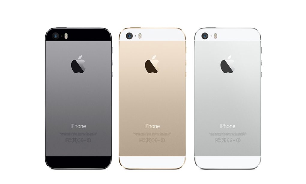
Well, not so much, but to be fair, Apple seems to be on a path of refinement and minor improvements recently rather than throwing as many features as possible at their handset (certainly something of which the Galaxy S range is guilty). Many were expecting a high end iPhone and a mid-range 'economy' version this time round. However, we seem to have been given an expensive option and a REALLY expensive option. But, when Apple sees itself as more of a luxury brand - why do cheap? No doubt the varied colours of the 'C' model will sell well amongst the younger audience, whilst the 'bling' of the new Gold iPhone 5S may do well among the glitterati.
Feature-wise there's nothing too ground-breaking, but the new fingerprint scanner could end up being a game-changer. It's not certain quite how accurate it is in the wild, and how Apple might then use the new security feature to connect other apps/services, but if it works as advertised, it could open up a whole new world of in-phone-payment that its competitors can't even get close to yet.
And talking of competitors, Microsoft was very quick to parody Apple's new creations - which would have worked well if those ads weren't so poor - they've now been quickly pulled after Microsoft admitted they were 'painfully unfunny' - oops!
more info (the verge)
Ya-who?
 So after 30 days of teasing, Yahoo! finally launched its 'real' new logo to the world. Did it make sense of the plethora of design variations previously shown? Has it moved the company forward and refreshed the brand? For one of the Internet's earliest and longest surviving players (it's 18 years old - which is about 180 years in web years!) it will be interesting to see how it is received by users and non-users once the initial parodies and criticisms die down.
Marissa Meyer, Yahoo!'s new young and energetic CEO writes all about it in her personal Tumblr blog (well, it would be Tumblr as she oversaw the purchase of that company not too long ago) – and goes into detail about the design process ...
http://marissamayr.tumblr.com/post/60336044815/geeking-out-on-the-logo
In her words:
"I love brands, logos, color, design, and, most of all, Adobe Illustrator. I think it’s one of the most incredible software packages ever made. I’m not a pro, but I know enough to be dangerous :)"
One would think it's a rare CEO who gets their hands dirty with this sort of thing (or even knows what 'Adobe Illustrator' is). Although, having said that, Rupert Murdoch essentially designed his own News Corp logo not too long ago, skipping the need for an external design agency, or even Adobe Illustrator. Is do-it-yourself brand design the new trend? If so, are these 'dangerous' times for brand agencies?
The jury is still out but as one of our clients we see this as an opportunity to help evolve and support the new brand. Our work so far has ranged from standard signage and wayfinding to the more adventurous art installations we produced for their Rolle office last year. This work demonstrates the life that can be brought to a brand through creativity and that a brand is far more than just a logo.
Only time will tell if this new logo can last as long as the previous one - but if stock price is a good measure, perhaps the refresh really has worked a charm! http://mashable.com/2013/09/12/yahoo-stock-30/
more info (adage)
Meanwhile, back at the ranch...
Microsoft's big Google search challenger 'Bing' has just announced its logo has had a makeover - it's now bright yellow instead of the original blue and much more angular than the previous version - and flat as a pancake of course.

And if rumours are true (update: turns out they were), Google is also going through a logo refresh - dropping the long-standing drop shadow and 3D bevelled effect and going for a simpler, flatter (there's that word again) identity.
This new version first started popping up all over the company's services, but was then officially announced a few days after Bing's updated identity.
So, can it be a coincidence that all the big internet search brands are refreshing their logos at the same time?
more info:
» bing logo change (the verge)
» google logo revamp (BBC)
A shriekingly good light show
 Had a bad day? Feel stressed and need to let it all out? Why not pop along to the ‘House of Pain’ on Borough High Street, where you can unleash a cathartic scream or yell, with each scream generating an instant light show that illuminates the whole building.
 We tried it out and it’s a lot of fun, but be warned, people on the street outside the building will hear you!
Part of this year’s MERGE festival, the ‘House of Pain’ is open between 5pm-10pm every night until 21 October.
And finally...
We're hiring! We're looking for a front-end web developer with an eye for design so if you're interested in joining the lovely ttp team or know of anyone who would fit right in and push new ideas, get in touch. For further info have a look at the opportunities page on our website or check out our Linkedin ad.
No comments:
Post a Comment