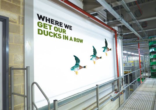
Our latest undertaking is to bring personality to their largest print plant in Broxbourne with the design and installation of interior graphics. Whilst Newsprinters as a business is setting the benchmark in their industry through state-of-the-art technology and a specialised workforce that is second-to-none, the building itself has suffered somewhat from being devoid of any character. Turning that to our advantage, we have literally treated the site as a blank canvas on which we can inject some fun and humour through 50+ wall graphics.
The project has been layered – starting with dividing the site into working zones and introducing colour coding that is translated through colourful walls and a co-ordinated internal wayfinding system. We are now putting the finishing touches to the next layer which applies a theme across the entire building that adds visual interest and provides a stimulating working environment. The concept is simple in its execution yet also thought-provoking for both employees and visitors.
Each graphic is centred around describing a working area or task and is titled 'Where the, Where we, Where it...' and so on... This straightforward, no-nonsense tone of voice is an integral part of their brand and reflects perfectly the people that work in this company, and this industry. Newsprinters' core aim is to simply be 'the best newspaper manufacturer in the world'. No corporate waffle, no long-winded mission statements, just straight to the point. Each 'strapline' is illustrated in a strong, bold and modern font and accompanied by an image of an object that then brings another meaning to that task/area, and in turn, adds a lighthearted element.
The paper reel storage area

The paper reel delivery area

It has been refreshing to work with a client that is open to a creative solution and has the confidence to create a 'non-corporate' environment. Even from the initial brief, Newsprinters made it clear that the scheme should appeal directly to the employees, to provide an uplifting ambience in the surroundings in which they work. Much of the plant is windowless so bringing colour and visual stimulation was imperative. Alongside this, the graphics have to communicate to visitors, many of whom are groups of schoolchildren that take tours of the factory, and so far our humour seems to appeal to those who have seen the ideas.
The press hall

The press control area


We feel that we have fulfilled the potential of the project to the full – through our creative thinking and concept in providing an exciting environment that offers the unexpected but also brings a wry smile to those that see the theme unfold as they go from area to area within the huge plant. We have delivered a vibrant system through the use of various materials, bringing to life the environment in which the staff work, and all within a budget that could well have escalated when considering the sheer scale of the building and the amount of wall space available. We didn't get too carried away and installation takes place next month when the true results and benefits will be seen, and hopefully heard...
The logistics centre
 The boardroom

2 comments:
Love this - looks just great!
A great way to brighten up the workplace.
Post a Comment