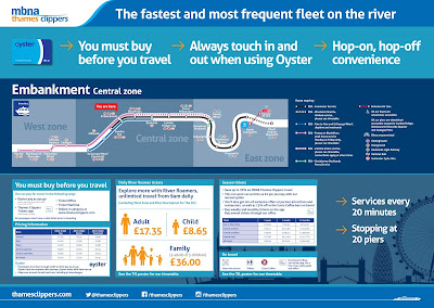
You may recall our work with MBNA Thames Clippers from last year, when we helped with their overall rebranding. They’ve now introduced Oyster touch in, touch out payment, making it easier for commuters to sail through the rush hour and for visitors to enjoy the river. This required a refresh of their pier signage and yours truly were on hand to help.
To communicate a visual link between MBNA Thames Clippers and TfL, we adapted the colours to the TfL river transport colour palette, keeping the recognisable MBNA Thames Clippers’ orange as a highlight colour. We adopted the route colours and timetable information into the MBNA Thames Clippers signage, to help bring synergy to the information and providing greater clarity for the traveller.
The big challenge was to collate the variety of information and develop a flexible format that allowed MBNA Thames Clippers to have ownership and clearly communicate the travel details for each pier. The signs needed to include the route map, timetable and pricing structure plus how these all worked with Oyster pay as you go. The team at MBNA Thames Clippers were also keen to use the signage to promote their services rather than just featuring information, as they have done previously.
Our client had this to say:
We worked with To The Point to refresh the branding across all 20 of our piers. It was a big challenge as we have lots of messages we need to get across whilst also promoting our services and key destinations we travel to. We were launching Oyster touch-in, touch-out across all of our services and zonal pricing so we had lots of new information we needed to include.
To The Point definitely rose to the challenge, creating a fresh look and feel whilst developing a template that could be used across all of the piers which differ dramatically in space and signage. The feedback from our staff and customers has been great. Thanks To The Point for all their hard work.
The new pier signage has now sprung up across the river, so make sure you keep your eyes peeled on your next riverside stroll! Maybe even tap in and treat yourself to a ride on a clipper!


No comments:
Post a Comment