
Polishing the Chrome - Google takes on Apple TV with a budget offering
The house of mouse - the original inventor of the mouse dies aged 88
What does Wifi look like? - art and science merge in these wifi visualisations
to Ћ point - a new symbol for 'the' is proposed, what the..?
A (webcam) view from the top - no time to visit the Eifel Tower? This is the next best thing!
Does X mark the spot? - Oxford Street has a brand new identity
Jane Austen and trolls - it is a truth universally acknowledged, that something needs to be done about trolls
Polishing the Chrome

Google, one of the largest and most influential companies in the world has been desperately trying to break into the TV space for quite some time now. From Google TV to their Nexus Q - so far, they've not had much luck.
Their most recent product launched this week aims to turn this around. The Chromecast is tiny (see image above) and isn't much bigger than your average USB stick. It's designed to plug right into your TV via an HDMI socket. It's essentially a TV extender turning your dumb, non-connected TV into a Netflix or Youtube player (and you use your phone/tablet as a remote control). At only $35 it's quite the bargain - and while anyone with a set-top box or other Netflix capable hardware won't really get much extra benefit, it does make us wonder what the point of those expensive 'Smart TVs' really are.
But will it succeed where their other efforts have failed? We'll probably have to wait till next year to see who the leaders are in this much fought over streaming hardware / broadcast service sector. For now, the Chromecast is available in the US only, rest of the world to follow.
read more (The Verge)
The house of mouse
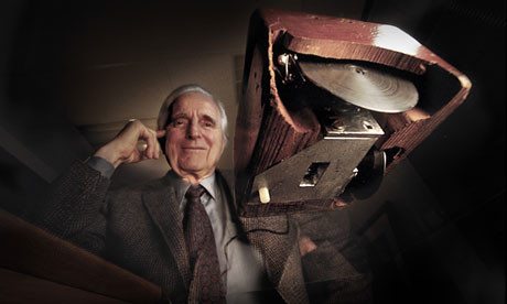
Doug Engelbart, one of the many unsung heroes of the computer age died this month at the age of 88. He's the man we can thank for creating the world's first computer mouse in the 1960s - long before it was taken up by Xerox / Apple in the 1980s. The mouse revolutionised the way we interact with the computer and brought precise and intuitive analogue control that's still unbeaten today (touch screen controls may be everywhere right now, but don't offer the speed or pin-point precision the mouse still gives us).
Although there are well over a billion mice around the world, unfortunately he wasn't the millionaire he could have been as, despite patenting his invention, the patent ran out in 1987 - just before the mouse became the popular and ubiquitous device it is today. His first prototype was a simple wooden box with two metal wheels and three buttons on the top - which pretty much set the 'mouse' style for many years to come. Later the rubber ball was added for smoother movement, the mechanical parts finally being replaced by the optical mice we use now.
read more (The Guardian)
What does WiFi look like?

click the image to view larger
Our cities are full of all sorts of pollution – from noise and crowds to light to smog – but what other things fill the air that we can't see or sense? Artist Nickolay Lamm decided to try to visualise one of those unseen forces: the Wifi signals that surround us, emanating out from almost every home, business and coffee shop. He studied how Wifi signals work and transmit taking current data from DC.gov to pinpoint their exact locations and then visualised these waves using central Washington as his backdrop. The resulting images are both beautiful and disturbing - the city is awash with what look like swirling forcefields of electronic communication.
read more (Motherboard)
to Ћ point

It was proposed this month that we should be adding an extra character to the English language. Paul Mathis thinks that as 'and' (which is the fifth most used word in the English language) has its own character, the ampersand, then surely 'the' (which is the number one most used word) therefore deserves its own shortened version? You can't fault his logic there. And, to save us all having to replace all our keyboards or add new characters to every major font, his proposal is to use something that already exists but is little used (a Serbian language character) which is a combination of 't' and 'h'. This would become a short-hand for 'the' in the same way we use '&'. He's going to need quite a lot of support for it to catch on, but it's an interesting idea. What do you think, could you see yourself using 'Ћ' - is it needed? And if so, will we need to change our logo?
read more (Design Week)
Does X mark the spot?

If the intention is to 'reignite London's love affair' with the street then it is arguably neglecting its less successful element (the east end). Most destination brands focus on the total visitor experience or the values they represent. Oxford Street is a long, straight shopping thoroughfare, in the same way that Regent Street is a crescent and Covent Garden is a series of lanes around a central piazza. The ‘X’ places too much emphasis on a single part of it, albeit a very important part, which is already highly successful, and we would have liked to see more made of the area it represents.
What do you think of the new identity? Let us know in the comments section below.
A (webcam) view from the top

The Google Cultural Institute and the Eiffel Tower Operating Company have joined forces to bring us three online exhibitions based on the iconic French monument, including a panoramic view from the top, just in case you can't make it there yourself. Known affectionately as the "Dame de Fer", or "Iron Lady", she stands at 324 metres tall and with almost 7 million visitors a year, is also the most visited (entrance fee) monument in the world.
Jane Austin and trolls
Jane Austin and trolls

Back in April it was noted in the press that with Sir Winston Churchill set to replace Elizabeth Fry on our £5 note, there would be no women (other than the Queen of course!) on our currency, prompting a high profile campaign led by Caroline Criado-Perez against the decision. Last week the Bank of England announced that Jane Austin will be the new face of the £10 note, leading George Osbourne to tweet “Mark Carney's choice of Jane Austen as face of £10 note is great. After understandable row over lack of women, shows sense and sensibility." We applaud the decision and George's play on words.
This campaign also led to some truly vile misogynistic Twitter trolling and raised an important and ongoing debate on the role of social media platforms in dealing with trolls. In response to criticism of its handling of this latest hate campaign, Twitter has said it's aware of the way some people misuse the platform and is launching a feature that allows users to report individual tweets. It will be interesting to see exactly how this works and what impact, if any, it has on trolls and the number of abusive tweets sent.
No comments:
Post a Comment