Wednesday, 27 October 2010
On yer bike
Phew! It feels appropriate to be writing my first blog about a racing track as the past few weeks have been quite a whirlwind for me...
What started as a dream has grown into a full blown campaign and it’s with professional pride and personal interest that I want to write about the campaign to Save the Herne Hill Velodrome.
I have been a keen cyclist, racer and fascinated visitor to the Herne Hill Velodrome for many years now. However, this beloved landmark now faces closure due to deterioration and lack of funding, and with the country’s own Olympic moment just around the corner, it’s hard not to get sad at the prospect of the Velodrome closing forever.
The Herne Hill Velodrome is one of those rare things – an iconic landmark that’s in use and as relevant to it’s visitors today as it was in decades past. The oldest cycling track in the country, it was home to the 1948 Olympic Cycling Championships, with famous riders including Bradley Wiggins the three-time Olympic gold medallist, who began his competitive cycling career at Herne Hill. Today, it’s a favoured location for cycling enthusiasts the world over and local children alike, all training, riding and racing their way to a better time, fitter body or simply a fun day out. As I watch the children, including my own, gather for the various races and events made available to them, I hope and believe that there may be one, if not more, future Olympic champions among them.
With the threat of closure – and without forgetting Peter Cattermole and the unsung heroes who, over the last ten years, have kept the Velodrome alive – a new impetus was required. A group of us, led by Hillary Peachey, conceived the Save the Herne Hill Velodrome Campaign, with me in charge of the campaign’s identity, look and feel and of course all the materials. Many may think I can pull an identity out of a hat or cook up a campaign in my sleep but this was unlike anything else I’ve had to do in such a short time frame and with no budget. Fitting four days' work into a weekend, using matchsticks and only a handful of hours’ sleep later, I had produced the basics of a campaign including logo, website, stationery, posters, postcards, leaflets and helped with the Facebook page – branding and some content. Over the weeks that followed, I built on this with help on the campaign strategy and other materials including track banners, t-shirts, displays, stickers and badges as well as providing brand elements to third parties to produce their own materials.
One such party was Condor Cycles who believed so strongly in the campaign, that they devoted a large area of their stand at the Earls Court Cycle Show to help raise awareness to the wider cycling community.
It was great to work on something I felt so passionate about and personally connected to, and the collective enthusiasm and spirit kept me going during those sleep deprived weeks. I’m proud of the designs I produced and the message my work helped shape but, in a bizarre twist, I’m almost prouder of what’s happened since...
As a designer, I love what I do, but there’s something very special about people taking your designs and running with them. As this campaign is so personal to so many, taking ownership of the messaging is essential and creating a structure (with consistency across the various elements) gives people the tools to take it further and help grow the campaign. This is a true word-of-mouth, combined with social media, success story and the momentum the campaign now has, has really blown me away: we got widespread and heartfelt coverage in the country’s press including the Guardian, London Evening Standard and the Telegraph to name but a few. We’ve had BBC’s Newsround filming us, a tweet by none other than Stephen Fry (reaching his 1.8million followers), a hugely successful public meeting with over £70,000 pledged in support, backing by Tessa Jowell and a global Facebook following that now has over 4,600 friends.
To my family's amazement, I now even have knowledge of twibbons with Facebook profiles being updated to help show support for our campaign. I’ve learned more about the strength and spirit of communities and my own knowledge of how this can be harnessed and built on using today’s technology. After the whirlwind, sitting back to enjoy the fruit of our hard work to date and come up with ways to build on this success, I’m left with a smile on my face and a very warm feeling of satisfaction and achievement (or is that muscle cramp?). Make my day and show me it was all worth it – support us and pledge money at www.savethevelodrome.com.
Carl Ison
Branding and Design Strategy
carl@tothepoint.co.uk
Where the interiors come to life!
Our relationship with Newsprinters has been going steady now for over four and a half years. During this time we've concentrated on evolving their brand, from the identity and marketing materials through to onsite signage and internal wayfinding.
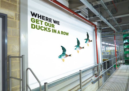
Our latest undertaking is to bring personality to their largest print plant in Broxbourne with the design and installation of interior graphics. Whilst Newsprinters as a business is setting the benchmark in their industry through state-of-the-art technology and a specialised workforce that is second-to-none, the building itself has suffered somewhat from being devoid of any character. Turning that to our advantage, we have literally treated the site as a blank canvas on which we can inject some fun and humour through 50+ wall graphics.
The project has been layered – starting with dividing the site into working zones and introducing colour coding that is translated through colourful walls and a co-ordinated internal wayfinding system. We are now putting the finishing touches to the next layer which applies a theme across the entire building that adds visual interest and provides a stimulating working environment. The concept is simple in its execution yet also thought-provoking for both employees and visitors.
Each graphic is centred around describing a working area or task and is titled 'Where the, Where we, Where it...' and so on... This straightforward, no-nonsense tone of voice is an integral part of their brand and reflects perfectly the people that work in this company, and this industry. Newsprinters' core aim is to simply be 'the best newspaper manufacturer in the world'. No corporate waffle, no long-winded mission statements, just straight to the point. Each 'strapline' is illustrated in a strong, bold and modern font and accompanied by an image of an object that then brings another meaning to that task/area, and in turn, adds a lighthearted element.
The paper reel delivery area
It has been refreshing to work with a client that is open to a creative solution and has the confidence to create a 'non-corporate' environment. Even from the initial brief, Newsprinters made it clear that the scheme should appeal directly to the employees, to provide an uplifting ambience in the surroundings in which they work. Much of the plant is windowless so bringing colour and visual stimulation was imperative. Alongside this, the graphics have to communicate to visitors, many of whom are groups of schoolchildren that take tours of the factory, and so far our humour seems to appeal to those who have seen the ideas.
The press hall
We feel that we have fulfilled the potential of the project to the full – through our creative thinking and concept in providing an exciting environment that offers the unexpected but also brings a wry smile to those that see the theme unfold as they go from area to area within the huge plant. We have delivered a vibrant system through the use of various materials, bringing to life the environment in which the staff work, and all within a budget that could well have escalated when considering the sheer scale of the building and the amount of wall space available. We didn't get too carried away and installation takes place next month when the true results and benefits will be seen, and hopefully heard...
The logistics centre
The boardroom
Our latest undertaking is to bring personality to their largest print plant in Broxbourne with the design and installation of interior graphics. Whilst Newsprinters as a business is setting the benchmark in their industry through state-of-the-art technology and a specialised workforce that is second-to-none, the building itself has suffered somewhat from being devoid of any character. Turning that to our advantage, we have literally treated the site as a blank canvas on which we can inject some fun and humour through 50+ wall graphics.
The project has been layered – starting with dividing the site into working zones and introducing colour coding that is translated through colourful walls and a co-ordinated internal wayfinding system. We are now putting the finishing touches to the next layer which applies a theme across the entire building that adds visual interest and provides a stimulating working environment. The concept is simple in its execution yet also thought-provoking for both employees and visitors.
Each graphic is centred around describing a working area or task and is titled 'Where the, Where we, Where it...' and so on... This straightforward, no-nonsense tone of voice is an integral part of their brand and reflects perfectly the people that work in this company, and this industry. Newsprinters' core aim is to simply be 'the best newspaper manufacturer in the world'. No corporate waffle, no long-winded mission statements, just straight to the point. Each 'strapline' is illustrated in a strong, bold and modern font and accompanied by an image of an object that then brings another meaning to that task/area, and in turn, adds a lighthearted element.
The paper reel storage area
The paper reel delivery area
It has been refreshing to work with a client that is open to a creative solution and has the confidence to create a 'non-corporate' environment. Even from the initial brief, Newsprinters made it clear that the scheme should appeal directly to the employees, to provide an uplifting ambience in the surroundings in which they work. Much of the plant is windowless so bringing colour and visual stimulation was imperative. Alongside this, the graphics have to communicate to visitors, many of whom are groups of schoolchildren that take tours of the factory, and so far our humour seems to appeal to those who have seen the ideas.
The press hall
The press control area
We feel that we have fulfilled the potential of the project to the full – through our creative thinking and concept in providing an exciting environment that offers the unexpected but also brings a wry smile to those that see the theme unfold as they go from area to area within the huge plant. We have delivered a vibrant system through the use of various materials, bringing to life the environment in which the staff work, and all within a budget that could well have escalated when considering the sheer scale of the building and the amount of wall space available. We didn't get too carried away and installation takes place next month when the true results and benefits will be seen, and hopefully heard...
The logistics centre
The boardroom
Labels:
concept,
graphics,
humour,
installation,
interiors,
NEWS,
print,
signage,
wayfinding
Subscribe to:
Posts (Atom)