Wednesday, 30 April 2014

The Spring Collection

XPocolypse
The end of an era has come as Microsoft cease to support Windows XP. The “XPocolypse” (as it’s been dubbed) marks the end for the 13-year-old operating system, however with support for Internet Explorer 8 also stopping, it seems that it’s out with the old for Microsoft. Whilst some big institutions still struggle on with older operating systems, given all the recent hacking, security and privacy issues hitting the news over recent months (see below!), it really is time for everyone to upgrade to something that's still supported. This is doubly true with regard to internet browsers - so if you're still using IE 8 (or older!) get yourself updated - as not only are you running a very insecure browser, but you'll start to find many big websites just don't work properly on this outdated software. IE 11 is better in every single way, but browsers such as Chrome and Firefox still lead the pack - and keep themselves updated so you don't have to worry about being out of date!

Read more on The Gaurdian

The internet of bleeding hearts
Don’t worry, we’ve not come over all melodramatic! At the start of the month the IT world was woken up by an emergency security advisory from the OpenSSL project warning about a very nasty open bug called “Heartbleed”. And it is as bad as it sounds, as it masquerades as the server and lets attackers listen in on data. Many companies have since taken the necessary measures.
Natural Twitter
This one is for all you nature lovers, Piip-Show is a three month long broadcast by Norwegian broadcasting network NRK.no. The project is a collaboration between photographer Magne Klann, model maker Lars Aurtrade, outdoor aficionados UT.no and NRK.no. The project invites you to watch various wild birds drop into their (very adorable) coffee shop and their lounge.

Dot London
A brand new domain just for London: .london went on sale April 29th. Are you thinking of safeguarding your URL? We're certainly considering getting a 'www.tothepoint.london' name, if only to protect our brand in London. And, as the official website suggests, getting one allows you to associate your name with the 'greatest city on earth'! Purchasing a .london domain is pretty easy and costs are very reasonable. You can set one up to use on a brand new website or just have it direct to an existing one. If you need any help or advice in purchasing a domain or creating a new website, just let us know!


The “hole” of London
And talking of the 'greatest city on earth'... the beloved tube map has a new cover, a very holey one! Designed by artist Rachel Whiteread, who won a Turner Prize for her work 'House' in 1993. The cover is an illusion though and is actually printed.

Read more on Design Week


.
Battle of the TV Gizmos
We featured the Google Chromecast on our News roundup a little while ago, but for those of you who need a refresher it’s a small device (a doobrey if you will) that plugs into your HDMI port and allows you to stream content from a smartphone or tablet onto your TV. However, since launching in the UK it seems a contender is hot on its heels, with Amazon recently launching Fire TV in the US. With no dates yet for its UK release it is set to be a slightly pricier option, but with claims that it’s three times faster will the extra buck be worth it?

Matisse en masse
The Tate Modern is currently hosting, what critics are hailing as, one of the largest collections of Matisse’s “cut-out” artworks ever assembled. There is also an accompanying film if you fancy something a bit more animated. It’s on until September so there’s plenty of time to catch it; make sure you don’t miss out!

Read more on the BBC


A little pick me up
The 2014 Pick Me Up festival at Somerset House is up and running, it features loads of fun (and sometimes quirky) workshops and plenty of artwork to buy from various illustrators and designers from all over the place!

Building a brand for a building

We’ve been working with Derwent London for a few months now on the naming, identity and marketing materials for 76-78 Charlotte Street; a striking building set in the heart of Fitzrovia (or NoHo if you’re in with the ‘It Crowd’).


Derwent London is one of London’s most innovative office regeneration and investment specialists, and is well known for their creative approach and design led philosophy. With a distinctive clean and contemporary style we couldn’t wait to start working with them on the project.

The first call of business was to decide on the name of the building. Charlotte St Studios was the perfect option as it references the (highly desirable) address and the target market (young creative companies), as well as lending itself very nicely to some clever yet subtle typography in the identity.

Entrance shot taken by the Derwent London photographer

The building itself has a very striking aesthetic and it sits in the middle of the original artisan district (playing home to some very famous creatives from Virginia Woolf to John Constable), so we were keen to reflect this in the identity and across the materials.


For the identity we created a device that frames the name and takes inspiration from the building’s distinctive windows on the Charlotte Street side, the mix of bold and light type picks out the address. We also use an art piece from local gallery The Rebecca Hossack Art Gallery (for all you art buffs out there the piece is Homage to a Circle No. 4 by David Whitaker) to subtly suggest the artisan history of the area and to show what it currently has on offer.

The “window” from the identity is used across the brochure and website to hold headline text or pull outs, both also feature a layout in which the content seems to float on the page, a style which really comes into its own on the website; where we used a bespoke single page parallax design which allows the images and text to float over each other as you scroll through.

"Our first project with tothepoint was interpreted well and complimented the property and Derwent London's brand. The final identity and marketing materials for Charlotte St Studios really show that they understood what we were looking for, they work well with our other materials but still give the building a unique look and feel.” Explains Lesley Bufton, Property Marketing Manager at Derwent London

Every website can pose various challenges, however the challenge with this particular site was that it uses no set template and employs various levels of parallax scrolling. These make the act of browsing a unique and fun experience but did mean we had to get away from standard template/wireframe mentality! Even with a static visual of the full sit (viewable here), it only really started to take shape during development, with plenty of parallax experimentation to make sure we had that effortlessly floaty experience perfected. Simple interactivity, such as choosing map categories and downloadable floorplans, helps to add to the sites functionality. You can see the full site here.

The PDF brochure (you view that here) is also fully interactive, linking back to the floorplans on the website for example, to fully support this digitally led marketing campaign. All copy for the website and brochure was crafted by our very own Katie, who is also the Account Manager for Derwent London.


“Our Account Manager Katie was available throughout the project to help with any queries, explain designs and really took on board our feedback - Katie was even on hand to oversee the vinyl installation for us. The design team were also there to help if we ever needed it, and worked hard to ensure we met all of our deadlines.” Lesley goes on to explain.

Charlotte St Studios is now open for business, it’s been a great project to be involved in, creating something unique that breaks many of the traditional property norms. We’ll be continuing to work with Derwent London during the course of the building’s marketing stage to update the various elements.

“Working with tothepoint was a smooth and enjoyable process, resulting in an identity and materials that we are very happy with. We look forward to working with them again." Well, we are blushing now!

Tuesday, 29 April 2014

New year new look

SeaBird Exploration is a global market leader in 2D seismic data services, providing valuable data to the oil and gas industry. The company also specialises in the niche 3D and shallow water market, so working with them is certainly an eye opener for us.


After working on the annual report, and subsequent quarterly reports, with SeaBird Exploration last year, we were very happy when they invited us back to help evolve the designs. Both ourselves and the team at SeaBird were keen to maintain the core elements from the previous reports but apply them with a fresh look and feel.

Prior to the report, we worked with SeaBird to commission two photographers to shoot company employees at work, equipment and vessels across two locations for use in the report. We were on hand to advise on the style of photography and to brief and liaise with the photographers, right up to the delivery of the final images.


With such great photography at our disposal imagery really was the king in the front section of this report, and offers a glimpse into various aspects of life at SeaBird. The mix of black and white and colour photography helps to add interest and dynamism throughout the document.

The bold yellow is now used more confidently throughout the report and the cyan is now used to pick out headings. The square device has also been updated to a subtle keyline or a transparent coloured block, both of which hold key information.


The report has now been distributed and work on the first quarter 2014 report is under way, no rest for the wicked!

You can view the full report online here

Tuesday, 1 April 2014

Marching on

Mozilla aren't feeling the love for OKCupid
The internet has exploded (from CNN to the Beeb, it's everywhere!) over claims of unrest between Mozilla and OKCupid, as it's claimed the Firefox CEO supports the anti-same-sex marriage campaign. Whether this is true, or something to do with the dawn of April Fools (it launched into the world on the eve of this mischievous day) remains to be seen!

Feeling foolish
...and talking of April Fools Day - it's April 1st and naturally a host of spurious news articles have popped up around the world - from Google's 'magic hand' to a proposed redesign of the Union Jack (without the Scottish bit!). Did you see any others that beat these?

It's certainly a terrible day to announce any serious news - as no one will take you seriously! Which is why we sent our monthly enewsletter out today. Hmmm. Still it's past mid-day now, so everything else is true - we promise!

more info: 

» Design Week - Were you fooled?

» The Guardian - April Fools 2014


The cream of the crop
The Design Museum has launched their 2014 Design of the Year exhibition, an annual event which celebrates the world of design in all it's glory! From the life changing floating school in a Nigerian lagoon to the less serious Dumb Ways to Die app it's always a great exhibition, and will open up your eyes to many exciting designs that you may not have known about.


A little distraction

Create musical sounds and colourful animations whilst you try to avoid looking at the emails piling into your inbox this lunchtime, all thanks to Google designer Jono Brandel and his little creation Patatap. A little bit of relaxing entertainment over a sandwich is just what you need, although be careful; it's easy to get sucked in!


Flagday
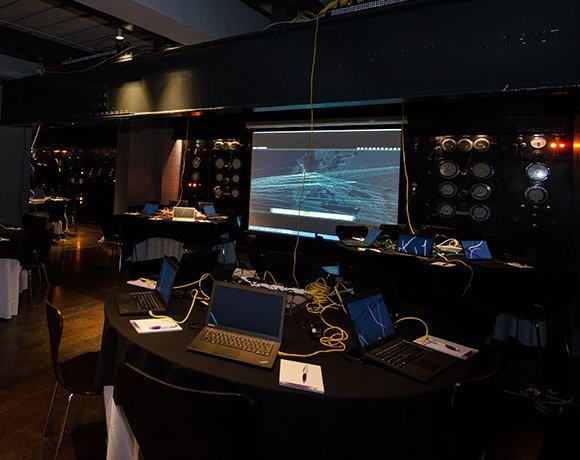
On March 15th we were invited to the 2014 Cyber Security Challenge UK Awards Ceremony at the Institute of Directors. We’ve been working with the Cyber Security Challenge to create a completely new website for them - more on that when it launches soon!

The organisation was set up to encourage more talented people to join the cyber security profession and is sponsored by groups and companies as diverse as GCHQ, Symantec, HP and Royal Mail (among many others). Each year they set up a series of challenges - from online competitions to full-on terrorist attack simulations.

These led up to the final ‘masterclass’ which involved 42 of the best players that had beaten their way through to the final round. This challenge was designed to test a wide variety of skills - and to add to the stress it took place over two days in an underground bunker beneath London within the Churchill War Rooms. The finalists had to contend with warning lights flashing away, sirens going off, briefings to ministers and press conferences to manage - all the while trying to contain an increasing (simulated) cyber attack on the UK’s infrastructure - scary stuff!

In the end, 19 year old Will Shackleton was awarded the top prize - and has pretty much guaranteed a top job in the industry. The awards themselves were a glitzy affair in a wonderful location. The only worrying point of the evening came right at the end - when the ceremony was interrupted with a rather terrifying video message from a group calling themselves the ‘Flag Day Associates’. We’re not sure whether this was a real terrorist warning - or maybe clever way to kick off the start of the next series of ‘challenges’ - take a look below and decide for yourselves!

More info about the event:


When brand videos go bad
The satirical video, titled This Is A Generic Brand Video, is the brain child of writer Kendra Eash and stock footage provider Dissolve. It sees the stock footage lead brand video act as fuel for the satire that is the world of stock imagery and footage providers (and of course the brands themselves to follow this particular formula). Of course our own brand videos (such as Informa, Seanhanna and Technology Partnership) break the standard mould and offer our clients a little something more than the usual! FYI if you missed out on the comedy that stock imagery can bring, check out Women Laughing Alone With Salad.