Thursday, 15 December 2011

A year in words

A custom word-cloud we've made from key news events of the year (click to view larger)

The top 10 words and phrases of 2011 include ‘occupy’, ‘Arab Spring’ and ‘Steve Jobs’, although given the industry we’re in, we can only claim to have links with the latter. Not quite in the same intellectual vein - given that Charlie Sheen comes in at number four - we’ve also looked at Facebook’s top 10 global topics. However, it is quite an interesting mix of the historic and the banal, ‘military operations begin in Libya’ versus ‘Call of Duty” being a case in point.

Facebook - top 10 global topics (click to view larger)

To find out what words would be in our top 10 over the year we created word clouds from our e-news stories and blogs throughout the year, with ‘Society’, ‘print’ ‘website’, ‘new’, ‘business’, ‘digital’ and ‘brand’ coming out on top. This links in very nicely when we look back at the projects we’ve worked on over the last year, as there has been an interesting mix of digital and print based work.

a custom word cloud from all of our 2011 blog posts (click to view larger)

Our digital services have definitely grown this year, and we’ve designed and created a number of websites for clients including e-Front (naming and producing new site Pevara), Montagu and CLS. However, the branding side of the business has remained strong, and we’ve created new identities for Clip and Ping, Optalis and The Physiological Society, amongst others. We’ve also become very much involved in the science sector, working with EPSRC, BBSRC, Bloodhound and The Technology Partnership as well as Optalis and The Physiological Society as above.

Property projects have also been successful for us this year, having worked with Carillion Richardson on the branding for St Martin’s Quarter in Worcester as well as Palazzo Dorottya in Budapest. The internal office graphics at CBRE’s headquarters also provided us with a fantastic opportunity to expand our expertise in experimental branding with the iColour tiles piece.

It's all doom and gloom for 2012 according to the news, however, it’s not all bad news here at TTP. Yes of course, the continuing difficult economy has had an impact and we have seen repeat work from old clients taper off as the downturn continues, but what is refreshing is that we’ve gained a number of new clients, either those coming to us direct or from introductions or recommendations, which shows we’re doing something right!

We have plenty of prospects for 2012 bubbling under and we’re looking forward to working on a number of projects, both digital and print, with new clients including Yahoo in Switzerland, YahSat in Abu Dhabi, Informa and PIE in London (and no, it’s not the apple variety).

Merry Christmas and wishing you a happy and successful New Year from all of us at tothepoint.

Tangram Teaser


With the Olympic games coming to London next year, giving our 2012 calendar a sporting theme was a natural choice. As the Games make the journey from Beijing to London, we thought we’d be clever and link them (and our calendar) to another game that travelled the same journey, albeit hundreds of years ago.

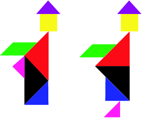
The tangram originated in ancient China before reaching America and England through trade in the early 1800s. To play a Tangram, you simply arrange the seven pieces – five triangles of varying sizes, a square and a rhomboid – without overlap, to exactly reproduce the given image. Sounds easy, doesn’t it? Believe us, it isn’t. We needed a number of attempts to produce recognisable Olympic sports. If you don't receive your calendar or know someone who would like one, let us know as we always have a few spare.

Continuing the theme, our Christmas card also features a tangram in the shape of a tree, which thankfully, was much easier to create. We'd love you to punch out the pieces and create your own symbols/icons and send the pictures to tangram@tothepoint.co.uk. We'll send a real tangram puzzle to the best ones.


We've also created a little screensaver just for christmas and inspired by the 12 tangram illustrations we've used on our calendar, you can download it (for Mac or PC) here.


Finally, an odd, and intriguing aspect of the tangram is the phenomenon of paradoxes. A tangram paradox exists where two puzzle configurations are almost the same, yet a part in one magically ‘disappears’ in the other version. One of the most famous examples is the Dudeney paradox featuring two monks, where on one version the figure is a complete person and on the second version, the figure appears to lose its foot. Have a look at this head-scratcher here and see if you can solve it.


The real Christmas lights


CBRE’s Architecture and Design division approached us earlier this year to create an innovative concept for their new headquarters in Henrietta Place. As part of the project we installed a sculptural lighting installation in the reception area (see our previous blog on this here). This was really well received and has become a great talking point, so we decided to help bring some Christmas cheer to visitors and CBRE employees by designing a bespoke Christmas animation sequence for the festive season.

The ambient animation consists of a number of sequences and is around 12 minutes in total. The aim was to create something vibrant and colourful without it being too garish or distracting. It seamlessly blends a series of seasonal images, including gently falling snowflakes, exploding fireworks, flickering candles, Christmas tree and baubles. Santa even puts in a brief appearance, complete with reindeers and sleigh.

The lighting installation is on permanent display in their main reception area and the Christmas animation will be running there until the new year.

Martin Lewis, Chief Operating Officer at CBRE had this to say: “Once again TTP has created an inspiring and visually appealing lighting installation, and it is an imaginative conversion of well trodden images into a fresh format that catches people’s attention.”

Ben Jackson, who created the sequence adds: "This was a fun and unusual project to work on, after all, it's not every day that we get to create something more as abstract art than functional design. The LED tile displays are perfect for a more ambient kind of animation - whilst lacking in the crisp detail of a TV screen, they convey movement and colour really well and I tried to take advantage of that with various sequences that convey some of the fun and 'sparkle' of Christmas."

You can see a section of the sequence above (or visit their headquarters to see it yourself).


Branding Macmillan's Next Chapter


Macmillan - The Next Chapter (click to view)


Macmillan is one of the world's leading publishers, home to Nature Publishing Group, Palgrave Macmillan, Macmillan Education and Pan Macmillan. To improve collaboration and give its employees a fresh, modern working environment, the company is bringing together its various publishing divisions, which are currently split between Oxford, London and Basingstoke. Macmillan is also investing in new premises in Basingstoke, which will become its main service centre for fulfillment and distribution.

We first got involved in branding the move when Mat Rumblelow, head of internal communications consultancy, Rumbers Ltd - whom we had worked with before on an internal branding project for News International - asked us to create a new logo and strapline for the project. As part of the brief, the internal communication needed to be on brand, work with the Macmillan 'red wave' logo and be bold, quirky and fun.

We were conscious that the project identity couldn’t focus solely on London given Macmillan's investment in Basingstoke, as well as the fact that although Macmillan’s identity is rooted in print, digital is a growing and vital part of its business.

We came up with a number of concepts, before opting for a fun, simple, iconic identity that reflected the joined-up thinking of bringing all the different publishing divisions under one roof. Using a bold red linear treatment that took its cue from the Macmillan logo, we created an overarching icon featuring a book and turning page to represent the project strapline of ‘The Next Chapter’. The turning page graphic also featured an extended line treatment to link the individual publishing divisions together.

We then created a number of images and accompanying straplines in the same style to represent the reasons for and advantages of the move. These included ‘sharing knowledge’ and ‘embracing innovation’ which were represented by arrows converging and a laptop, while Q&A and Next Steps sections of the briefing pack were represented by mortar boards and pencil illustrations.

The move was announced to all staff on 9 November 2011, with the overarching logo and The Next Chapter strapline used on all internal communications, including briefing packs (given to over 2000 staff globally), presentations, newsletters and the staff intranet. The campaign was underpinned by a video from the CEO that covered the vision and changes ahead. The video was scripted by Mat and shot by Stickman Productions, who worked with us on the EDF video for upstreaming.

The project’s branding was really well received by employees at Macmillan, who felt it was highly professional, with a clear tie-in with the Macmillan logo and culture. Some even went as far as to say it as the ‘best internal communications ever seen at Macmillan.’

Mat Rumblelow says: "As always, TTP demonstrated their ability to capture the essence of the Macmillan Brand, while creating a new vibrant identity for the co-location project. The team pulled together a range of concepts under extremely tight deadlines, giving us a number of viable options. The chosen identity was a real success and will be carried forward over the course of the project to create a range of high-impact deliverables."