

Pomak and the Painter
Over the years we have built up good relationships with clients based overseas, such as New York, San Francisco, Dubai and a little closer to home in Ireland. At the beginning of September, one of our senior designers, Jem, flew over to Dublin to oversee the installation of an exciting new project. It called for us to use some old techniques and methods we had not used for some time. One of the highlights was using Dublin based signwriter, Colm O'Connor, who brought some of our icons and messaging to life on real wood. You can see him in action in the video Gentlemen of Letters.
We are still trying to work out if Jem was more impressed with the painting or the pint of real Guinness before his flight home.
 Totally Bricking It!
September 24 has seen the launch of ‘The Art of The Brick’ at Truman’s brewery - to put this plainly, it's an entire exhibition filled with lego sculptures! That's right, childhood dreams do come true.
Created by New York Artist Nathan Sawaya, the sculptures are bound to leave both children and adults in awe. The highlight has to be the 20ft dinosaur, but there are also some special London influence pieces.
Created by New York Artist Nathan Sawaya, the sculptures are bound to leave both children and adults in awe. The highlight has to be the 20ft dinosaur, but there are also some special London influence pieces.

Reasons to be Creative
At the beginning of this month, our very own Jem Pomak went to his very first design conference and learnt a very pertinent lesson:
"The running theme of Reasons to be Creative seemed to be “design what you know and love”, although that might have just been my dreamy-eyed first-conference-wander talking. One speaker in particular, James Victore hammered home how important it is to design boldly, saying “If it doesn’t move you, how can you expect it to move anyone else?”. It was just one little thing but it really hit home, as an agency we do design with passion but it's not something I'd consciously thought of before.".
Our picks from LDF
If this year's London Design Festival has been a bit overwhelming for you we have picked a couple of our favourites for you to have a look at.
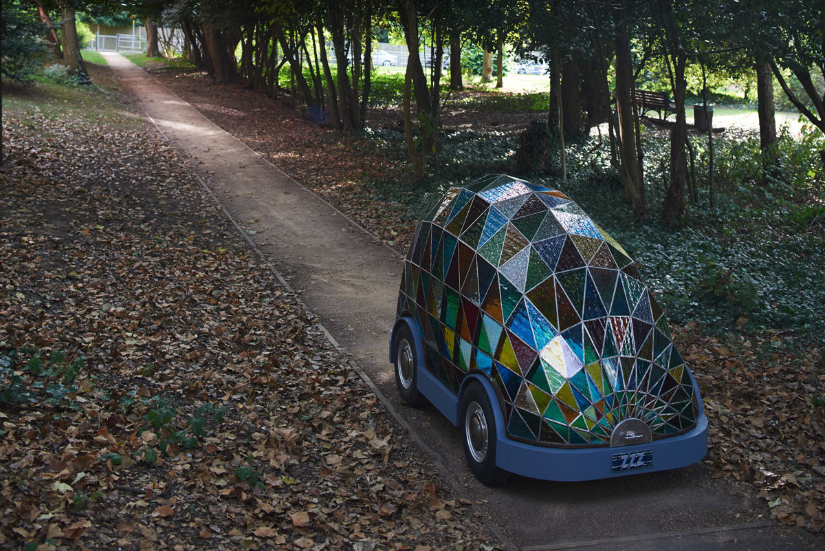
If Dominic's self-driving car is anything to go by, the future is going to be a beautiful place! Wilcox predicts that by 2058 (very specific) it will be safer to ride in driverless vehicles than ones controlled by humans. Our client, Transport Systems Catapult agree, as they're currently trialling driverless pods.

Dan's latest installation draws inspiration from the sci-fi writer Phillip K Dick, who stated that endless clutter builds up in a persons life as ‘kipple’. Through Dan’s Studio there is a pathway defined by the absence of miscellaneous clutter. From afar, it would be easy to think that the items have been spray painted to achieve the effect, but look closer and the sheer scale of the project becomes clear.
 A tricky start for the iPhone 6
With more competition than ever before, Apple-sceptics had a fun September. Initial reports that iOS8 had more bugs than usual were joined with complaints on-line that the new iPhone 6 was actually bending!
Many have been quick to jump on the Apple bashing wagon with the likes of LG being swift to take the mickey “Our phones don’t bend, they’re naturally curved :) #bendgate.” (However, if you are going to poke fun at iPhones, then using one to send the tweet is probably not the smartest move!)
This all highlights the importance of some serious testing before launching something, whether it's a bendable phone or a mis-interpreted logo!
 The science underdogs
This week the world of Science has recognised some of the contributions made to mankind that make very little difference (even the underdog needs a bit of recognition).There are some truly cracking entries, but we've picked our top three:
1. Researchers who have studied the slipperiness of a banana skin
2. Pork strips stuffed into peoples noses to stop severe nosebleeds.
3. The men who dressed up as polar bears to study reindeers reactions (sadly we do not have an image for this one, that said our imagination does a pretty good job).
Luckily some of our science based clients are striving for slightly more ‘impact’ and ‘imovation’.
 Challenge over but not out
Well, Sam completed his Challenge-Charlie 97 days of running with his final 12k along the banks of the Bosphorus with our MD, his Dad, desperate to complete it with him.
In a tremendous effort by Sam he has raised thousands of pounds for the Team Hutton Just Giving page from sales of the now iconic ‘Join Us’ T-shirt and donations. You may have seen some of our team out running in our shirts over the bridges along the Thames on a Wednesday after work (finishing with a well earned pint at the Mudlark!).
The last weekend park run on the 14th September will be a difficult one to forget, as Sam was joined by many of those who had run with him for one epic run (and picnic) in Battersea Park. What has been truly inspirational is the lasting effect these runs have had on people, transforming non-runners into runners. We certainly intend to keep it up, so if you fancy joining us let us know... we’ve even got some T-shirts left so you wont feel left out. To find out more about the actual Challenge and Sam’s 97 days of running, visit the website. Well done Sam - we’re all proud of you, and a little bit fitter!
 Sorry, summer’s gone
Now that the summer has come to an end, illustrator Seth Armstrong’s feature ‘Book your Stay’ in Mr Porter reminds us of the hot days and holidays past, as we now wait for the wind and rain of Autumn. Armstrong paints some of the world’s most famous novels held up agains the background of the novel itself. The results are something to behold.


