Friday 31 May 2013

News round

This month, we've compiled a few of the interesting, fun and quirky bits of news that caught our eye from the world of branding, design and digital (as well as other random bits and pieces too).

Coming up...

» New idents for News
   News Corp splits into two with new identities to match

» Sticky Toffee
   Everton FC and their controversial new logo

» The fight for our living rooms has begun (again)
   the announcement of the Xbox One heralds a new war over our TVs

» The future will be wearable
   smartphones and tablets are so passé, the future will be attached!

» It's a GIFt
   the inventor of the popular .GIF image format tells us where we've been going wrong

» Crazy happy running
   possibly the happiest run on the planet?


Things that caught our eye this month...


New idents for News

Image taken from Pentagram.com

The big reveal for the big split started earlier this month as the immediately identifiable '20th Century Fox' logo finally caught up with the rest of the world and re-branded for the 21st Century. Created by Pentagram, it's clean, neat and follows the new 'flat' aesthetic that seems to be doing the rounds. However, we can't help feeling like the movie logo has lost a little magic in the translation - especially when it comes to that animation - I wonder if they plan on losing the old familiar fanfare too?

Image taken from Guardian.co.uk

The second half of the company announced its new logo the other day - and it's dramatically different in style to both the original News Corporation logo (featuring a rather stern and official portcullis) and the new 21st Century Fox logo above. So far, it's not been attributed to any agency and, as it's apparently based very much on Mr Murdoch's own handwriting, we're wondering if he hasn't created it entirely himself?

The question is, does it work and is that friendly, fluid script appropriate for a multi-billion dollar news 'corporation'. It's certainly divided opinion here – we'd love to know what you think (a quick Google will give you plenty of other opinions on the new News Corp identity!)


Sticky Toffee

Image taken from bbc.co.uk

Another logo hitting the headlines is the new Everton logo. Massively unpopular with fans, over 20,000 have signed a petition calling for the ‘embarrassing, Fisher Price logo’ to be dropped. Everton has since issued a statement saying that whilst it will be used for the coming season, a new badge will be developed in consultation with fans for the 2014/15 season.

A win for the power of social media, however, it’s an embarrassing climb down for Everton (as a Liverpool fan, however, I think it’s hilarious!). It is worth noting that one of the reasons for the change was that the previous logo didn’t reproduce well digitally, an important factor that got lost amongst all the furore.


The fight for our living rooms has begun (again)

Image taken from telegraph.co.uk

On May 21st, at Xbox HQ, Microsoft announced the next-gen Xbox gaming console to the world. Why should we care? Well, apart from offering us new ways to shoot zombies (it's a pretty safe bet right?) the presentation was interesting as it focused almost exclusively - not on games - but on new ways to control and interact with your TV. Microsoft is positioning this device not really as a gaming upgrade but as a new 'all in one' box that controls everything you do on your tellie (hence the new moniker 'Xbox One' - which is a little confusing as this is actually the Xbox 3 - but we'll leave that for now).

Whilst its main competitors at Sony did a 'sort of unveiling' a few months before of the PS4 (showing the games, but not the box - in fact its recently released a hilarious teaser showing the device itself - or at least a very blurry image of it anyway - can you imagine any other brand doing this?) - Microsoft seem to be aiming at a different set of competitors altogether - that of Google, Apple and maybe even the big media companies too.

The new device features a brand new version of the 'Kinect' device - which captures user motion, gestures and speech to control the console (whether you’re telling it to 'duck and cover' or 'show today’s TV guide for BBC1'). But at a rumored retail price of £399 (although currently on Amazon at £599!) is this just too high a price for their budget conscious, mainstream target audience?

The battle for the touchscreen is ongoing, but the battle for who dominates the 'TV space' has just heated up several degrees. All eyes are still on Apple though - can it do another 'iPhone' with its much rumoured big-screen Apple TV?


The future will be wearable

the Apple 'iWatch' (artists impression!)

Unless you've been hiding under some virtual rock over the last few months, you'll no doubt be aware of the Google Glass project which has been getting a whole load of media attention recently. What is it? Well, it's basically a smart-phone on your head - not strictly virtual reality or even augmented reality (it doesn't overlay a full Heads Up Display - but projects a small image to one corner of your vision when wearing the glasses).

Some say it will completely revolutionise the way we live - finally removing all barriers between us, our daily lives and the internet at large. Others say it's a creepy invasion of privacy - constantly gathering personal data and creating a whole new barrier between humans and other humans. Recently, Apple's Tim Cook commented that he thought it really won't catch on. He may well be right, but then, he would say that wouldn't he?

Apple and Google have been at loggerheads for years over the smartphone space - and wearable computing threatens to be the next battleground. There are very heavy rumours that Apple is set to launch their new iWatch (probably early next year) - which will come as wonderful news to Apple die hards who can't own enough Apple devices and will proceed to get seriously confused as to which 'i' device they've been reading their emails on.

Whilst Google Glasses is definitely NOT a return of the fabled 80's tech: 'virtual reality' – the forthcoming Oculus Rift (we love the name!) does look like someone's finally managed to turn the dream into a reality. Whilst still being far too bulky to be considered something that you might wear as part of your daily life, the promise of genuine virtual experiences must be very interesting to anyone wanting to demo or experience a true virtual environment - from games to architects or even learning tools - the possibilities are, (as they were 30 years ago), boundless.


It's a GIFt

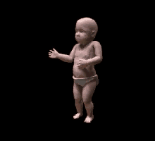
The 'Dancing Baby' .GIF animated 'meme'

Over the last year or so, the humble 'GIF' image has been responsible for many a meme. (Just a few of our favourites: iheartcatgifs, whatshouldwecallme and jamesvandermemes).

Invented in 1987 by CompuServe (a long dead pioneer of the internet age - since swallowed by AOL). The GIF format may not produce the same quality of image or get anywhere near the compression efficiency of the now standard 'JPEG' - but it did offer one major USP - that of simple animation. It remains as one of the only ways you can guarantee to show animating image content on ALL devices (from emails to Flash banner ads on mobiles).

However, 26 years after inventing it, the original creator: Steve Wilhite has announced that we've all been pronouncing it wrong - it's not GIF, it's pronounced 'JIF'. Well, that's us told. It seems however, that the rest of the world disagrees with the inventor - where do you stand - is it 'Jif' or 'Gif'? And does that make him an old 'Jit'?


Crazy happy running

Taken from thecolourrun.com

The Colour Run London 2013 , this is quite possibly the happiest 5k run on the planet and caught our eye this month. It's coming to Wembley on the 16th of June and is a truly unique running experience, being less about speed and more about brightly coloured paint flying through the air as you run! Our Katie is signing up... pictures to follow but for now enjoy this video.

The skillet takes to feed Britain

Kettleby Foods, where the magic happens
New client Samworth Brothers, one of Britain’s leading producers of chilled foods providing everything from sandwiches to ready meals, has been keeping us busy this month. Each quarter the company produces an internal newsletter, The Samworth Standard, and sends a copy to the homes of each of the 7,500+ employees across 15 sites.

The Samworth Standard is sent to every employee, whether they’re in the heart of the production line, exploring flavours in the development kitchen or based at the Group Centre at Chetwode House. Therefore, we knew it needed to cater for not only the Group Chief Executive, but also a worker on the factory floor who might have English as a second language.
Chris the development chef cooking up a storm...
With these factors in mind, we've introduced colour-coded signposting at the top of each edition, which allows readers to easily navigate their way through the newsletter. We have also introduced the pie-dea (sorry, we couldn’t resist!) of quotes and pullouts to help draw the reader to a key piece of information.

With 100 years of history comes a business rich community spirit, which we knew was important to bring out in The Samworth Standard. We’ve kept the layout very people focused, introducing lots of imagery and interspersing articles with cut out photographs to soften the layout and make it more personable.

After all this thinking about the 7,500 members of the Samworth Brothers family, it was time for Katie to meet them...well some of them!

Then the team take Chris's recipes and turn them into food for the masses
“I made the trip up to Melton Mowbray, along with Emma Foster, the Standard's new copywriter, for a tour of Kettleby Foods, which specialises in ready meals for Tesco. I’d been debriefed that I had to be fully make-up free, and would be required to wear an oh-so-attractive hair net (thankfully I have inner beauty…and no pictures are allowed from inside the site!).

As part of the tour, we met the talented development chefs who are responsible for both creating exciting new dishes and improving the classics. Their inspiration for a new dish can come from anywhere, from a surge in popularity for traditional cuts of meat like beef cheeks, to dishes they find on a global fact finding mission.
Finally it all gets packed and shipped out!
Then it was time for a tour of the nine acre site to see how their recipes are turned into dishes to feed the masses. Contrary to what I've “learnt” from the classic film Chicken Run, each meal is made from scratch with everything marinated, minced, mashed, prepped and packed on site. Not a stretchy arm or Mrs. Tweedy in sight! The team can get through around 50 tonnes of mashed potato and more than a blue whale’s weight in beef a week (that’s 160 tonnes just in case your whale knowledge isn’t up to scratch)!

My eyes have been opened to what goes into each ready meal (both effort and ingredients) and could talk for hours about it, just ask the team here! It’s given me a real insight into Samworth Brothers, which will be invaluable moving forward.”


Songs of praise

the new postcard for Concerto Group
They say word of mouth recommendations are the best way to win new business and who are we to disagree? We have the lovely people at Better Bankside to thank for some of our newest clients after they sang our praises (thanks guys!) and we’re now working on two really exciting projects for Croydon BID and Concerto Group.

Croydon BID is a Business Improvement District, and given our experience of working with Better Bankside over the years, the team there thought we’d be the perfect choice to help Croydon BID improve its positioning, marketing collateral and two websites.
the current Croydon BID logo

Following Better Bankside’s lovely words, Croydon BID invited us to pitch for the project, focusing on its messaging and helping to promote the benefits the BID has already brought to the town as a place to work, live, visit and do business, as well as its future ambitions.

a Croydon icon!

We’re thrilled to have won the project, and to be part of Croydon BID at such an exciting time (even more so now Crystal Palace have been promoted to the Premier League, which just shows it’s a town on the up!).
Crystal Palace: 2013 Playoff winners!
The initial strategic work has just begun, which we’re keeping top secret for now but we’ll be sure to share it with you over the coming months so watch this space. 

Matthew Sims, Chief Executive, Croydon BID had this to say about our partnership so far:
“The evolution of our messaging, collateral and overall marketing communications is a significant part of the jigsaw that must sit succinctly within the values of our business, both now and in the future. To The Point’s creative approach embodies much of our vision for the future and the team has really taken to the project, adding greater value to our positioning, messaging and overall look and feel. We are building a long term relationship with the team in order to evolve over time the strength of the brand, our communications and collateral and are delighted with the progress made to date.”

Concerto Group is our other project courtesy of Better Bankside (although, like Croydon BID, we did have a hand in winning it ourselves, after all, recommendations don’t win the project by themselves, fantastic work and a wonderful team helps too...)

One of the UK’s leading event services companies, Concerto Group covers everything from venues and catering through to event management and services, we also hear they do some epic Christmas parties! The company approached us to develop a postcard advertising its fundraising events to charities. Although the timeframe was tight, the team had a clear idea of what was needed (being in the creative industry certainly helps!) and we turned the project around very quickly. We created a vibrant, engaging postcard for them and are looking forward to working with the team on upcoming projects.


An exchange of ideas


London-based foreign exchange specialist FC Exchange asked us for help to create a national ad campaign for both corporate and private clients to increase awareness of its offer and expertise in a crowded market. The campaign, running in a number of broadsheets, including The Times, The Daily Telegraph and The Sunday Times as well as a number of consumer lifestyle magazines, launched this month.

As well as increasing brand awareness and developing a campaign that reflected its offer of a fast, easy and secure service, FC Exchange also wanted to differentiate itself from the people focused approach used by its competitors. We retained personalisation by introducing quotes from FC Exchange’s staff and its financial director to highlight the benefits of the service.


We created two campaign headlines to differentiate the private and corporate offers. For corporate audiences we focused on services with the copyline, ‘make your money go further, faster’, and reinforced this messaging with the graphic arrow device from the company’s logo to create an iconic look and feel. We used the same device for private clients but introduced the new copyline, ‘why not save £9,332 on your currency transfers?’, focusing on the money customers can save over using a bank. This was backed up by market research, with new ads updated with the latest figures from ongoing research, the latest being in May.

We tailored the messaging further depending on the sector and publication, whilst the orange, grey and white colour palette provides visual intrigue and works across both corporate and private client audiences to build brand recognition and cross sell the business.

FC Exchange received a positive response to the first ads, which generated several good quality leads as well as some new corporate customers. These results highlighted to the company that less is more, and that a clean, simple message allows the reader to focus on the elements that matter most.